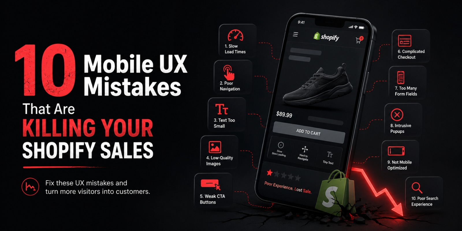
10 Mobile UX Mistakes That Are Killing Your Shopify Sales
You spent time building your Shopify store. You picked a theme, wrote product descriptions, set up your collections, and started driving traffic.
But something is off.
The traffic is coming in but the sales are not matching up. Your conversion rate is lower than it should be. People are visiting and leaving without buying.
Here is what most store owners do not think to check. They never open their own store on their phone and actually try to buy something. They check the desktop version constantly but the mobile experience the version that the majority of their customers are actually seeing gets ignored.
When they finally do check it, they find problems. Things that look fine on a laptop feel clunky and frustrating on a phone. And those frustrations are costing real sales every single day.
These are the ten mobile UX mistakes that are quietly killing conversion rates on Shopify stores right now and exactly what to do about each one.
Mistake 1: Your Store Takes Too Long to Load on Mobile
Let us start with the one that hurts the most because it affects every single visitor before they even see your products.
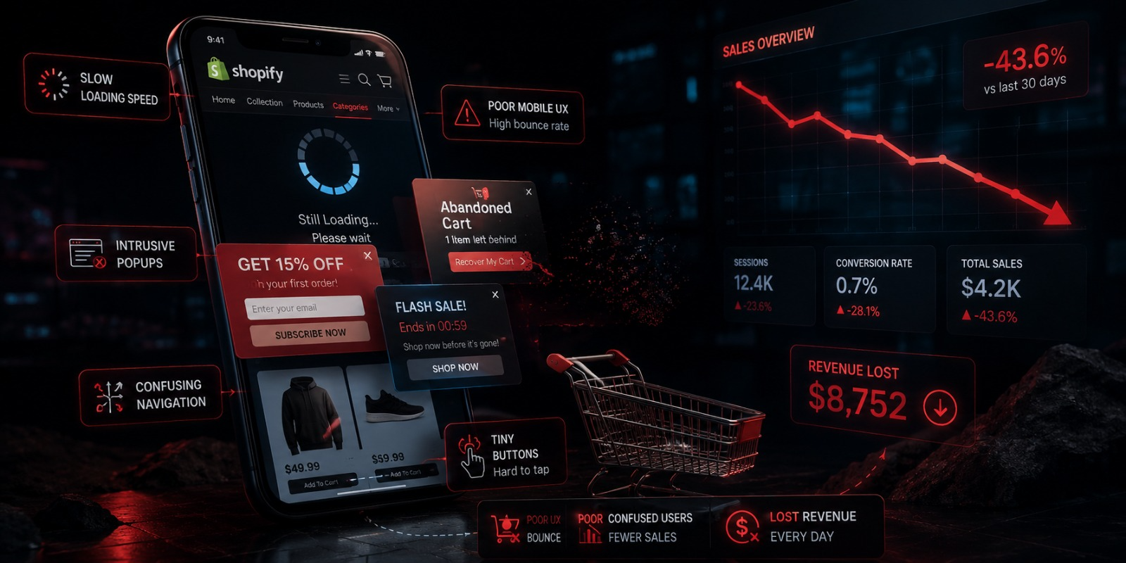
Page speed on mobile is not just a technical issue. It is a revenue issue. Google’s own research shows that the majority of mobile users will abandon a page that takes more than three seconds to load. Three seconds. That is it. And most Shopify stores do not meet that standard on a real mobile connection.
Think about what that means in practice. You are running ads, doing SEO, posting on social media, all to bring people to your store. And then a significant chunk of those people leave immediately because the page did not load fast enough. They never saw a product. They never read a description. They just got a loading spinner and moved on.
The damage is bigger than just that one lost visit. People who have a slow experience on your store do not come back. You paid to acquire them and they are gone.
Speed problems on Shopify stores come from a handful of predictable sources.
Unoptimized images are almost always the biggest culprit. Store owners upload high resolution photos straight from a camera or from a supplier and those images can be several megabytes each. On a desktop with fast broadband that might load fine. On a mobile connection it is painfully slow. Every image on your store needs to be compressed before it is uploaded. Tools like TinyPNG, Squoosh, and ImageOptim reduce file sizes by 60 to 80% with no visible quality loss. This single change alone can dramatically improve your mobile load times.
Too many apps are the second most common cause. Every Shopify app you install adds code that has to load every time someone visits your store. Apps for reviews, pop-ups, live chat, loyalty programs, upsells, countdown timers each one adds a little more weight to your pages. If you have ten apps installed and you are actively using three of them, the other seven are slowing down your store for every single visitor without giving you any benefit. Go through your app list ruthlessly. Remove everything you are not actively using.
Heavy themes with lots of animations, video backgrounds, and complex design elements add load time too. If your theme is built for visual impact on desktop, it might be dragging your mobile performance down. Simpler, performance focused themes consistently load faster.
The way to measure your current situation is with Google PageSpeed Insights. It is free, it is accurate, and it gives you a specific mobile performance score plus a prioritized list of what to fix. Put your store URL in today and see where you stand. A score below 50 is a serious problem. Between 50 and 70 is average. Above 70 is where you want to be. Above 80 is excellent.
Mistake 2: Navigation That Does Not Work for How People Actually Use Their Phones
Watch how someone actually uses their phone for five minutes and you will notice something important. They hold it with one hand and navigate with their thumb. And depending on the size of the phone, large portions of the screen particularly the top corners are genuinely difficult to reach comfortably.
Most Shopify themes were designed on desktop and the mobile navigation is an afterthought. The result is menus with tiny text links crammed at the top of the screen, category structures with multiple nested levels that require tapping deep into sub menus, and interactive elements that are physically too small to hit accurately with a finger.
Every link and button on your mobile store needs to be large enough to tap without difficulty. The minimum recommended tap target size is 44 by 44 pixels. Anything smaller and users start missing their intended target, accidentally tapping the wrong thing, or giving up and leaving.
Navigation structure matters just as much as tap target size. If getting to a product category requires opening a menu, tapping a parent category, waiting for a sub menu to appear, and then tapping the right sub category that is too many steps for a mobile user who is browsing casually. They will not follow that path. They will either use search or they will leave.
Simplify your mobile navigation to the essentials. Your most important product collections should be reachable in one or two taps from anywhere in your store. Use clear, plain-language labels not clever brand names that require context to understand. Make your menu items large and well-spaced so they are easy to tap accurately.
If your store has a large catalog with many categories, consider adding a prominent search bar as an alternative navigation path. Many mobile users find it faster to search for what they want than to navigate through menus. Make search easy to find and easy to use.
Test your own navigation on your actual phone with your actual thumb. Not on a desktop emulator. On your real phone, trying to use it the way a customer would. You will find the friction points immediately.
Mistake 3: Product Images That Are Not Good Enough on a Small Screen
On a desktop, your customer has a large screen, the ability to zoom in on images by hovering, and easy side by side comparison of multiple products. On mobile, they have a screen roughly the size of their hand, no hover functionality, and a much harder time seeing fine detail.
This means the bar for product images on mobile is actually higher than on desktop. Your images need to do more work in less space.
The most common image mistakes on mobile Shopify stores are images that are too small or low resolution to show product detail clearly, a limited number of images that do not show the product from enough angles, images that are not formatted well for vertical mobile screens, and no zoom functionality that lets customers inspect details they care about.
For any product where quality, texture, material, fit, or fine detail matters clothing, jewelry, skincare, food, handmade goods, furniture these image problems directly translate to lost sales. The customer cannot feel your product. They cannot pick it up and examine it. Your images are the only way they can assess whether it is worth buying. When those images do not give them enough information, doubt creeps in and they do not buy.
Fix this by making your main product image large and immediately impactful. When someone taps on your product from a collection page, that first image should be striking and clear. It should fill a significant portion of their screen and show the product compellingly.
Add enough images to answer every question a customer might have visually. Show the product from multiple angles. Show details up close. Show it in a real-life context — being worn, being used, in a room, in someone’s hand so customers understand the scale and can visualize it in their own life.
Enable pinch-to-zoom so customers can inspect details themselves. And make sure swipe to navigate between images works smoothly. These interactions feel completely natural on a phone and customers expect them.
Mistake 4: The Add to Cart Button Is Buried or Too Small
If there is one element on your product page that needs to be impossible to miss, it is the Add to Cart button. This is the most important single element on your entire store. Everything on every page is working toward getting someone to tap that button.
And yet on a surprising number of Shopify stores, the Add to Cart button on mobile is easy to miss.
This happens because on desktop, the product page has a two-column layout image on the left, product details and the buy button on the right. Everything is visible without scrolling. When that layout stacks to a single column on mobile, the image comes first, then the product title, then the price, then the description, then the variant selectors, and then finally the Add to Cart button which might now be positioned below a wall of text that many mobile users never bother to scroll through.
The button can also be visually weak a small, narrow button that does not stand out from the rest of the page. Or it can be too small to tap comfortably, requiring a precise tap that people miss and have to try again.
Your Add to Cart button on mobile needs to be wide ideally spanning the full width of the screen or close to it. It needs to be a strong, high-contrast color that makes it visually unmissable. And it needs to be positioned where customers can find it without extensive scrolling.
The best solution many Shopify themes offer is a sticky Add to Cart button one that remains fixed at the bottom of the screen as the customer scrolls through the product page. With a sticky button, no matter where the customer is on the page reading the description, checking the size guide, browsing the reviews — the buy button is always right there, always accessible, always visible. If your theme supports this, turn it on. If your current theme does not support it, consider switching to one that does or using an app to add this functionality.
The impact of getting this right is immediate and measurable. When customers can always see and easily tap the buy button, more of them do.
Mistake 5: Pop Ups That Destroy the First Impression
Email pop-ups are a legitimate marketing tool. Building your email list is important and a well timed offer can convert a significant percentage of visitors into subscribers.
But on mobile, the way most Shopify store owners implement pop ups creates one of the worst first impressions in e-commerce.
Picture this from the customer’s perspective. They found your store maybe through an ad, maybe from social media, maybe from a search result. They tap the link and they are excited to see what you offer. The page starts to load. And the moment it finishes loading, before they have seen a single product or read a single word of copy — a full-screen pop-up covers everything and asks them to enter their email address.
They arrived three seconds ago. They know nothing about your brand. They have not seen why they should care about your products. And you are already asking for their personal information.
Most people dismiss it immediately. Some people leave entirely and do not come back. A small percentage sign up, usually because the offer is compelling enough to override the irritation.
And here is an additional problem you might not know about. Google penalizes mobile pages that use intrusive interstitials full screen overlays that appear immediately on page load. If your pop up appears the moment someone arrives, it can hurt your search engine rankings, meaning you get less organic traffic in the first place.
The fix is not to eliminate your pop-up. It is to implement it in a way that respects the customer’s experience.
Delay the pop-up. Show it after someone has spent at least 30 to 60 seconds on your store and has demonstrated genuine interest. Trigger it based on scroll depth when someone has scrolled 50 or 60 percent down a page they are clearly engaged, and that is a much better moment to make your ask. Or use an exit trigger that shows the pop up when someone’s behavior suggests they are about to leave.
Use a smaller format on mobile. A slide up banner at the bottom of the screen is far less disruptive than a full screen overlay. Make the offer genuinely compelling so that when it does appear, people feel like they are getting something valuable. And make the close button large, obvious, and easy to tap a tiny X that is almost impossible to hit accurately with a thumb is a classic mobile frustration.
Mistake 6: A Checkout Process That Is Too Long and Too Painful
You have done everything right. The customer found a product they want. They tapped Add to Cart. They tapped Checkout.
And then they leave without completing the purchase.
Cart abandonment is a massive problem in e commerce in general. On mobile it is even worse because the standard checkout process typing a full name, email address, shipping address, and credit card number on a mobile keyboard is genuinely tedious and error-prone.
Mobile keyboards are small. Autocorrect changes things you did not intend to change. Fat-finger errors mean people retype the same field multiple times. Every additional field in the checkout form is another opportunity for frustration to build up and for the customer to decide it is not worth the effort.
The most powerful thing you can do to improve mobile checkout conversion is enable one tap payment options. Shop Pay, Apple Pay, and Google Pay allow customers who have their payment information saved to complete a purchase with a single tap no forms, no typing, no friction at all.
These are not obscure features. A large proportion of mobile shoppers already have Apple Pay or Google Pay set up on their phones. When they see that button on your store they can tap it, authenticate with Face ID or their fingerprint, and the order is placed. The entire checkout takes under ten seconds.
Enable every accelerated checkout option available in your Shopify settings. And display these buttons prominently on your product pages, not just deep inside the checkout flow. The earlier in the journey you give customers the option to buy with one tap, the better.
For customers who go through the traditional checkout form, make every possible improvement to reduce friction. Only ask for information you genuinely need to fulfill the order. Make every field large enough to see and type in comfortably. Use the correct keyboard type for each field a number pad for phone number and credit card fields, an email keyboard for email fields. Enable address autocomplete so customers do not have to type their full address from scratch. And make sure your error messages are clear and immediate so customers can fix mistakes without guessing what went wrong.
Mistake 7: Text That Is Too Small to Read Comfortably
This is one of those mistakes that is easy to miss because it looks perfectly fine on the desktop version of your store. The font size that feels elegant and readable on a 27-inch monitor becomes genuinely small and difficult on a five inch phone screen.
The minimum recommended body text size for mobile is 16 pixels. Below that, many users particularly anyone over 35, anyone using their phone in bright sunlight, anyone who does not have perfect vision will struggle to read comfortably without zooming in.
When customers have to zoom in to read your product description, your return policy, or your ingredient list, a few things happen. The reading experience becomes laborious and annoying. They lose their place when they zoom back out. And they get a nagging sense that the store has not been properly built for mobile — which creates a subtle but real erosion of trust.
Check every text element on your store on a real phone. Product descriptions. Size guides. Policy pages. Ingredient or specification lists. Read them at normal viewing distance. If anything requires you to zoom or squint, it needs to be larger.
Beyond size, readability on mobile is affected by contrast, line spacing, and line length. Text with low contrast against its background light gray on white is a common offender — is hard to read on a phone in anything other than ideal lighting. Text with tight line spacing feels cramped and fatiguing. And text that runs full width across a large phone screen in long lines is harder to read than text with a slightly narrower measure.
These details collectively determine how comfortable it is to read information on your store. And comfortable reading keeps customers on your pages longer, reduces frustration, and builds the trust that leads to purchases.
Mistake 8: Pages That Break on Mobile Screens
This one is easy to spot and impossible to overlook when you actually check your store on a phone.
A page that breaks on mobile is a page where content does not fit the screen properly. Elements that extend beyond the edge of the screen horizontally. Text that overlaps images. Buttons that are cut off. Sections that display in a scrambled, visually chaotic way that clearly was not intentional.
The most common cause is content that was added to the store product descriptions, custom page sections, blog content using formatting that works on desktop but does not adapt to small screens. Wide tables are a particularly common culprit. A product specification table or a size comparison chart that displays beautifully on desktop will very often extend beyond the edges of a mobile screen, requiring horizontal scrolling to read which most mobile users will not bother with.
Embedded content from third party sources videos, maps, social media widgets, external tools is another frequent source of layout problems on mobile. These elements often have fixed widths that do not scale down properly on small screens.
Custom HTML or CSS added to Shopify pages by themes or apps that was not properly tested on mobile creates these issues too.
The fix is methodical. Go through every page of your store on your phone. Not just the homepage check your collection pages, your product pages, your about page, your policy pages, your cart, and your checkout. Look specifically for anything that extends beyond the screen edge or displays in a visually broken way.
When you find a problem, identify what is causing it. If it is a table in your product description, replace it with a mobile friendly alternative bullet points, an accordion section, or a simplified layout that works at any screen width. If it is an embedded video, make sure it is embedded using responsive code that scales with the screen size. If it is a theme or app element, check the settings for a mobile specific layout option or contact the developer.
A store with broken layouts looks unfinished and untrustworthy. Customers who see layout problems on mobile make quick judgments about your professionalism and reliability as a brand. Do not let avoidable technical issues create that impression.
Mistake 9: A Search Experience That Lets Down Purchase Ready Customers
Here is something important to understand about mobile shoppers who use search on your store. They are some of your most purchase-ready visitors.
Someone who types a specific product term into your store’s search bar knows what they want. They are not browsing casually. They have intent. They are a buyer if your search helps them find what they are looking for quickly and clearly.
When your search experience fails them, you are not losing a casual browser. You are losing a customer who was ready to buy.
Mobile search failures on Shopify stores come in several forms.
The search bar is hard to find. If your search icon is small and hidden in a corner of your mobile header, users who prefer to search will not find it easily. Some will give up. Make search visible and accessible a prominent icon or an always-visible search bar in your header.
Search results are slow or inaccurate. If someone types a product name and gets irrelevant results or has to wait several seconds for results to appear, they lose confidence in the search function and abandon it.
There is no predictive search. Predictive search where product suggestions appear as the customer types is one of the most useful features for mobile users specifically because it reduces typing. If your theme does not support it, your customers are typing out full search queries on a small keyboard when they could be tapping a suggestion after two or three characters.
Search results display poorly on mobile. Results that show up in a format that is hard to scan, with images that are too small or product information that is truncated in confusing ways, make it hard for customers to quickly identify what they want.
The search results page should display products in a clean, mobile optimized grid. Product images should be clear and large enough to identify at a glance. Product names and prices should be immediately visible. And filtering and sorting options should be available and easy to use so customers can refine their results without leaving the page.
Mistake 10: Neglecting the Mobile Experience After the Purchase
Almost every conversation about mobile UX in e commerce focuses on the purchase journey. And that makes sense getting someone to buy is the primary goal.
But the mobile experience does not end when an order is placed. And what happens after the purchase has a significant impact on whether that customer buys from you again.
Your order confirmation page is typically the first thing a customer sees after completing a purchase. It is almost always viewed on mobile. Is it clean and professional? Does it clearly confirm the key order details what was ordered, the total paid, the shipping address? Does it set expectations about what happens next and when the customer can expect their order? Or is it a cluttered, hard to read page that leaves the customer wondering whether everything went through correctly?
Your post-purchase emails order confirmation, shipping notification, out for delivery, delivered are opened predominantly on mobile. Research consistently shows that transactional emails have among the highest open rates of any email you will ever send, precisely because customers are eager to know the status of their order. These emails need to be properly mobile optimized. Readable text size. Buttons large enough to tap. Clean layout that does not break on different email clients and screen sizes. A professional, on-brand appearance that reinforces confidence in your store.
Your customer account pages order history, tracking information, address book, return requests are used almost entirely on mobile. When a customer needs to check their order status or start a return, they pick up their phone. If those pages are confusing, slow, or difficult to navigate on mobile, the frustration they feel colors their impression of your entire brand. And a frustrated post-purchase experience is one of the strongest predictors of a customer never buying again.
If you have a loyalty program or referral program, those touchpoints need to be mobile friendly too. A loyalty dashboard that is hard to read on a phone or a referral link that is difficult to share from a mobile device is a missed opportunity at every level.
Think of the complete mobile journey as a loop from discovery to purchase to post-purchase to return visit. Every stage of that loop either builds or erodes customer confidence and loyalty. Make every stage feel intentional and polished on a phone.
How to Start Fixing These Problems Today
Reading about these mistakes is useful. But the most valuable thing you can do right now takes five minutes and costs nothing.
Pick up your phone. Open your Shopify store as if you are a first-time customer. Browse a few products. Add something to your cart. Go through to checkout and see how it feels.
Do not use the Shopify app or the theme editor preview. Visit your actual store URL in your phone’s browser exactly the way a real customer would.
As you go through this process, notice every moment that creates even a small amount of friction or uncertainty. Every tap that is slightly hard to hit. Every piece of text that is slightly hard to read. Every step that takes slightly longer than it should. Every element that looks slightly off or out of place.
Write down everything you notice. Those are your priorities.
Then tackle them one by one. Start with load speed because it affects every single visitor. Then fix your Add to Cart button visibility because it has a direct and immediate impact on conversion. Then work through the rest.
You do not have to fix everything at once. Improving your mobile experience is an ongoing practice you test, you find problems, you fix them, and then you test again.
But every improvement you make to your mobile experience is a direct improvement to your conversion rate. And in a store where the majority of visitors are on mobile, small improvements compound quickly into significant revenue gains.
Your mobile experience is either your biggest problem or your biggest competitive advantage. The difference comes down entirely to whether you pay attention to it.
Final Thoughts
Every one of these ten mistakes has the same root cause. The store was designed on a desktop and never properly experienced on a real mobile device by someone genuinely trying to buy something.
The good news is that fixing these problems does not require a complete store redesign or a large budget. Most of the changes described in this post are adjustments to settings, configurations, and content that any Shopify store owner can make.
The stores that win on mobile are not necessarily bigger or better funded than yours. They are simply the ones where someone took the time to pick up their phone, go through the experience honestly, and fix what was not working.
Start today. Open your store on your phone. See what your customers see.