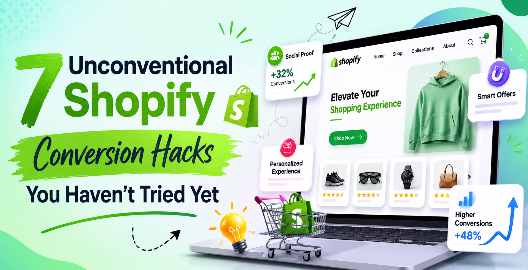
7 Unconventional Shopify Conversion Hacks You Haven’t Tried Yet
Most Shopify store owners reading conversion rate optimization advice are seeing the same tips recycled across the same blogs. Add urgency timers. Use high quality images. Write better product descriptions. Offer free shipping. These are not bad pieces of advice but they are table stakes in 2026. Every serious store has already implemented them. They are the baseline, not the differentiator.
This article is about something different. These are seven conversion strategies that most Shopify store owners have not implemented, either because they have not heard of them, because they seem counterintuitive, or because they require a bit more thought and effort than the standard advice. Every one of them has been tested on real stores with documented results.
If your conversion rate has plateaued and the standard optimization playbook has stopped moving the needle, these are the strategies worth exploring next.
Before getting into the hacks, it is worth understanding what conversion rate optimization actually is in 2026. It is not about tricking people into buying things they do not want. The most effective conversion strategies work by removing friction, building trust, and making it easier for people who already want your product to complete their purchase. When you approach optimization from that angle, the strategies feel less like manipulation and more like genuine improvement of the shopping experience.
Hack 1: The Strategic Abandonment Sequence That Brings Buyers Back
Most Shopify stores have an abandoned cart email. It sends one or two emails after someone leaves without purchasing, usually within a few hours. This is standard practice and your competitors are doing it too. The problem is not that abandoned cart emails do not work. They do. The problem is that most stores are using them in a way that leaves significant revenue on the table.
The unconventional approach is what experienced ecommerce operators call a strategic abandonment sequence that treats different types of abandoners differently and extends well beyond the standard 24 to 48 hour window.
Point 1: Segment your abandoners by behavior before they left
Not all cart abandoners are the same. Someone who spent 12 minutes on your product page reading the description, looking at all the images, and checking your shipping policy before adding to cart is a very different kind of abandoner than someone who clicked an ad, glanced at the page for 30 seconds, and left. The first person had high purchase intent and probably left because of a specific objection. The second person may never have been a serious buyer.
Most cart abandonment tools treat both the same way. They send the same sequence to everyone. Segmenting your abandoners based on time spent on the product page, number of pages visited, and whether they reached the checkout creates the ability to send much more targeted and effective recovery messages.
Point 2: Address the specific objection rather than just reminding them
The standard abandoned cart email says something like you left something behind with a picture of the product and a link to return. This works for people who genuinely just got distracted. It does not work for people who left because they had a specific concern that was not addressed.
A more effective approach is to identify the most common reasons people abandon your specific store and address those reasons in your sequence. If your analytics show that most people abandon after visiting your shipping policy page, your recovery email should directly address shipping costs and times. If people abandon after spending time on your returns policy, address the returns concern. If your product requires a significant commitment, address the hesitation directly with social proof and guarantees.
Point 3: Extend your sequence to 14 days for high-consideration products
The conventional wisdom is that cart abandonment emails should go out within the first 24 hours because that is when purchase intent is highest. This is true for impulse products. For products that require more consideration, a product that costs $80 or more or that requires the buyer to think about fit, compatibility, or lifestyle alignment, purchase intent can remain high for much longer. A sequence that runs for 14 days with messages spaced appropriately, addressing different concerns at each touchpoint, consistently outperforms a 48 hour sequence for higher-priced products. Test extending your sequence and watch what happens to your overall recovery rate.
Point 4: Use SMS as part of your abandonment recovery
Email abandonment sequences are standard. SMS abandonment messages are still underused relative to their effectiveness. Open rates on SMS messages are dramatically higher than email open rates. A single well-timed SMS sent a few hours after abandonment, kept short and genuine rather than spammy, can recover purchases that the email sequence never would have reached. Make sure you have explicit SMS consent from subscribers and keep your messages brief and human in tone.
Hack 2: The Reverse Risk Reversal That Actually Builds More Trust
Every conversion optimization guide tells you to offer a money back guarantee. Reduce the risk for the buyer. Make it easy to return. This is correct advice. But there is a more powerful version of this strategy that almost no Shopify stores are using, and it works by flipping the conventional risk reversal on its head.
Point 1: Make your guarantee so specific it becomes believable
Generic guarantees do not build trust the way they used to. Satisfaction guaranteed and 30 day money back guarantee are phrases that buyers have seen so many times they barely register. Customers in 2026 are skeptical of generic promises because they have been burned by stores that made them and did not honor them.
The unconventional approach is to make your guarantee hyper-specific in a way that signals you have genuinely thought about what your customers might be unhappy with. Instead of 30 day money back guarantee, write something like if you do not see a difference in your skin within 21 days of consistent use, we will refund your order in full and let you keep the product. No return shipping required. The specificity of 21 days, consistent use, and no return shipping required communicates that you have thought about this carefully and that you stand behind the product with genuine confidence.
Point 2: Put your guarantee where buyers are most hesitant, not just on the homepage
Most stores put their guarantee in their footer or on a dedicated guarantee page. A minority of visitors ever see it there. The unconventional placement is to put your guarantee exactly where buyer hesitation is highest, which is on the product page immediately below the add to cart button and again at the checkout.
A/B testing has shown repeatedly that moving guarantee language to these high hesitation locations produces significantly better conversion lifts than displaying it prominently on the homepage where visitors are still in exploration mode.
Point 3: Use a guarantee to address your most common sales objection directly
Look at your customer service emails and your product reviews. Find the most common concern that comes up before people buy or the reason people most commonly request returns. Build your guarantee specifically around that concern. If people frequently worry that the sizing will be wrong, your guarantee should speak directly to sizing. If people worry that the product will not work for their specific situation, your guarantee should address that use case. A guarantee that speaks to the real concern converts better than a generic promise.
Point 4: Consider a pay after you love it model for appropriate products
Some product categories are well suited to a trial model where the customer does not pay until after they have experienced the product. This is uncommon in ecommerce and that rarity is part of what makes it powerful when it works. The friction of paying before receiving a physical product is one of the fundamental challenges of ecommerce compared to physical retail. Any store that can genuinely remove that friction gains a significant conversion advantage. This is not viable for every product or every business model, but for stores where the economics and logistics allow it, the conversion rate impact can be enormous.
Hack 3: The Micro-Commitment Funnel That Warms Cold Traffic
Cold traffic, meaning visitors who have never heard of your brand before clicking your ad, converts at the lowest rates. This is the fundamental challenge of paid advertising for ecommerce. You are asking strangers to trust you with their credit card details based on a few seconds of exposure to your store.
The micro-commitment funnel is a strategy that warms cold traffic by getting small, low-risk commitments from visitors before asking for the big commitment of a purchase.
Point 1: Use a quiz as the entry point instead of a product page
Instead of sending cold traffic directly to a product page, send them to a short interactive quiz that helps them find the right product for their needs. The quiz does several things simultaneously. It gets the visitor engaged in an interactive experience rather than passively reading a product description. It collects information about the visitor that can be used to personalize their experience. It creates a feeling of investment in the process that makes the subsequent purchase recommendation more compelling. And it captures an email address at a much higher rate than a standard popup because people are willing to share their email to receive their personalized recommendation.
Stores that send cold traffic to quizzes rather than product pages consistently see higher overall conversion rates despite the additional step in the funnel, because the visitors who complete the quiz and reach the product recommendation are far more qualified and engaged than visitors who land directly on a product page.
Point 2: Ask for the email before the purchase, not simultaneously
The standard checkout flow asks for the email address as part of completing the order. By this point, the customer has already decided to buy. The micro commitment approach captures the email earlier, before the purchase decision, by offering something of value in exchange. A discount, a buying guide, a quiz result, or access to a limited sale.
This email capture serves two purposes. First, it gives you a way to follow up if the visitor does not complete a purchase, which is your abandoned cart sequence. Second, it creates a micro commitment. Someone who has voluntarily given you their email address has taken a small action that psychologically aligns them slightly more with your store. They are more likely to complete a purchase than someone who has given you nothing.
Point 3: Use add to wishlist as a conversion pathway for undecided visitors
Not everyone who visits your store is ready to buy today. Some people are in research mode, saving options for a future purchase. Most stores have no pathway for these visitors other than hoping they remember to come back. A wishlist feature, combined with automated emails when wishlisted products go on sale or run low in stock, creates a conversion pathway for visitors who were not ready to buy on their first visit but have genuine interest in your products.
Wishlist emails convert at very high rates because the recipient has already expressed specific interest in the exact product you are emailing them about. These are not cold emails to a general list. They are warm emails to people who told you they wanted this specific thing.
Point 4: Implement a samples or starter kit option for appropriate product categories
For consumable products, beauty products, food items, supplements, and similar categories, a low-cost sample or starter kit option creates a micro-commitment purchase that introduces new customers to your products with minimal financial risk. A customer who tries a sample and likes it converts to a full-size or subscription purchase at a dramatically higher rate than a cold visitor who has never tried the product. The economics of a low-margin sample sale often make sense when you account for the lifetime value of the customers it converts.
Hack 4: The Social Proof Sequencing Strategy Most Stores Get Backwards
Social proof is one of the most powerful conversion drivers in ecommerce. Reviews, ratings, customer photos, and testimonials all reduce the uncertainty that prevents potential buyers from completing their purchase. Most Shopify stores have some form of social proof. Very few are using it in the right way at the right moments.
Point 1: Put your most compelling social proof at the point of maximum hesitation
Most stores display their reviews in a reviews section near the bottom of the product page. This is where reviews live by convention and it is the wrong placement for maximum conversion impact. The point of maximum hesitation for most buyers is the moment just before clicking add to cart. They are looking at the price, thinking about whether it is worth it, and deciding whether to trust you.
Placing your single most compelling review, specifically a review that addresses price objections, quality concerns, or the most common hesitation for that product, immediately above or beside the add to cart button consistently outperforms the standard reviews section placement in A/B testing.
Point 2: Match the social proof to the specific concern at each stage of the funnel
Different concerns dominate at different stages of the buying journey. A visitor who has just arrived on your product page needs general credibility signals. Total number of reviews, overall rating, and a selection of positive headlines. A visitor who has been on the page for several minutes reading carefully has moved past general credibility concerns and now has specific questions. Does it fit true to size? How long does shipping take? Does it really work as advertised? The social proof you show at this stage should answer those specific questions.
Dynamic review display that shows different reviews based on visitor behavior and the time they have spent on the page requires some technical implementation but produces measurable conversion improvements.
Point 3: Use video reviews and unboxing content as conversion tools, not just social media content
Video reviews and customer unboxing videos are extraordinarily powerful conversion tools when placed on product pages rather than just used for social media marketing. A genuine video of a real customer showing the product, talking about their experience, and demonstrating it in use addresses multiple conversion barriers simultaneously. It provides product visualization that static images cannot match. It delivers social proof in the most credible format available. And it keeps visitors engaged on the product page longer, which increases purchase probability.
Reach out to customers who leave positive written reviews and ask if they would be willing to record a short video. Offer a discount on their next order in exchange. Even a small collection of genuine video reviews on your top products can produce significant conversion lifts.
Point 4: Show social proof from buyers who match the visitor’s profile
Generic positive reviews are convincing. Reviews from people who are demonstrably similar to the visitor are much more convincing. If your store sells products for runners and a review says I have been running marathons for 15 years and this is the best product I have found, that review is far more persuasive to your target audience than a generic this is great review.
When collecting reviews, ask customers to include relevant context about themselves and how they use the product. When displaying reviews, highlight the most specific and contextually relevant ones prominently rather than just sorting by rating or recency.
Hack 5: The Checkout Friction Audit That Reveals Hidden Conversion Losses
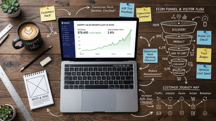
Most conversion optimization work focuses on the product page and the homepage. The checkout is treated as a fixed element that cannot be significantly improved. This is a major missed opportunity. Checkout abandonment rates on Shopify stores typically run between 60% and 80%, meaning the majority of people who reach checkout do not complete their purchase.
Point 1: Record and watch real checkout sessions
Install a session recording tool like Microsoft Clarity, which is free, or Hotjar and specifically look at recordings of visitors who reached your checkout and did not complete it. Watch where they paused, what they clicked, where they went back, and at what point they left. This qualitative data reveals friction points that analytics data alone cannot show you.
Common friction points discovered through checkout recordings include confusing field labels, unexpected costs appearing for the first time at checkout, trust signals missing at the payment step, lack of preferred payment method, and mobile keyboard issues on certain form fields. Each of these is fixable once you know it exists.
Point 2: Eliminate every form field that is not absolutely necessary
Every additional field in your checkout form is a small amount of friction that contributes to abandonment. Review your checkout fields and ask whether each one is genuinely necessary to fulfill the order. Many stores collect information at checkout that they do not actually need or could collect after the purchase.
Shopify’s one-page checkout, which became the default in recent versions, already eliminates some friction. But there are still opportunities to streamline the experience, particularly on mobile where typing is more laborious.
Point 3: Make your shipping costs visible before checkout
One of the single most common causes of checkout abandonment is unexpected shipping costs appearing for the first time when the customer reaches checkout. They have spent time on your store, selected a product, decided to buy, and then discovered that the total cost is higher than they expected. The psychological impact of this surprise is disproportionately negative.
Display your shipping costs or your free shipping threshold prominently on your product pages and cart. If you offer free shipping over a certain order value, make sure every visitor knows about it before they reach checkout. The cart page should show a progress bar toward free shipping so customers know how close they are and can decide whether to add another item to qualify.
Point 4: Add trust signals specifically at the payment step
The moment of entering credit card information is the highest anxiety point in the entire purchase journey. This is when customers most acutely feel the risk of shopping with an unfamiliar store. Most stores have essentially no trust signals at this specific moment. Their trust badges are in the footer. Their guarantees are on the product page. The checkout itself looks bare.
Adding security badges, your guarantee reminder, and a brief reassurance message specifically at the payment entry step addresses peak anxiety at the moment it is most likely to cause abandonment. A simple one line message near the payment fields saying your payment is encrypted and your order is covered by our guarantee can measurably improve checkout completion rates.
Hack 6: The Post Purchase Experience That Turns One Time Buyers Into Repeat Customers
Most conversion optimization stops at the purchase. The order is placed, the conversion is counted, and attention moves back to acquiring the next customer. This is a significant strategic mistake because the post purchase experience is one of the most powerful drivers of repeat purchase behavior, and acquiring a second purchase from an existing customer is dramatically cheaper than acquiring a first purchase from a new one.
Point 1: Turn the order confirmation page into a conversion opportunity
The order confirmation page is one of the most underutilized pages in ecommerce. The customer has just completed a purchase and is in a state of positive excitement about their decision. Their guard is down and their openness to further engagement is at its peak. Most stores show a generic thank you message and order details on this page.
The unconventional approach is to use the order confirmation page to make a highly targeted, one-time offer for a complementary product at a special price, collect additional information that helps you serve the customer better, encourage social sharing of their purchase, and invite them to join your loyalty program or email list if they are not already on it. The conversion rate on well designed order confirmation page offers is significantly higher than on standard product pages because the buyer mindset is still active.
Point 2: Send a genuinely useful email within the first 24 hours after purchase
The standard post-purchase email is a shipping confirmation with a tracking link. This is useful but it is a missed relationship-building opportunity. Within the first 24 hours after purchase, when the customer is excited about their incoming order, send an email that goes beyond tracking information.
Include content that helps them get the most out of the product they just bought. Usage tips, care instructions, suggested pairings, or a guide to getting started. This email establishes you as a brand that cares about the customer’s experience rather than just their money, which sets the foundation for a long-term relationship. Customers who receive genuinely useful post-purchase communication have higher repeat purchase rates than customers who receive only transactional emails.
Point 3: Ask for a review at the exact right moment
The timing of your review request dramatically affects the quality and quantity of reviews you receive. Most stores send review requests either too early, before the customer has had time to use the product, or too late, after the excitement of the new purchase has faded.
The right moment varies by product category but is generally when the customer has had enough time to use the product and form a genuine opinion. For apparel, this might be two to three days after delivery. For a skincare product, it might be three weeks after delivery. For a kitchen appliance, it might be one week after delivery. Test different review request timing for your specific products and measure the response rate and review quality.
Point 4: Create a 90 day post purchase nurture sequence
Most stores’ post-purchase communication ends after the shipping confirmation and maybe one review request. A 90 day post purchase nurture sequence maintains the relationship through the entire period when the customer is forming their impression of your brand and deciding whether you are worth buying from again.
This sequence might include a check in email at two weeks asking how they are enjoying the product, a content email at one month sharing something useful related to the product category, a re engagement email at 45 days with a personalized product recommendation based on their purchase, and a loyalty offer at 90 days rewarding them for their business and incentivizing their second purchase. This sequence requires upfront setup time but runs automatically and dramatically improves repeat purchase rates.
Hack 7: The Page Speed Conversion Connection That Most Owners Ignore
The final hack is one that is technically outside the traditional definition of conversion rate optimization but has a larger impact on overall conversion performance than most of the strategies that fall within it. Site speed and page performance are direct conversion rate drivers, and most Shopify store owners treat them as technical concerns rather than revenue concerns.
Point 1: Understand that your conversion rate and your load time are directly linked
The data on this relationship is unambiguous. Google’s research shows that conversion rates drop significantly with every additional second of load time. For mobile users, the relationship is even more pronounced. A store that loads in 1.5 seconds converts at a measurably higher rate than an identical store that loads in 3.5 seconds, all other factors being equal.
Most store owners think about their conversion rate and their site speed as separate issues managed by different people. The marketing team worries about conversion rate. The developer or the hosting provider worries about speed. In reality, investing in site speed is one of the highest-leverage conversion optimization activities you can undertake.
Point 2: Measure your real mobile performance, not your desktop experience
If you are testing your store on a fast desktop computer connected to your home WiFi, you have no idea what your actual customers are experiencing. Run your store through Google PageSpeed Insights specifically on the mobile tab. Look at your Largest Contentful Paint, your Interaction to Next Paint, and your Cumulative Layout Shift scores. These numbers tell you what real mobile users experience.
If your mobile LCP is above 3 seconds, your mobile conversion rate is being meaningfully suppressed by load time regardless of how good your product pages look or how compelling your offers are. Fix the performance and the conversion rate improvement will follow automatically.
Point 3: Audit your apps for performance impact before adding new ones
Every app you install on your Shopify store adds JavaScript that loads on every page. Before installing any new app, run a PageSpeed test, install the app, and run the test again. If the app significantly degrades your score, weigh that performance cost against the conversion benefit the app is supposed to provide. Many conversion-focused apps, urgency timers, popup tools, and chat widgets, reduce overall conversion rates by slowing down the store more than the feature they provide is worth.
This audit should also be applied to your existing app stack. Some of your currently installed apps may be costing you more in performance than they are delivering in conversion value.
Point 4: Treat performance optimization as a conversion investment with a measurable return
Calculate what a one percentage point improvement in your conversion rate is worth to your store in monthly revenue. Take your current monthly traffic, multiply by your current conversion rate plus one percentage point, and multiply by your average order value. The difference is the monthly revenue value of that conversion improvement.
Now treat your site performance the same way. If improving your mobile load time from 4 seconds to 1.5 seconds would produce even a 0.5 percentage point conversion improvement, calculate what that is worth monthly. For most stores doing meaningful traffic volume, the number is significant enough to justify serious investment in performance optimization.
The stores that are winning on Shopify in 2026 are the ones that treat speed as a conversion strategy, not just a technical metric. They optimize relentlessly for fast load times because they understand that every millisecond of improvement has a direct and measurable impact on their bottom line.
Putting It All Together
These seven hacks are most powerful when implemented as a system rather than in isolation. A store that has a strategic abandonment sequence, a compelling specific guarantee, a micro commitment funnel for cold traffic, intelligent social proof placement, a friction-audited checkout, a relationship-building post-purchase experience, and fast performance is operating at a fundamentally higher level than a store that has implemented any one of these things alone.
The compounding effect of multiple well implemented conversion strategies is what separates stores with 1% conversion rates from stores with 4% and 5% conversion rates. The difference in revenue between those conversion rates, on the same traffic, is the difference between a struggling business and a thriving one.
Start with the hack that addresses your most obvious current weakness. If your cart abandonment rate is high, start with Hack 1. If your checkout abandonment is your biggest leak, start with Hack 5. If your store is slow, start with Hack 7 because the performance foundation affects everything else.
Work through each one systematically, measure the impact, and build toward a store that converts visitors into customers at every stage of the journey more effectively than your competitors. That is what separates the stores that grow from the stores that stagnate.