HOW TO CHOOSE A CURSOR THAT FITS YOUR SHOPIFY STORE’S BRANDING
Introduction
Your Shopify store’s branding is built from many small decisions: colors, typography, photography, language, and the way customers interact with each page. A custom cursor can be another part of that identity, provided it feels consistent with the store around it.
The challenge is choosing a design that suits your brand rather than simply picking the most eye-catching option. This guide explains how to choose a cursor for Shopify branding, compare designs using Custom Cursor, and activate your selection. The eight images below follow the supplied order.
The Main Headache: Plenty of Choices, but Which One Fits?
A cursor can look attractive in a gallery and still feel out of place on a storefront. A playful animal icon might suit a mascot-led gift shop but distract from a restrained, minimal product presentation. A gold pointer may complement warm colors yet become difficult to see over pale product images.
Merchants also need to consider practical use. An oversized pointer can cover small controls. Detailed artwork can become unclear when reduced. Animation or trails may draw attention away from products. The decision should balance visual identity with comfortable browsing.
Manually testing several designs through theme code adds more work. An app-based gallery and preview can make comparing options easier before you commit to a storefront change.
Why Use Custom Cursor?
Custom Cursor offers a visual gallery, a preview area, cursor size controls, and an option to upload your own design on eligible plans. These controls let you compare a ready-made pointer with a more personalized brand symbol without manually implementing each candidate.
The supplied images show different pointer selections and the theme activation process. Treat these as examples of how to compare and apply designs, not as a recommendation that every store should use the same cursor.
Why Brand Fit Matters
A well-chosen cursor can make a desktop browsing experience feel more coherent. However, it remains a finishing detail. It does not guarantee sales or replace clear navigation, useful product information, or accessible controls.
Use the following comparison as a starting point. These are design suggestions, not fixed rules:
| Store style | Cursor direction to consider | What to check |
|---|---|---|
| Minimal or professional | Simple pointer with a restrained outline | Visibility and precise clicking |
| Warm or premium | Subtle gold or neutral design | Contrast over cream and white areas |
| Playful or mascot-led | Recognizable character or animal icon | Whether the shape stays clear at a small size |
| Bold and creative | Colorful pointer or modest animation | Whether motion competes with products |
| Distinctive brand identity | Simplified custom brand symbol | Eligible upload plan and usable artwork |
Step-by-Step: Choose and Apply a Cursor That Fits Your Brand
Step 1: Install Custom Cursor
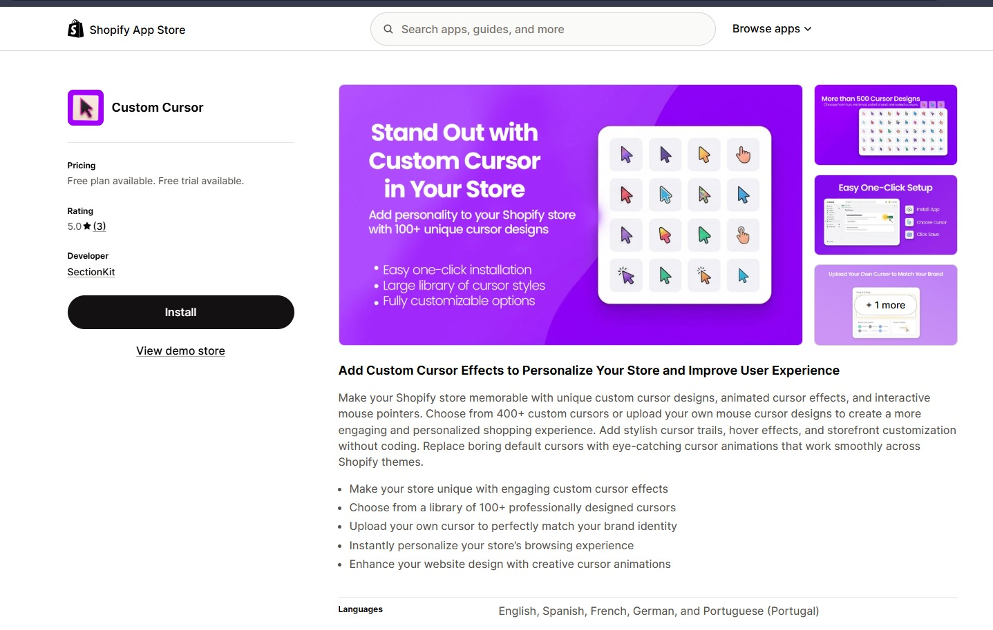
Open the app listing in the Shopify App Store and click Install. Choose the correct store if prompted, review the permissions, and complete the installation.
Before browsing designs, describe your store in three words—for example, calm, refined, and warm. Use those words to narrow your choices instead of selecting an icon only because it stands out.
Step 2: Review Plan Access Before Choosing
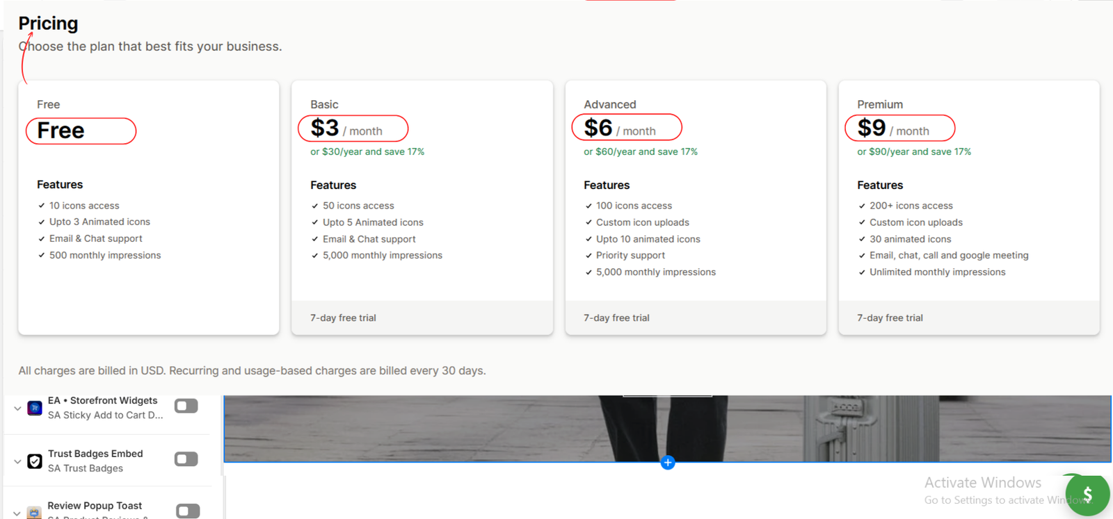
The second image shows Free, Basic, Advanced, and Premium plans. Compare the included designs, animated icon access, and impression allowances with your needs.
Custom icon uploads are listed under Advanced and Premium in this image. You do not need a custom upload simply to try a gallery design available on your plan. Confirm current prices and terms in the app before approving a subscription.
Step 3: Compare Gallery Designs with Your Own Artwork
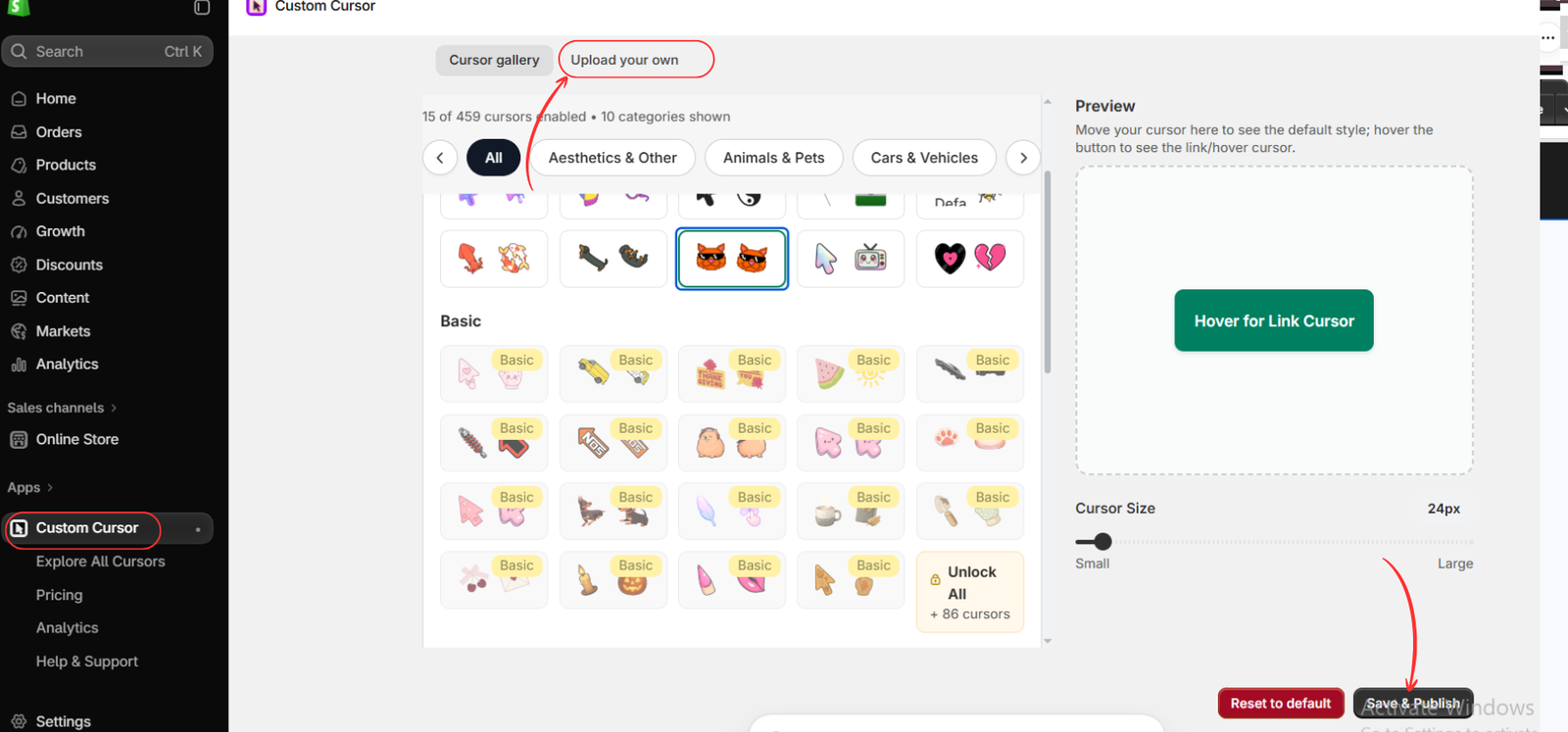
Open Apps → Custom Cursor. The third image shows the gallery categories and highlights Upload your own.
Start by comparing gallery options with your store’s colors and visual tone. If none fits and your plan supports uploads, open Upload your own and follow the displayed requirements to add a simplified brand symbol. The image shows the entry point, not the upload form or a completed upload.
A full logo with small lettering often needs simplification for cursor use. Check that any custom artwork remains recognizable at its actual display size.
Step 4: Preview a More Restrained Option
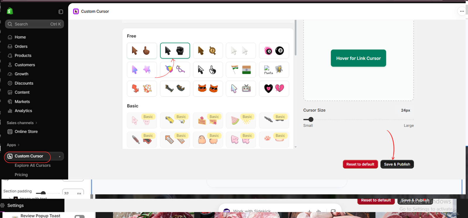
The fourth image highlights a dark pointer paired with a fist-shaped hover design. Use the preview box to inspect the normal pointer, then hover over the preview button to check its link state.
Judge both states. A simple normal pointer may fit your store while its hover partner does not. Adjust Cursor Size to keep the selection visible without obscuring buttons. If you decide to use this option, click Save & Publish.
Step 5: Compare a Playful Alternative and Make Your Selection
The fifth image highlights an orange cat cursor. Compare its personality with the previous option. A character may suit a playful storefront, but the same design may not complement a restrained brand.
Consider color, shape, hover behavior, and size together. The 24px value shown is an example, not a required setting. Select the candidate that best fits your brand and remains comfortable to use, then click Save & Publish.
You are comparing alternatives; you do not need to publish both designs. Your final saved choice should be the one you intend customers to see.
Step 6: Open the Intended Theme
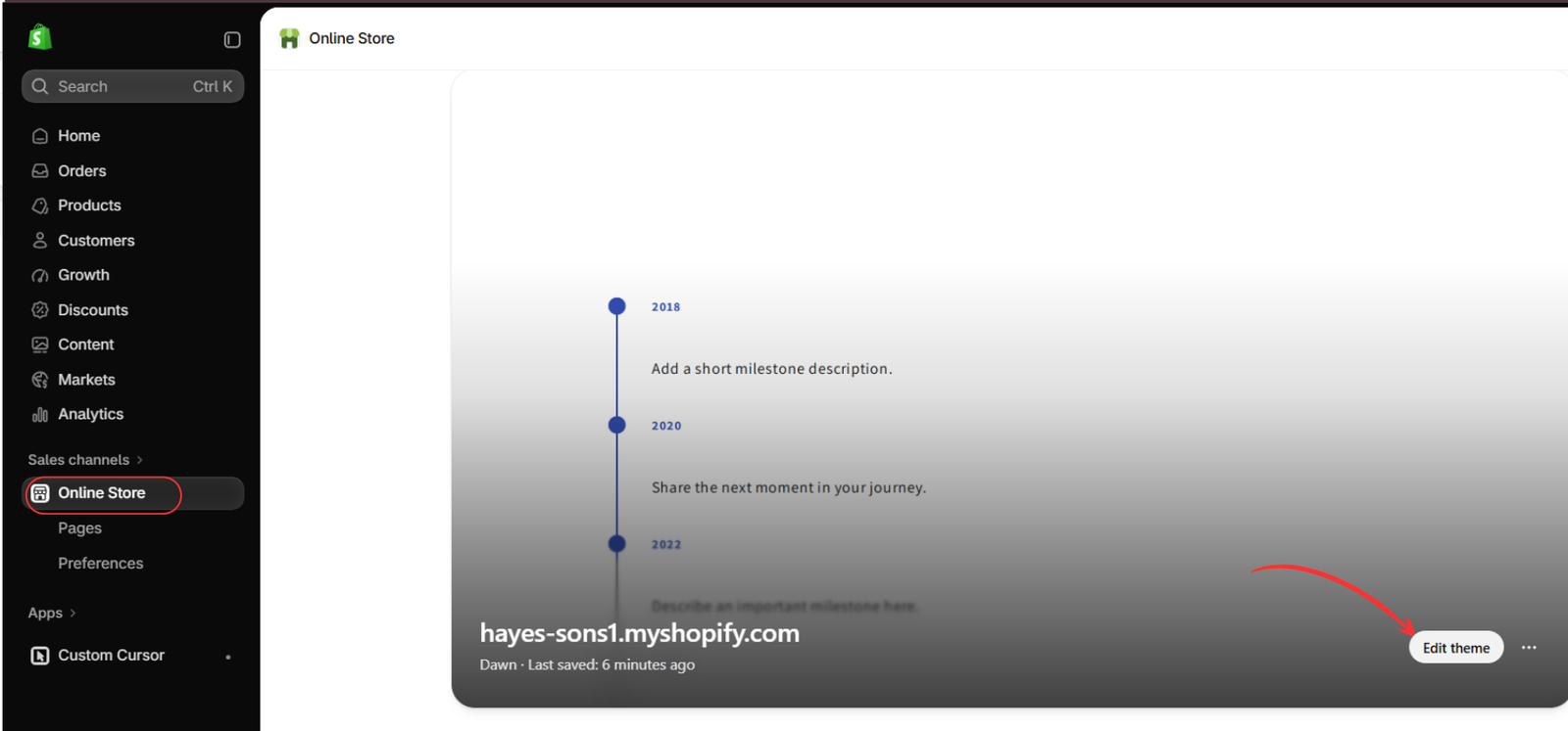
Go to Online Store → Themes and click Edit theme for the theme you want to customize, as shown in the sixth image.
Confirm that you are editing the correct theme. Activating the embed in a draft theme does not enable it in a different live theme.
Step 7: Enable the Custom Cursor App Embed
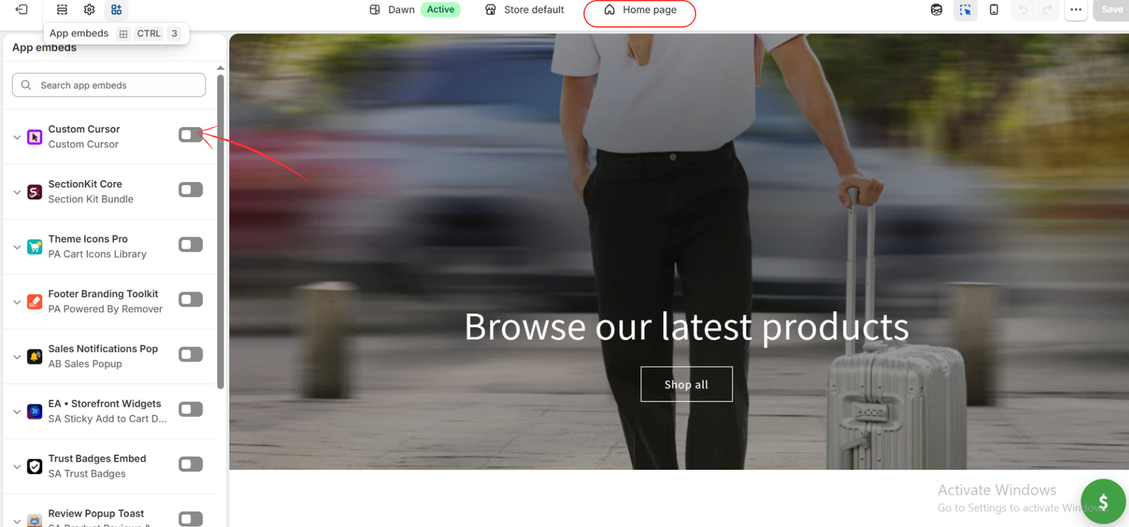
Open App embeds in the theme editor and locate Custom Cursor. The seventh image shows the toggle switched off. Turn it on to activate the app in this theme.
You do not need to add a homepage section to enable the cursor.
Step 8: Save and Evaluate the Result on Your Store
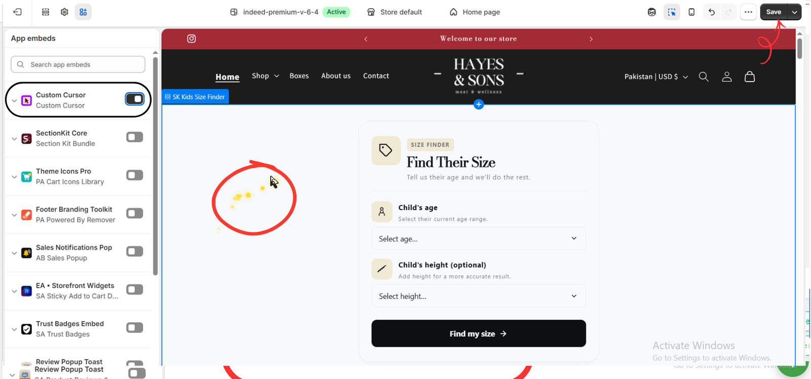
Click Save in the top-right corner. The eighth image shows the embed enabled and a pointer with yellow particles in the preview.
This final example uses a different theme from the earlier images. It illustrates an enabled result; you do not need to switch themes or add a trail. A trail is a separate visual decision from the pointer design.
Open your own storefront in a desktop browser and test the homepage, collections, product pages, menus, and buttons. Check the pointer over light and dark areas. A touchscreen-only phone is not a suitable way to assess a mouse cursor.
A Quick Check Before Keeping Your Choice
- Brand consistency: does the design match your store’s visual tone?
- Visibility: can you see it over images and different background colors?
- Clicking: is its selection point obvious and accurate?
- Hover behavior: does the link state feel consistent with the normal pointer?
- Comfort: can visitors browse and read without distracting motion?
Ask a few people who resemble your intended shoppers to try the store with a mouse. Ask whether the cursor feels natural and whether anything makes navigation harder. Use their feedback alongside your own brand judgment.
If the Cursor Does Not Appear
Confirm that your chosen design is available on your plan, that you clicked Save & Publish in the app, and that the embed is enabled and saved in the correct theme. Refresh the storefront and test again with a mouse or trackpad.
The Final Choice Depends on Your Brand and Your Viewers
There is no single cursor that fits every Shopify store. The final choice belongs to the merchant and should reflect the brand’s identity, the audience’s preferences, and how comfortably viewers can use the storefront.
Choose the design that feels appropriate in your store, not merely the one that attracts the most attention. If a custom cursor adds little value or makes browsing harder, keeping the standard pointer is also a valid choice.
Explore available designs and decide what fits your audience with Custom Cursor on the Shopify App Store.