HOW TO CUSTOMIZE A SHOPIFY BUNDLE WIDGET TO MATCH YOUR THEME
Introduction
Your product page has its own visual identity: colors, typography, buttons, and spacing all work together. A bundle widget should fit that identity while making the offer easy to compare and select. When its styling feels consistent, customers can focus on the products and savings instead of being distracted by an unfamiliar design.
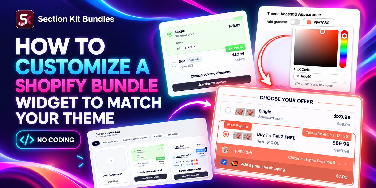
This guide explains how to customize a Shopify bundle widget with Section Kit Bundles. Follow the six supplied images in order to install the app, choose a layout, explore accent colors, and customize an offer in the editor.
The Main Problem: A Bundle Widget That Looks Out of Place
A default widget can introduce a bright accent that your store never uses, oversized badges, or a card layout that feels different from the rest of the page. Even a useful offer can become harder to understand when too many visual elements compete for attention.
Merchants also need to balance brand consistency with usability. If the selected option is barely visible, customers may not know what they are choosing. If every label uses a different color, the offer can look crowded. Manual CSS changes add another maintenance task when the theme or app changes.
Why Use Section Kit Bundles for Customization?
Section Kit Bundles provides a visual workflow for building and styling product offers. The official app listing describes customization of widget colors, fonts, and typography, alongside quantity breaks, BOGO offers, and product bundles. Use the current app settings to style the offer, and check which controls are available for your selected template and plan.
The supplied images show template selection, an accent color picker, and a Templates & Design panel. These are the controls this tutorial follows. Other typography settings may appear elsewhere in the editor; their exact location is not shown in this image sequence.
Why Matching Your Theme Matters
Consistent styling helps the offer feel like part of the product page. Reusing your store’s accent color creates a familiar selected state, and a clear layout makes quantity options and prices easier to compare. Good visual integration can support a smoother shopping experience, although a design change alone does not guarantee more sales.
The goal is to make the widget recognizable and readable. Preserve visible selection controls, accurate pricing, and a clear purchase action while reducing unnecessary decoration.
Before You Start: Identify Your Theme’s Design Settings
Open a product page and note the main button color, text color, background, font family, and corner style. Use the theme’s configured color values when available so you can enter the same values in the bundle editor.
| Design element | What to match |
|---|---|
| Accent color | Your primary button or brand highlight color |
| Typography | The theme’s font family, weight, and readable sizing where supported |
| Card corners | The rounded or square style used on existing cards and buttons |
| Layout | The width and density of your product information area |
| Labels and badges | Short wording and a consistent visual hierarchy |
Step 1: Install Section Kit Bundles
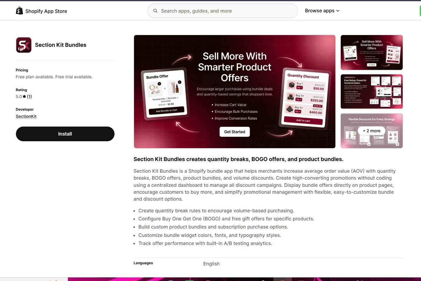
Visit Section Kit Bundles in the Shopify App Store and click Install. Select your store, review the requested access, and complete the installation. If it is already installed, open it from your Shopify admin.
Step 2: Open the Dashboard and Start a Bundle
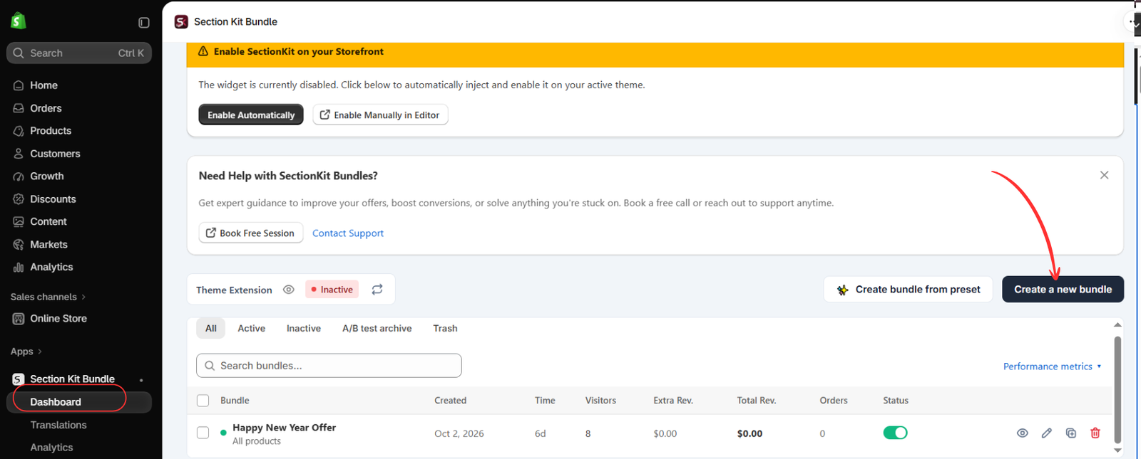
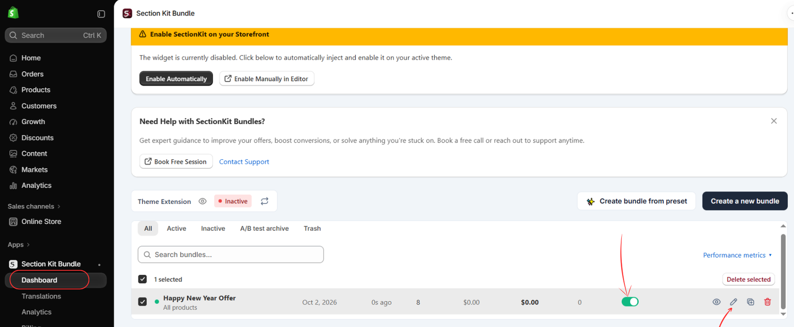
Go to Apps → Section Kit Bundle → Dashboard. Click Create a new bundle to begin. If you already have an offer you want to restyle, you can edit that offer instead of creating a duplicate.
Image 2 also shows the theme extension as Inactive. Styling an offer does not automatically confirm its storefront integration is enabled. Check the integration before testing the finished widget on your store.
Step 3: Choose a Layout That Fits Your Product Page
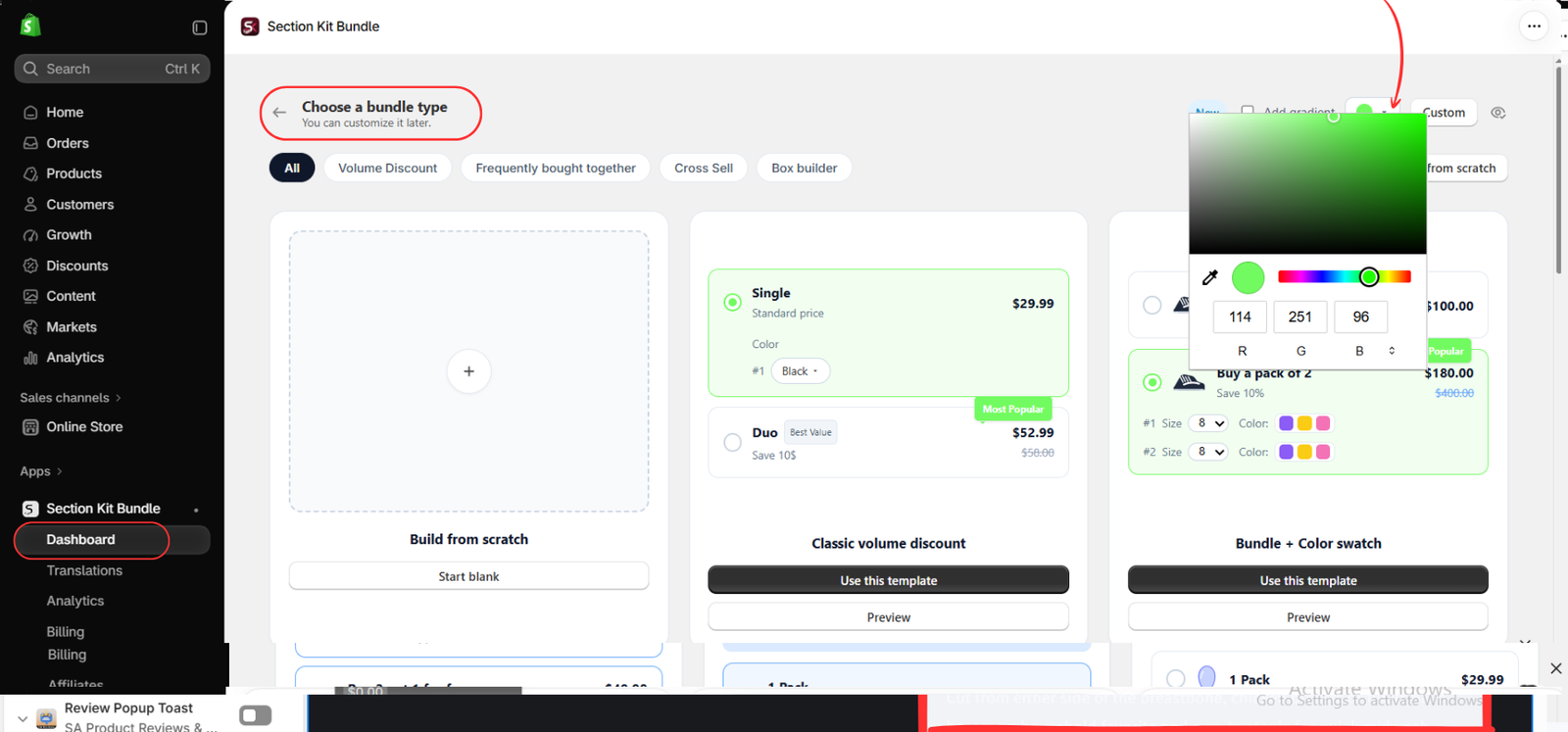
On the Choose a bundle type page, compare the available templates. Image 3 highlights Classic volume discount and its Use this template button. The adjacent Bundle + Color swatch template shows another presentation for products with color choices.
Before committing to a template, use Preview to inspect its structure. Choose a layout that fits your product page and the offer you are actually running. For a straightforward quantity offer, the classic volume discount layout is a practical starting point.
Image 4 shows this same template-selection area with its color picker open. To follow that view, inspect the accent color before entering the template editor; if you already selected a template, make the final color changes in the editor described in Step 6.
Step 4: Explore the Accent Color in the Template Preview
In the template-selection view, click the color swatch near the top-right controls. Image 4 shows the color picker open, with RGB fields and a hue selector. Adjust the color and observe how the template previews change.
The visible example uses RGB 114, 251, 96, a bright green accent. That is a demonstration color, not a recommendation for every store. Enter your own brand color using the supported fields. Prefer a shade that remains clearly visible against the widget background.
Keep gradients optional. A solid accent usually fits a theme that uses flat buttons and simple cards. Only add a gradient when it suits your existing design. After exploring the preview, use your chosen template and confirm the final accent in its offer editor.
Step 5: Open Your Saved Offer for Further Styling
When the offer has been created and saved, return to the dashboard and find its row. Click the pencil icon to reopen the editor. Image 5 highlights the edit icon and the offer’s status switch.
The row shown is an existing example named “Happy New Year Offer.” Your offer may have a different name. The status switch controls whether the offer is active; review the design and pricing before enabling it for customers. The supplied images do not show every intervening offer setup field, so complete any required product and discount settings in the app.
Step 6: Refine the Widget in Templates & Design and Publish
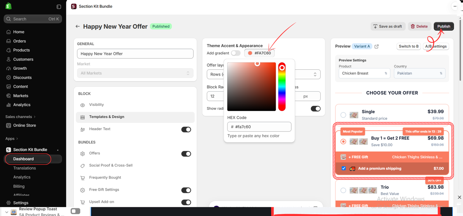
Inside the offer editor, select Templates & Design. Image 6 shows the Theme Accent & Appearance panel alongside a live product preview. Click the accent swatch and enter your desired color in the HEX Code field.
The image uses #FA7C60, a coral accent. You can see that color reflected in the offer borders, selected controls, badges, and gift strip in the preview. Replace it with your theme’s accent value, then inspect each affected element for readability.
Review the available Offer layout and Block Radius controls. Match the card shape to your theme, and use the radio-control option if it helps customers recognize the selected offer. The panel shows an Add gradient toggle; leave it off if your theme uses solid fills.
Use the preview’s product and country settings to inspect a relevant product and market. The image also shows a Header Text control in the left panel. Review the heading wording and any available typography controls so the offer feels consistent with nearby product information. Keep optional features enabled only when they are part of your promotion.
When the result is ready, click Publish in the top-right corner. If you need to continue later, use Save as draft. The preview includes example BOGO, free-gift, and shipping elements; you do not need to copy those features to customize a simple bundle widget.
Enable the Storefront Integration and Verify the Result
Return to the dashboard and check the theme extension status. If it remains inactive, use the app’s Enable Automatically or Enable Manually in Editor option shown in Image 2. Follow the integration prompts for the intended theme and save any theme-editor changes.
Open an eligible product on the storefront. Compare the bundle widget with the page’s buttons, headings, and cards. Confirm that the selected state is visible and that all labels remain readable on desktop and mobile. A color that looks good in a large editor preview may need adjustment on a narrow phone screen.
Test every offer option, any variant selector, and the purchase action. Verify the products, quantities, discount, and checkout total. Styling should preserve the offer’s behavior and make the choices easier to understand.
Common Styling Mistakes to Avoid
Too many accents: Use one main brand accent instead of assigning unrelated colors to every badge. Weak contrast: Keep text readable on selected cards and colored strips. Oversized labels: Use concise wording that fits smaller screens. Unclear selection: Retain a visible border, radio control, or another clear selected state.
Do not use a “Most Popular” label unless it reflects actual popularity, and only show a countdown for a genuine time-limited promotion. Remove optional elements that do not belong to the offer rather than allowing them to crowd the design.
Conclusion
To customize a Shopify bundle widget successfully, start with your theme’s existing design settings. Choose an appropriate layout, apply your brand accent, refine the card shape and typography where supported, and preview the result before publishing.
Explore Section Kit Bundles to build a widget that feels consistent with your Shopify theme and makes your bundle choices clear to customers.
Feature reference: official Section Kit Bundles Shopify App Store listing. Steps follow the supplied images; interface labels and available settings may change.