HOW TO CUSTOMIZE TRUST BADGE COLORS AND LAYOUTS IN SHOPIFY
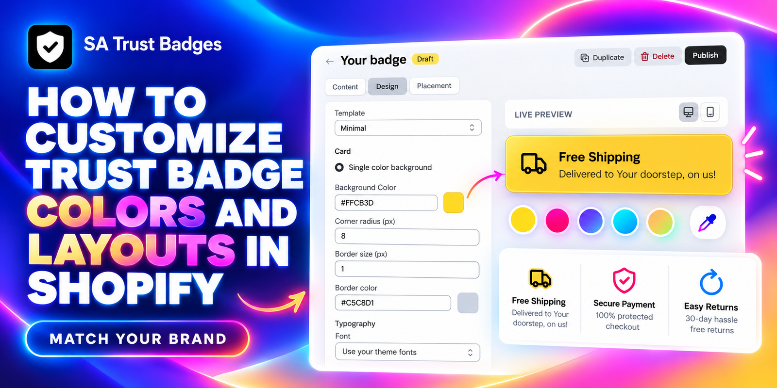
Trust badges should feel like part of your store. A shipping banner or payment icon row can communicate useful information, but mismatched colors, oversized icons, or awkward spacing can make the product page look inconsistent. The goal is to highlight reassurance while keeping the buying experience clear.
This guide shows how to customize trust badge colors and layouts in Shopify with SA Trust Badges. Follow the five images in order to choose a badge format, adjust its design, publish it, and check the result in your theme.
The problem: badges that do not fit your theme
A default badge may use a background that clashes with your store, text that is too faint, or corners that differ from your buttons and cards. A large block can also compete with the Add to Cart button instead of supporting it.
Merchants need a way to adapt the badge without repeatedly editing theme code. Consistent fonts, readable colors, and a suitable layout help the message look intentional and make it easier to scan.
Why use SA Trust Badges?
SA Trust Badges supports trust badges, guarantee banners, and payment icons. Its official listing describes customizable layouts, colors, icon sizes, and borders, with integration through Shopify Theme App Embeds. The supplied Design image shows additional controls for the template, background, corner radius, border, and typography.
You can manage the badge presentation inside the app and review it in the live preview. Check the current plan and usage limits before selecting features for your store.
Choose a design that supports the message
Start with the colors and typography already used in your theme. Use a brand accent sparingly, keep the text easy to read, and choose a format that suits the amount of information you need to display. A bright badge should still leave the purchase button easy to identify.
Only include shipping, return, payment, or guarantee messages that match your policies. A polished design helps present the information; it does not create a new store promise or guarantee higher sales.
Step 1: Install SA Trust Badges
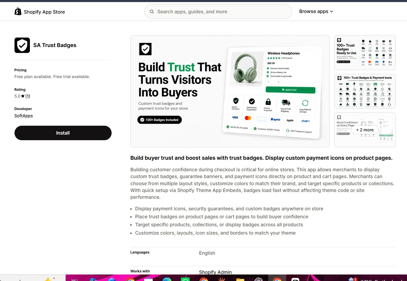
Open SA Trust Badges on the Shopify App Store and click Install. Select your store if prompted, review the installation details, and complete setup. Then open the app from your Shopify admin.
Step 2: Choose the badge layout and content
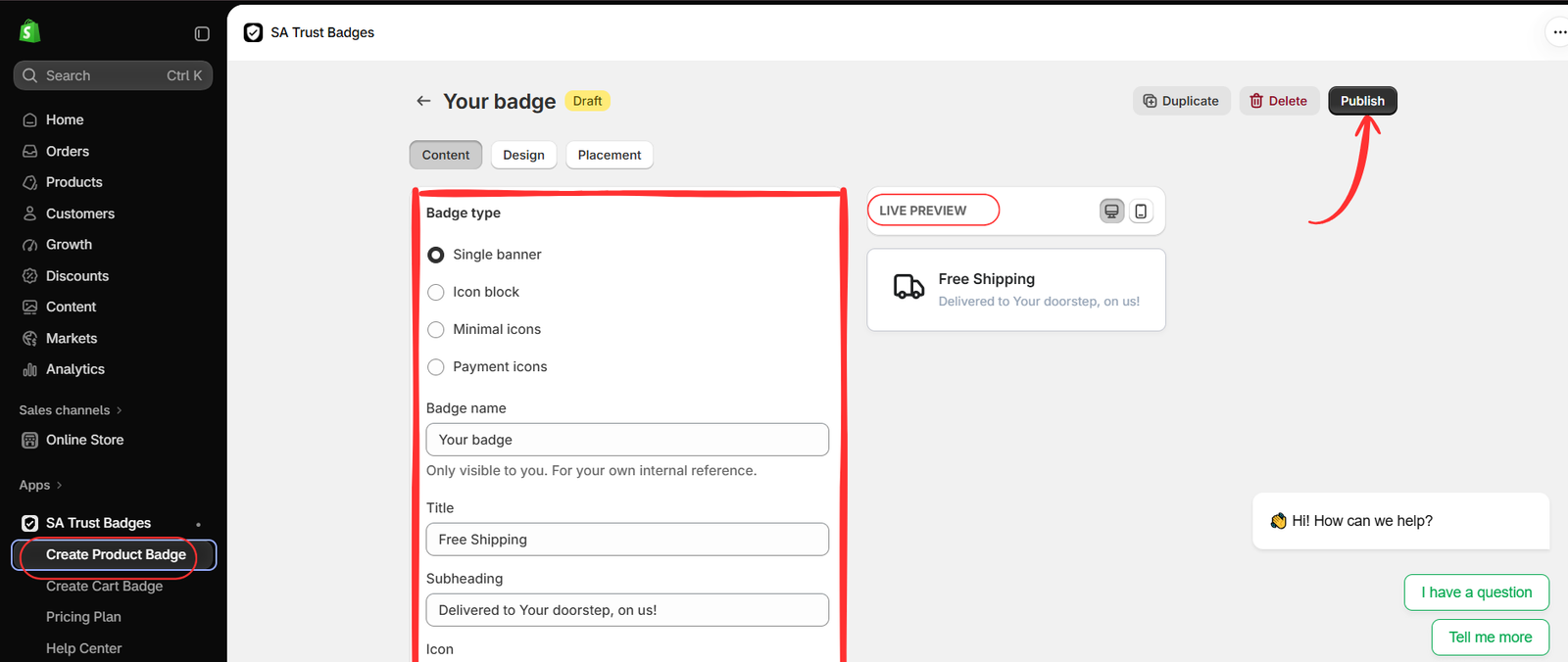
Select Create Product Badge to follow the example. If you are updating an existing badge, open its editor instead. In Content, choose the appropriate Badge type.
- Single banner: highlight one message with an icon, title, and supporting line.
- Icon block: group several short trust messages.
- Minimal icons: choose a compact icon-focused presentation and inspect its preview.
- Payment icons: show relevant payment methods that your store accepts.
The second image uses Single banner for Free Shipping. Enter a descriptive internal Badge name, then configure the customer-facing title, subheading, and icon. Keep the wording short and accurate. Review placement before publishing, even though the Publish button is already visible.
Step 3: Customize colors, card styling, and fonts
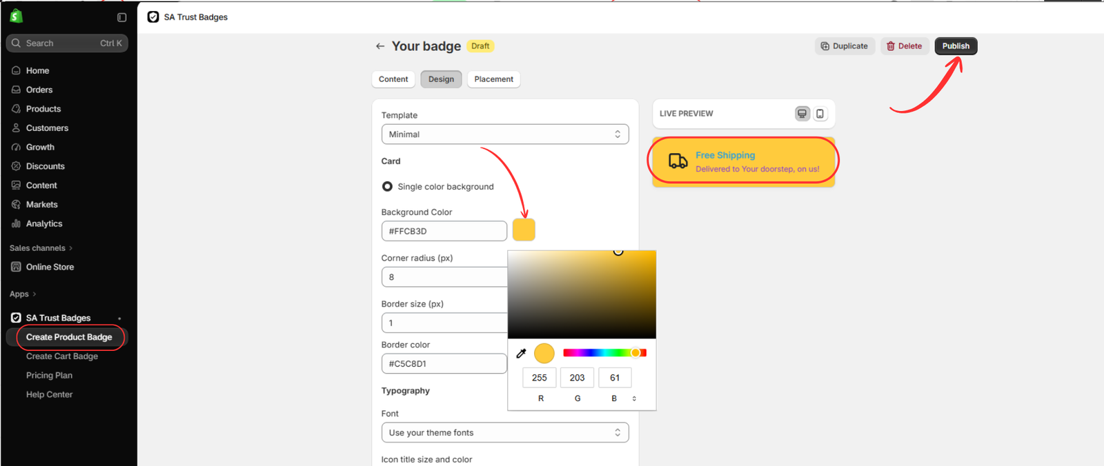
Open Design. The third image shows the Minimal template and Single color background selected. Use the Template dropdown to review the available styles, then choose the one that fits your theme. The badge type controls the content format; the template and card controls refine its appearance.
Click the Background Color swatch to open the color picker, or enter the desired hexadecimal value in the field. To reproduce the yellow background in the image, use #FFCB3D. The visible picker also shows RGB values 255, 203, and 61 for that color.
| Control | Value shown in the image | Purpose |
|---|---|---|
| Template | Minimal | Choose the available visual style. |
| Background Color | #FFCB3D | Set the card background. |
| Corner radius | 8 px | Adjust corner rounding. |
| Border size | 1 px | Set border thickness. |
| Border color | #C5C8D1 | Choose the border color. |
| Font | Use your theme fonts | Keep typography consistent with the theme. |
These values reproduce the example, but you can adapt them to your brand. Match the corner radius to nearby cards or buttons, and use a subtle border when a heavy outline would distract from the message.
In Typography, select Use your theme fonts if you want the badge to follow your store’s type style. Review the title-size and color controls visible further down the panel, together with any supporting-text settings available for your selected format. Choose readable text colors rather than copying a low-contrast combination simply because it appears in the example.
Use the desktop and mobile preview controls while making changes. Confirm that the title and subheading remain clear, then review Placement and click Publish when the badge is ready.
Step 4: Open the theme editor
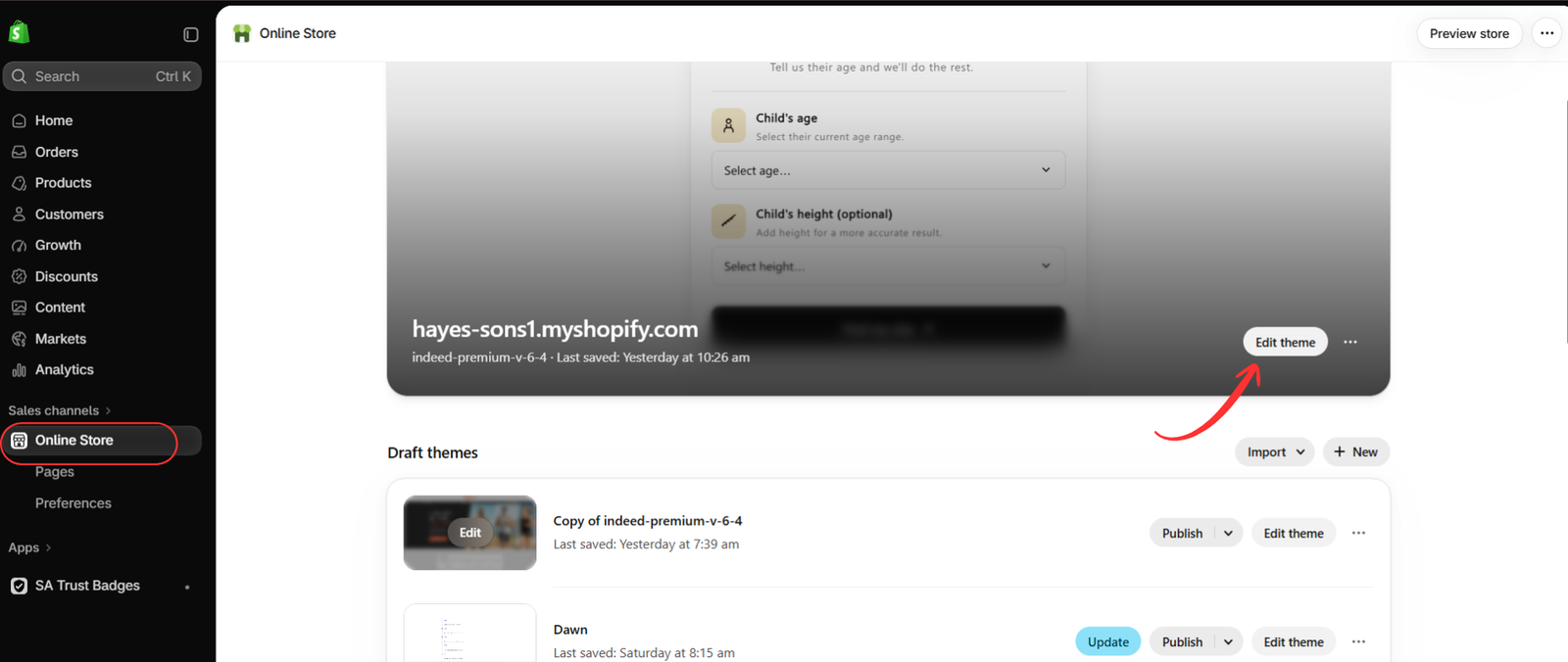
Go to Online Store → Themes. Find the intended theme and click Edit theme, as shown in the fourth image. Your admin may label this action Customize.
If you configure a draft theme, review its preview before expecting the changes on your live store. The badge must be published in the app and its integration enabled in the theme you are viewing.
Step 5: Enable the embed and check your customized badge
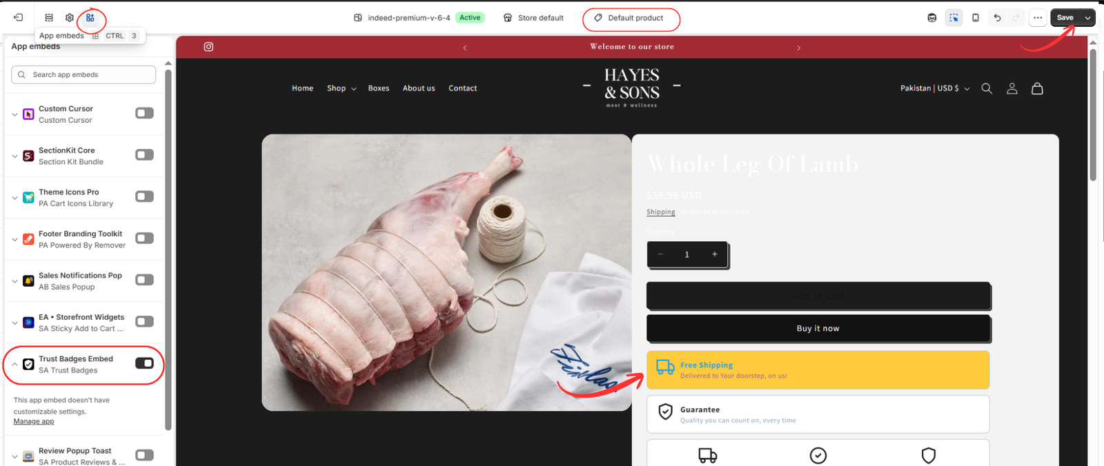
Open App embeds in the theme editor. Locate Trust Badges Embed under SA Trust Badges, turn it on, and click Save. Open a relevant product template to inspect the finished design.
The fifth image shows the yellow Free Shipping banner beneath the purchase buttons. Compare its colors, typography, width, and corner shape with the surrounding theme. Check mobile layout as well as desktop, and save any theme changes.
The embed panel states that it does not have customizable settings. Use the app’s Design tab to adjust badge styling; the embed control enables the integration. The Manage app link can help you return to the app.
Check readability and spacing
Open a relevant product on your storefront after saving. Confirm that both the title and supporting text are easy to read, the icon is recognizable, and the badge does not overlap purchase controls. Shorten long text if it wraps awkwardly on a phone.
If the design is missing or appears unchanged, check the badge’s published status, the embed in the correct theme, and the placement settings. If several badges overlap, review existing configurations before adding another one.
Keep the design consistent
Use one clear visual style across related badges. Match your theme fonts, keep border treatments consistent, and limit strong accent colors to messages that deserve attention. A single well-designed banner can be more useful than several competing blocks.
To begin, install SA Trust Badges, choose the right layout, adjust Design, publish, and enable the theme embed. Finish by checking the result on real storefront pages.
Feature reference: SA Trust Badges official listing. Design values and interface labels follow the supplied images.