Case Study
Dierych
WEBSITE Redesigned
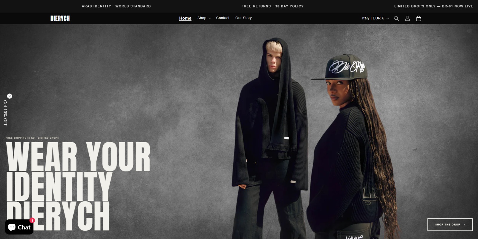
Redesigned a single-video homepage into a full luxury storefront with sections, trust badges, and reviews to boost conversions now.
0.13%
STARTING CONVERSION RATE
8
NEW HOMEPAGE SECTIONS ADDED
100%
MOBILE OPTIMIZED
09
What I Did
01
Redesigned the homepage with brand text, tagline, and clear call-to-action buttons.
02
Built new sections: collections grid, featured products, brand story, and lookbook.
03
Added trust badges and reviews below the Add to Cart button on product pages.
04
Restructured confusing navigation into a clean collections dropdown menu.
05
Added lifestyle and on-model photography guidance for every product page.
06
Fixed the sold-out product issue and improved the mobile shopping experience.
Client Situation
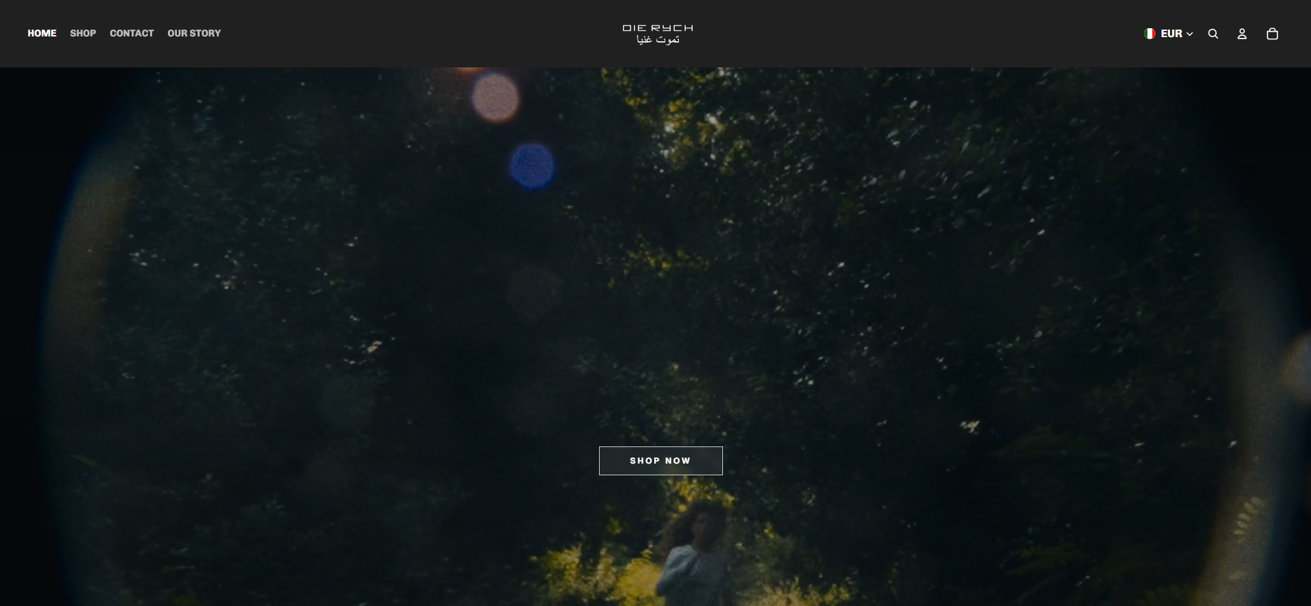
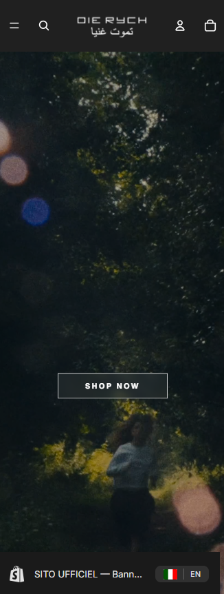
Dierych had a single-video homepage with no sections, no brand story, and no trust signals. Visitors were dropping off right after landing, with only a 0.13% conversion rate.
Results & Impact
8
NEW SECTIONS
Optimized performance by removing heavy apps and improving structure.
↑ TRUST
BUYER CONFIDENCE
Added trust badges and reviews to build first-time buyer confidence.
↑ NAV
CLEAR NAVIGATION
Restructured confusing menu into a clean collections dropdown.
↑ UX
MOBILE EXPERIENCE
Fully responsive homepage sections improved mobile browsing.
Before & After
Before
Desktop View
Mobile View
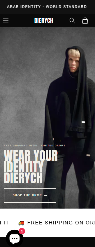
After
Desktop View
Mobile View