HOW TO FIX MOBILE LAYOUT PROBLEMS ON A SHOPIFY THEME WITH AI

Introduction
A mobile-friendly Shopify store is essential for delivering a smooth shopping experience. Customers often browse products, explore collections, and make purchases directly from their smartphones.
However, even a professionally designed Shopify theme can develop mobile layout problems after installing apps, customizing sections, or changing theme code.
You might notice product images extending beyond the screen, text overlapping buttons, uneven product grids, or sections that look perfect on desktop but appear broken on mobile.
These problems can make your store difficult to navigate and may discourage customers from completing purchases.
Traditionally, resolving such issues required manually editing Liquid, CSS, and JavaScript files or hiring a Shopify developer.
Fortunately, AI-powered theme editing tools can help identify and fix mobile layout problems without requiring merchants to manually write code.
In this tutorial, you’ll learn how to fix mobile layout problems on a Shopify theme with AI using AI Theme Code Editor.
We’ll explain how to connect your theme, describe the mobile layout issue, review AI-generated changes, and preview your storefront before applying updates.
The Merchant’s Challenge: Common Shopify Mobile Layout Problems
Mobile layout issues can affect different parts of a Shopify storefront.
1. Product images overflowing the screen
Large images or incorrect CSS sizing can cause product images to extend beyond the mobile viewport.
This may introduce horizontal scrolling or interfere with nearby content.
2. Broken product grids
Collection pages sometimes display uneven product cards, inconsistent spacing, or incorrect column widths on smaller screens.
For example, a collection may be designed to show two products per row but display cards that are too narrow or overlap.
3. Overlapping text and buttons
Headings, product descriptions, and call-to-action buttons can overlap when fixed dimensions or incorrect positioning rules are used.
This is particularly common with custom banners and promotional sections.
4. Incorrect mobile spacing
Excessive padding, margins, or gaps can make a mobile storefront look unbalanced.
Some sections may have too much empty space, while others appear cramped.
5. Broken mobile navigation
Navigation menus, dropdowns, and interactive elements may stop working correctly after theme customizations.
6. Desktop-only CSS customizations
CSS changes designed for desktop screens may unintentionally affect mobile layouts when appropriate responsive breakpoints are missing.
These problems make mobile optimization an important part of maintaining a Shopify store.
Why Fixing Mobile Layout Problems Matters
A responsive Shopify storefront helps customers browse products comfortably across different devices.
When your mobile layout is broken, shoppers may have difficulty reading information, selecting variants, opening menus, or accessing the Add to Cart button.
Fixing these problems can improve usability, make your storefront appear more professional, and help customers navigate your products with fewer interruptions.
Mobile-friendly layouts also support accessibility and can contribute to a better overall page experience.
The Role of AI in Fixing Shopify Mobile Layout Issues
AI-powered code editors can simplify parts of the troubleshooting process.
Instead of manually searching through theme files to identify conflicting CSS or incorrect responsive settings, merchants can describe the problem in plain English.
The AI assistant can inspect relevant theme code, identify potential causes, and propose changes to improve the mobile layout.
For example, you can ask AI to correct product grid alignment, adjust image widths, fix mobile spacing, or investigate overlapping elements.
AI can also help examine CSS media queries, Liquid section structures, and related JavaScript behavior.
However, proposed changes still need to be reviewed and tested on real mobile screen sizes.
Introducing AI Theme Code Editor by SectionKit
AI Theme Code Editor is a Shopify app that allows merchants to customize and troubleshoot their Shopify themes using natural-language instructions.
Instead of manually writing every Liquid, CSS, or JavaScript modification, merchants can explain the desired result to the AI assistant.
The application includes a theme file explorer, integrated code editor, AI assistant, sandbox workflow, and Live Preview functionality.
Key Features
- AI-powered theme editing: Describe layout issues or customization requests in plain English.
- Mobile layout troubleshooting: Ask AI to investigate responsive design problems.
- CSS and Liquid assistance: Review and modify relevant Shopify theme files.
- Theme file explorer: Access sections, snippets, assets, templates, and layouts.
- Sandbox editing: Review and save changes before applying them.
- Live Preview: Inspect proposed storefront changes.
- Custom section creation: Request new sections and storefront features.
App Link: Install AI Theme Code Editor on Shopify
Step-by-Step Guide: How to Fix Shopify Mobile Layout Problems With AI
Follow these eight steps using the original AI Theme Code Editor screenshots you previously shared.
The screenshots demonstrate the app’s installation and theme-editing workflow. The code examples show collection-page troubleshooting rather than a verified mobile-specific before-and-after repair.
Step 1: Open the Shopify App Store
First, open your browser and search Google for Shopify App Store.
Click the official Shopify App Store result.
You can also visit https://apps.shopify.com directly.
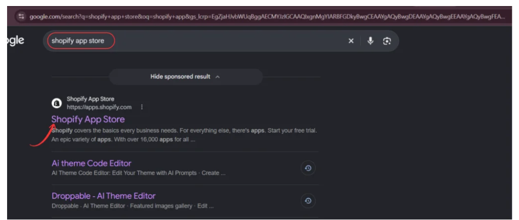
Image 1: Search Google for the official Shopify App Store.
The Shopify App Store provides applications that help merchants customize storefronts, manage operations, and improve shopping experiences.
Step 2: Search for AI Theme Code Editor
Once you open the Shopify App Store, locate the search bar.
Type AI Theme Code Editor.
Find the application named AI theme Code Editor, identified by its code-editor icon.
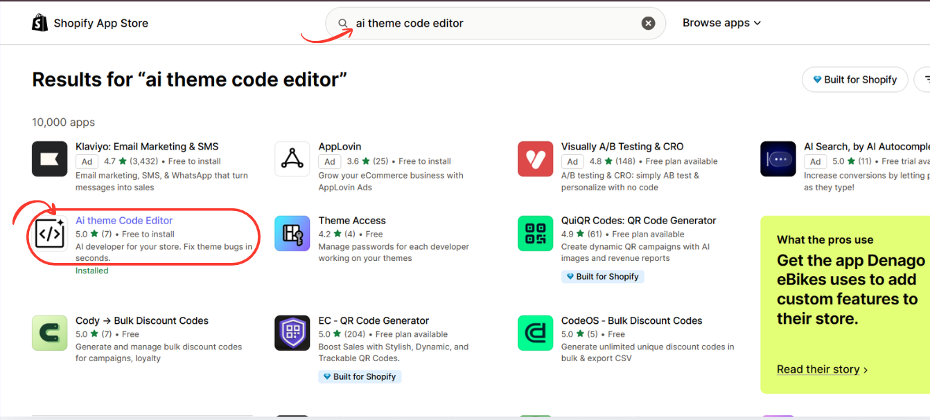
Image 2: Search for AI Theme Code Editor and select the application from the results.
Click the app listing to open its installation page.
Step 3: Install AI Theme Code Editor
On the app listing, review the available features and installation information.
Click Install and follow Shopify’s authorization process.
If the application is already installed, you may see Open instead.

Image 3: Open the AI Theme Code Editor listing and install the application.
After installation, you can access the app directly from your Shopify admin.
Step 4: Connect Your Shopify Theme
Open AI Theme Code Editor from your Shopify admin dashboard.
Navigate to Connected Themes in the app sidebar.
The Connected Themes page allows you to select which Shopify theme you want to work on.
Click Connect theme if your desired theme is not already connected.
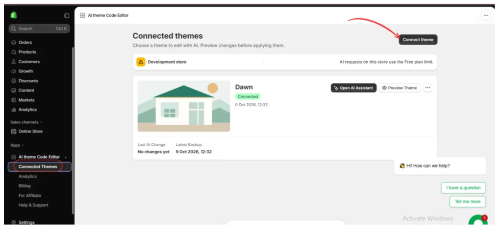
Image 4: Open Connected Themes and connect the Shopify theme you want to optimize for mobile devices.
In the example screenshot, the Dawn theme is already connected.
Before editing, verify that you have selected the correct theme.
Consider making a duplicate of your Shopify theme so that your original version remains available if a change causes unexpected behavior.
Step 5: Open the AI Assistant
After connecting your Shopify theme, locate it in the Connected Themes dashboard.
Click Open AI Assistant.
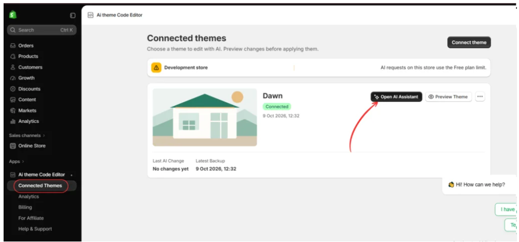
Image 5: Click Open AI Assistant to begin troubleshooting your Shopify theme.
The AI editing workspace will open.
You will see the theme file explorer on the left, the code editor in the center, and the AI Assistant panel on the right.
Step 6: Tell AI to Fix Your Mobile Layout
Inside the AI Theme Code Editor workspace, locate the AI Assistant chat box.
Describe the mobile layout issue you want to fix.
For example, if your Shopify collection page looks broken on smartphones, ask the AI to identify and correct the relevant responsive styling problems.
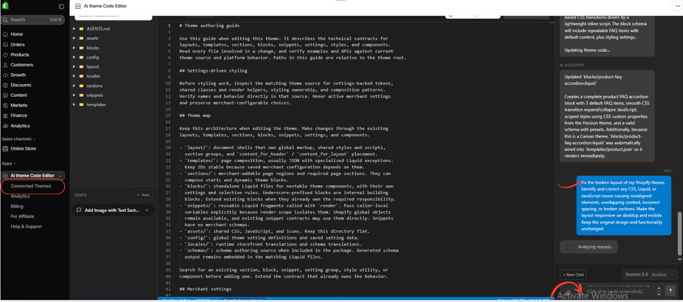
Image 6: Use the AI Assistant to describe the layout problem and request targeted theme code changes.
Exact AI Prompt to Fix Shopify Mobile Layout Problems
Copy and use this prompt Copy
Fix the mobile layout problems in my Shopify theme. Inspect the relevant Liquid, CSS, and JavaScript files. Correct overlapping elements, overflowing images, broken product grids, incorrect spacing, text alignment, and horizontal scrolling on mobile devices. Ensure the layout works properly on common mobile screen sizes. Keep the desktop layout, original design, and existing functionality unchanged. Make only necessary changes and explain the fixes before applying them.
This prompt identifies common mobile layout problems while telling the assistant to preserve the existing desktop design.
If only one page is affected, such as your collection or product page, mention that specific page for more focused troubleshooting.
Step 7: Review the AI-Generated Responsive Layout Changes
After submitting the prompt, AI Theme Code Editor analyzes the request and identifies relevant files.
In the provided example, the assistant works with:
sections/main-collection.liquid
This file contains code related to the collection page structure.
The screenshot shows modifications involving product grid layout, spacing, card alignment, and CSS styling.
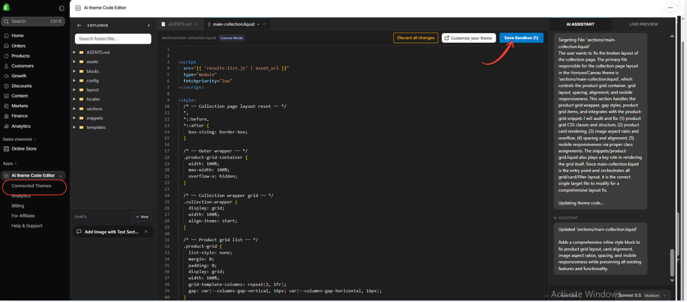
Image 7: Review AI-generated theme code changes and use Save Sandbox to save the proposed modifications.
For a mobile layout issue, relevant changes may involve responsive media queries, grid columns, image sizing, or overflow behavior.
Before saving, review the proposed code and check that the changes match your original request.
Avoid approving unnecessary modifications to unrelated theme files.
When you are satisfied with the changes, click Save Sandbox.
This saves the proposed changes within the app’s sandbox workflow.
Step 8: Preview and Test Your Shopify Mobile Layout
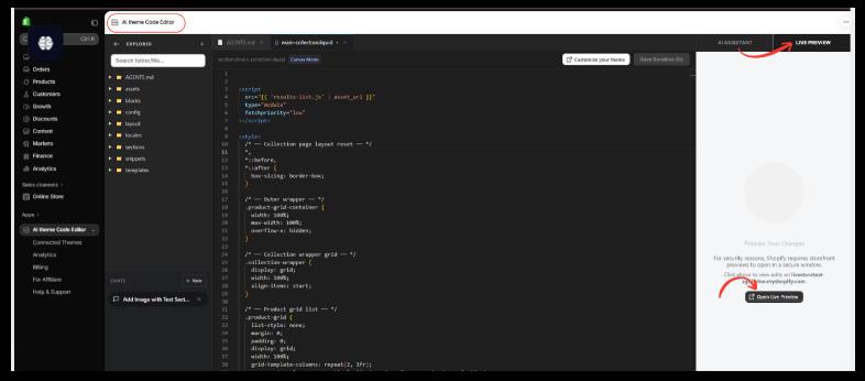
After saving the changes, open the Live Preview tab.
Click Open Live Preview to inspect the storefront.
AI Theme Code Editor Live Preview optionImage 8: Open Live Preview to inspect the updated Shopify storefront and test the mobile layout.
Check how the affected page looks on mobile devices.
Pay attention to product image widths, grid alignment, text readability, button placement, horizontal scrolling, and spacing.
Test common smartphone widths, including approximately 320px, 375px, 390px, and 430px, along with any device sizes relevant to your customers.
Also check the desktop layout to ensure the changes did not introduce new problems.
Important: The screenshot shows how to open Live Preview; it does not itself prove that the mobile layout has been fixed.
Once you have verified the results, follow the app’s available review and approval workflow before applying the changes to your live storefront.
Common Shopify Mobile Problems You Can Ask AI to Investigate
Product grid misalignment
AI can inspect grid column definitions, card widths, and mobile breakpoints to help resolve uneven product layouts.
Images extending beyond screen width
AI can examine image containers, width settings, max-width, and overflow behavior.
Broken Add to Cart button positioning
AI can help investigate positioning and spacing problems that make purchasing controls difficult to access.
Mobile menu display issues
Problems with dropdowns, navigation drawers, or menu alignment may require reviewing CSS and JavaScript together.
Excessive space between sections
Incorrect margins and padding can produce large gaps on smaller screens.
Text overlapping product images
AI can inspect text positioning, typography settings, and responsive rules that may be responsible.
Best Practices for Mobile Shopify Theme Optimization
Preserve your desktop design
Ask AI to make targeted mobile changes rather than rebuilding the entire theme.
Use responsive sizing
Layouts should adapt to available screen width instead of relying on large fixed dimensions.
Keep product images consistent
Appropriate image proportions and container sizing can help maintain an organized product grid.
Test different smartphones
A layout that works on one device may still have problems on smaller or larger screens.
Keep buttons accessible
Make sure essential controls are visible, readable, and easy to tap.
Test after every major change
Review the storefront after applying new apps, sections, or theme modifications.
Frequently Asked Questions (FAQs)
1. How do I fix mobile layout problems in Shopify without coding?
You can use AI Theme Code Editor to connect your theme, describe the mobile layout problem, review proposed code changes, and test the results through the preview workflow.
2. Can AI fix broken Shopify mobile layouts?
AI can help identify and correct many layout problems involving responsive CSS, Liquid structures, or JavaScript. However, results depend on the underlying issue and should be tested.
3. Can AI fix Shopify collection pages on mobile?
Yes. You can ask the assistant to investigate product grid widths, image sizing, card spacing, and responsive layout settings.
4. Will fixing my mobile layout affect the desktop design?
It can if changes are too broad. Ask AI to preserve desktop styling, review the generated code, and test both mobile and desktop layouts.
5. Can AI fix horizontal scrolling on Shopify?
AI can help identify elements that exceed the mobile viewport and propose changes. The underlying cause should be corrected rather than simply hiding all overflow.
6. Does AI Theme Code Editor support Dawn?
Your screenshots demonstrate the Dawn theme connected to AI Theme Code Editor.
7. Can I preview mobile changes before publishing?
The app includes sandbox and Live Preview functionality. You can use Shopify’s available preview and device testing tools to inspect the result before applying changes to a published theme.
8. Is AI Theme Code Editor free?
The provided Shopify App Store screenshots show the app as free to install. Paid plans and usage-based charges may apply, so check the current listing.
9. Do I need a Shopify developer?
Some responsive design problems can be addressed through AI-assisted editing. Complex integrations or critical functionality may still require developer review.
10. What if AI does not fix the mobile issue correctly?
Provide more specific details about the affected page, screen size, and observed problem. Review the next proposed fix in a sandbox or backup theme before applying it.
Conclusion
Mobile layout problems can affect the usability and professional appearance of a Shopify store.
Issues such as overflowing images, misaligned product grids, overlapping content, and broken navigation can make shopping frustrating for customers.
With AI Theme Code Editor by SectionKit, merchants can describe these problems in plain English and use AI to help investigate and modify their Shopify theme code.
The app’s theme explorer, AI Assistant, sandbox controls, and Live Preview functionality provide a practical workflow for reviewing changes before they reach a live storefront.
If you want to improve your Shopify store’s mobile experience without manually writing every line of code, AI Theme Code Editor is a useful tool to explore.
Get started with AI-powered Shopify theme customization:Install AI Theme Code Editor on Shopify