How to Add a Product Slider to a Shopify Store
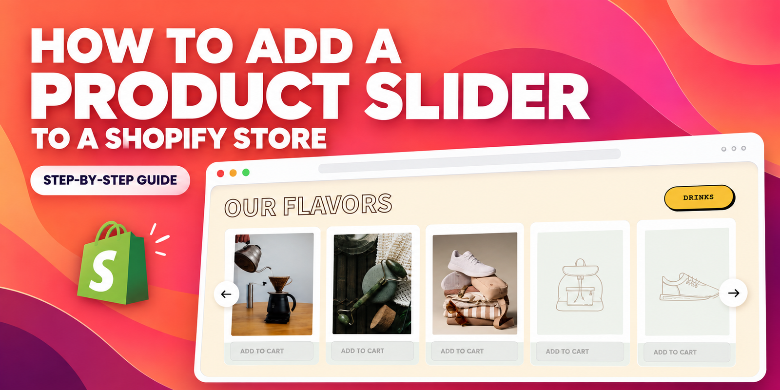
A product slider displays a selection of products in a horizontal row that visitors can browse using navigation arrows or supported swipe controls. It is a practical way to introduce bestsellers, new arrivals, or a focused product range without filling your homepage with a long product grid.
For Shopify merchants, the goal is straightforward: make products easier to discover while keeping the storefront organized. This guide explains how to add a product slider using Section Kit: Theme Sections, following the supplied images in their original order. The example uses SK Featured Collections Slider #1 on the homepage.
The Common Challenge: Your Theme Does Not Offer the Slider You Need
A theme may include a featured collection, but its layout or navigation options may not match the experience you want. Some merchants need a more distinctive product presentation, while others want to display several items in a compact area instead of extending the page with additional rows.
Building a custom slider can mean editing Liquid, CSS, and JavaScript, then checking how the section behaves across screen sizes. Hiring a developer adds another step to a relatively small storefront improvement. Changing the entire theme can also be unnecessary when the main requirement is one additional section.
The challenge is finding a slider that fits your existing design, remains manageable in the theme editor, and connects customers to the correct products.
Why Use Section Kit for a Product Slider?
Section Kit offers premade Shopify sections, including sliders, that can be customized inside the Shopify Theme Editor. This gives merchants a way to add a new layout and adjust it alongside their existing theme sections.
The app is free to install and offers both free sections and premium sections with one-time charges. Review the selected section’s price before adding it. In the provided image, SK Featured Collections Slider #1 is marked Free.
For this workflow, the main benefit is the familiar editing process: find a section, add it to your section library, open the theme editor, and customize the layout and content without manually building the slider code.
Why a Product Slider Matters
A thoughtfully placed slider gives visitors another route into your catalog. You can use it to introduce a new range, highlight seasonal products, or make a small selection of bestsellers visible near the top of the homepage.
- Organized product discovery: present a focused selection without adding a large grid.
- Clearer merchandising: group products around a purpose, such as new arrivals or customer favorites.
- Flexible page design: place the section where it supports the surrounding content.
- A shorter path to products: use accurate product links and purchase controls where supported.
A slider can support browsing, but it does not guarantee more sales. Its usefulness depends on the products you select, the clarity of the cards, and how well it works on desktop and mobile.
How to Add a Product Slider: Step-by-Step
Before starting, have your product images and product details ready. Make sure the products you intend to feature are available on the Online Store sales channel. If you want to prepare the design before it becomes visible to customers, work on an unpublished copy of your theme.
Step 1: Install Section Kit: Theme Sections
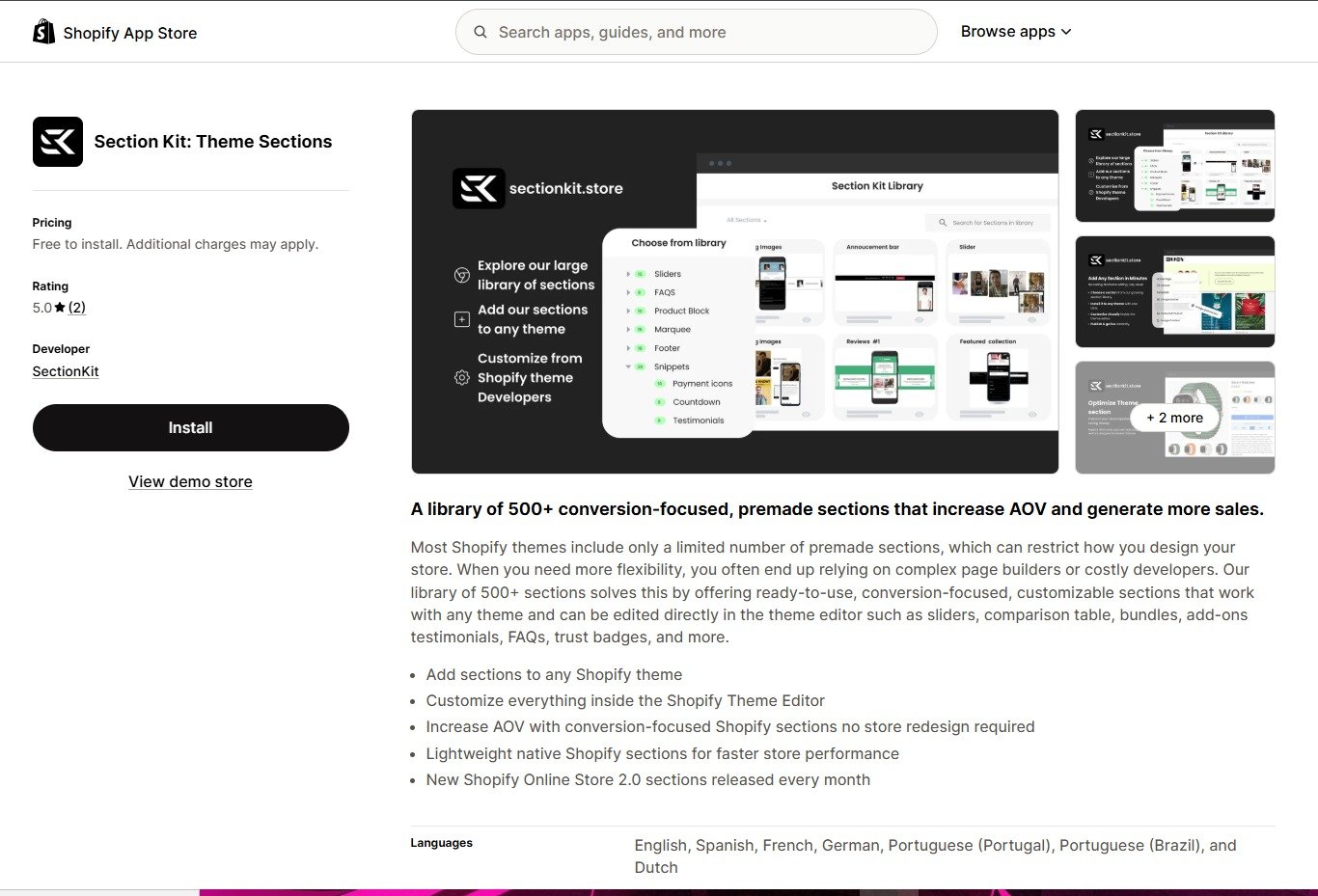
Open the Shopify App Store listing for Section Kit: Theme Sections. Click Install, choose your store if prompted, and follow Shopify’s installation instructions. Review the requested access before completing installation.
After installation, open Section Kit from your Shopify admin. Image 1 shows the app listing and the Install button.
Step 2: Open Explore Sections and Search for a Slider
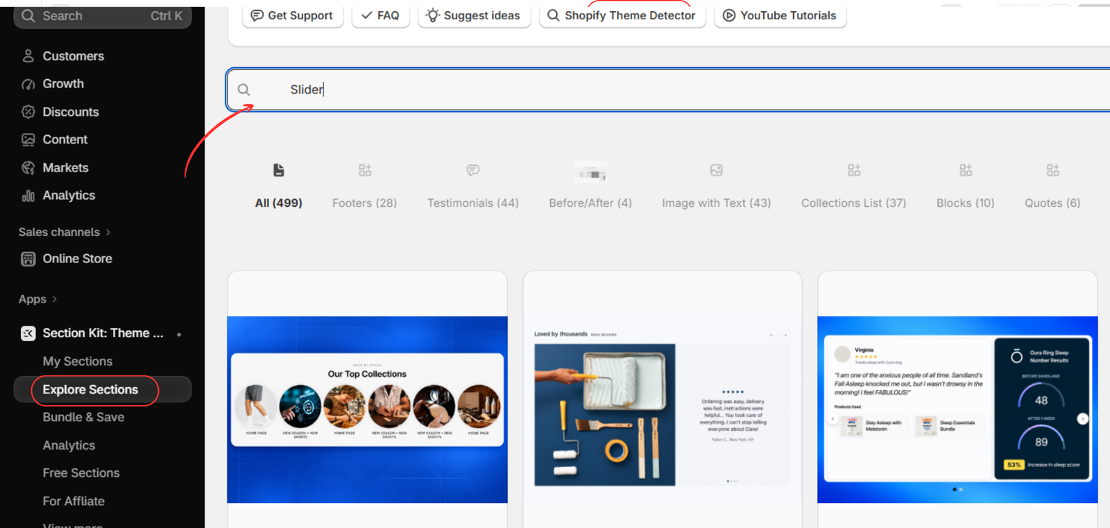
Inside Section Kit, select Explore Sections from the app menu. Enter Slider in the library search field to find relevant designs.
Browse the available results and choose a layout that suits the products you want to feature. Consider the card style, the space available on your homepage, and whether the design fits your brand. Image 2 highlights the Explore Sections menu and search field.
Step 3: Add SK Featured Collections Slider #1 to My Sections
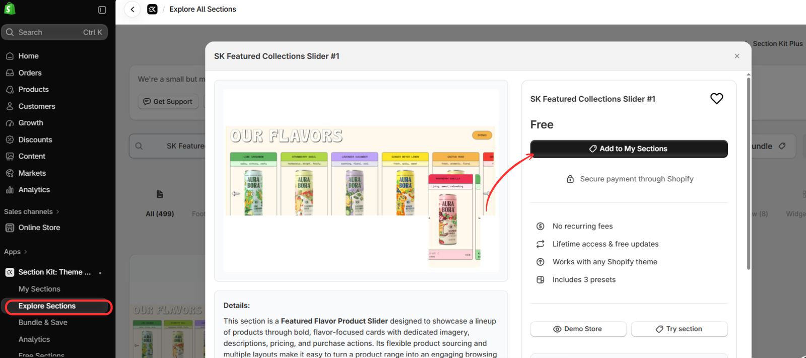
Open SK Featured Collections Slider #1 to view its preview and section details. Although its name refers to featured collections, the example layout presents a lineup of product cards.
Review the design and displayed price, then click Add to My Sections. The supplied image shows this section as free and highlights the button used to add it to your library. If you select a different section, check its own price and settings before proceeding.
Step 4: Open My Sections and Click Customize
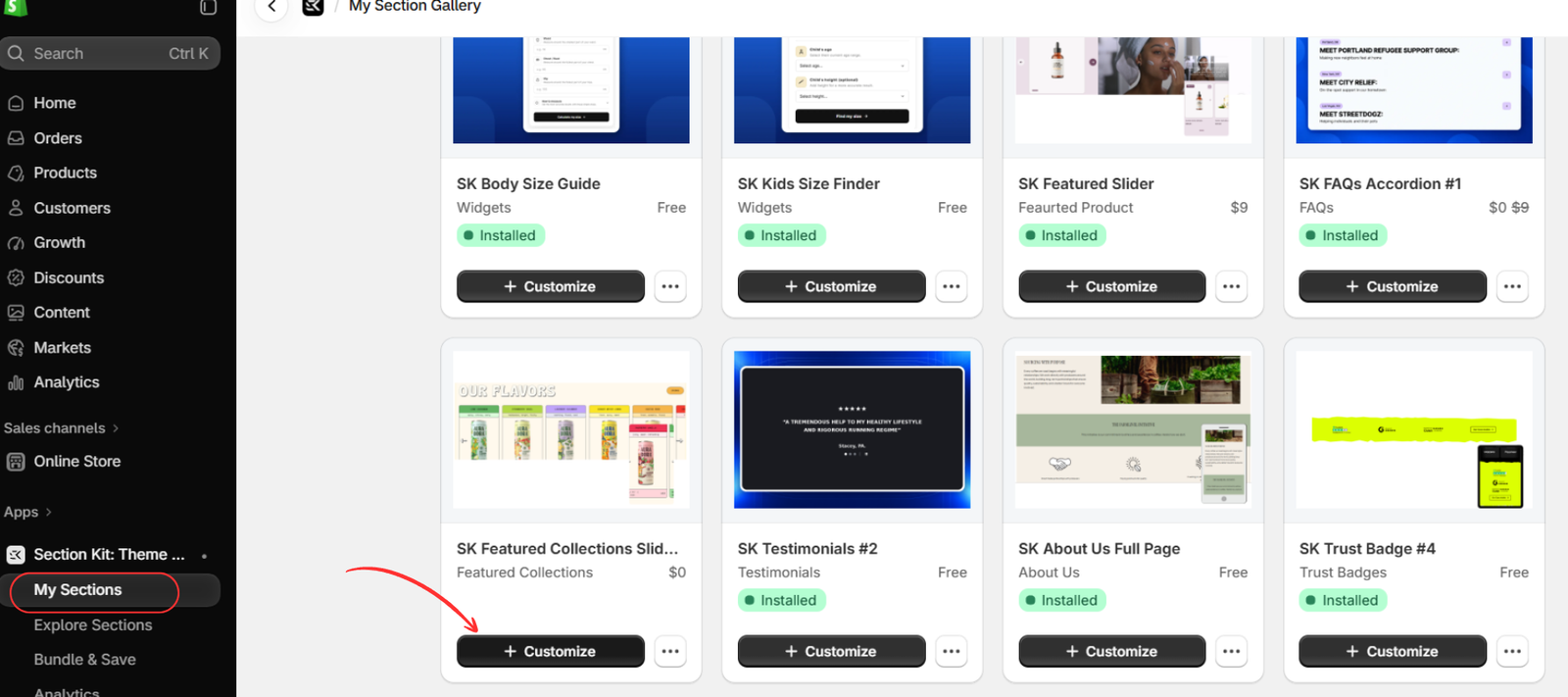
Select My Sections in the Section Kit app menu. Locate the slider you just added and click its Customize button.
This is the next step toward configuring the section in your theme. If the app asks you to select a theme or complete an installation step, follow the prompts for your intended theme. Image 4 shows the slider card and its Customize button in the section gallery.
Step 5: Add the Slider to Your Homepage
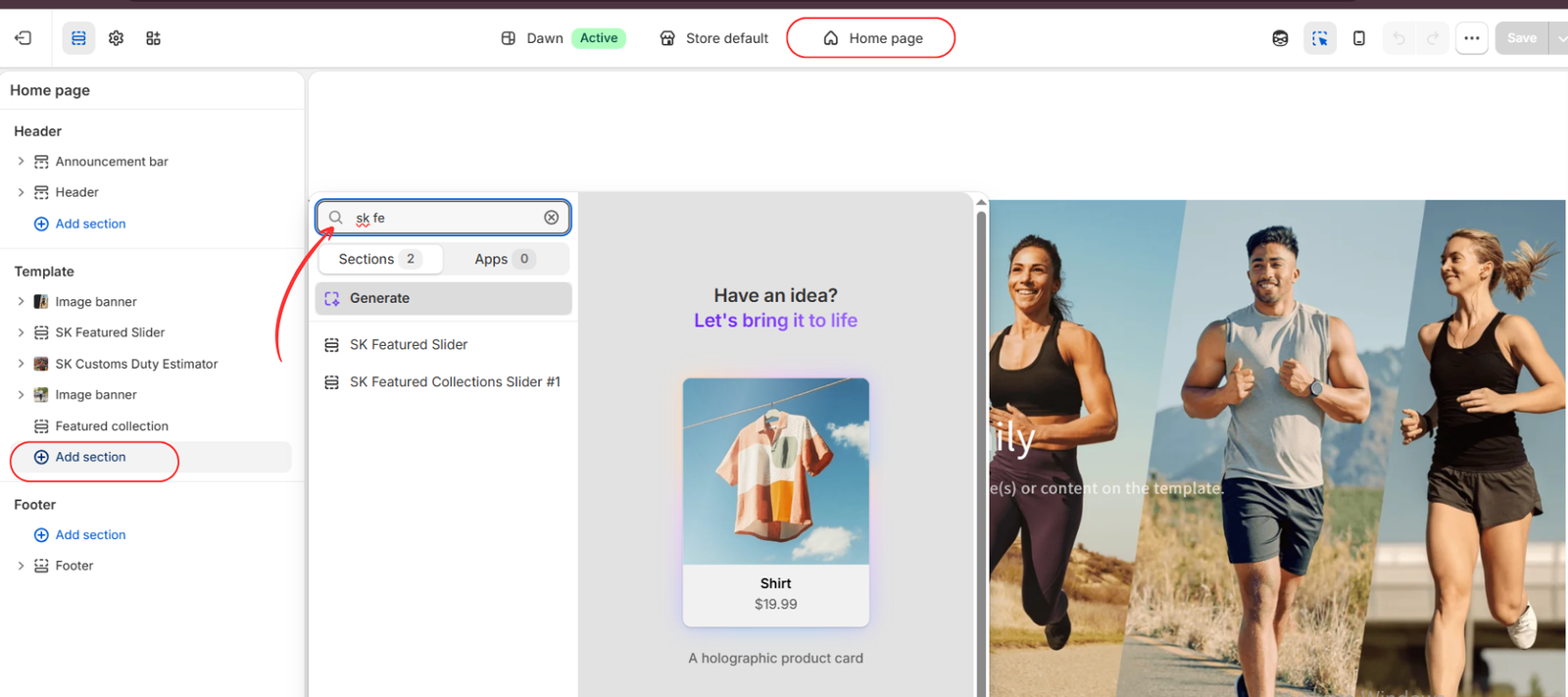
In the Shopify Theme Editor, confirm that Home page is selected at the top. Under the Template area in the left panel, click Add section.
Search for the section name or type SK Featured to narrow the results. Select SK Featured Collections Slider #1 to add it to the homepage. The image shows two similarly named sections, so choose the exact section used in this guide.
Move the section to a suitable position in the page. For example, a new-arrivals slider may work below the main banner, while a secondary product selection may sit farther down the homepage.
Step 6: Customize the Slider Layout and Heading
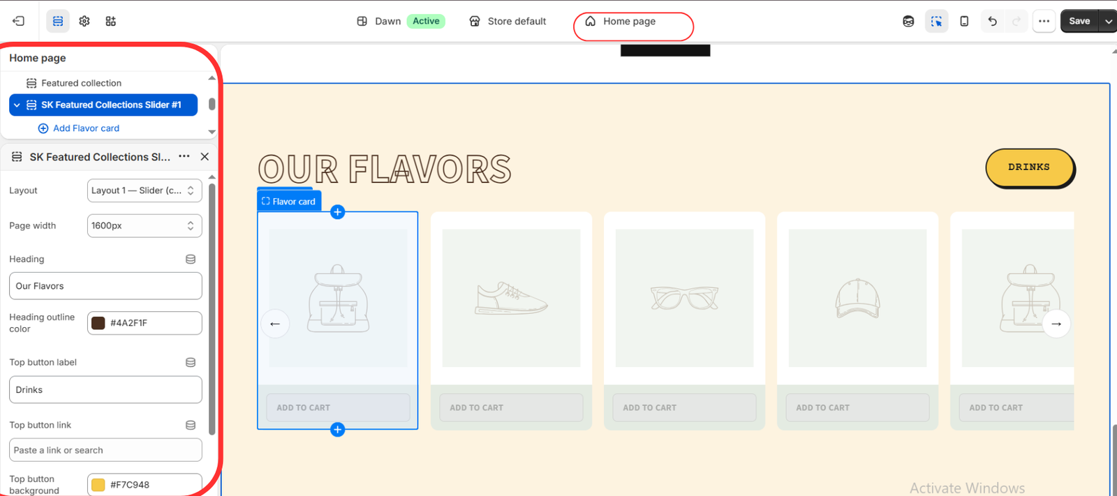
Select the added slider in the left panel to open its settings. Image 6 shows controls for Layout, Page width, Heading, Heading outline color, Top button label, Top button link, and Top button background.
Choose your preferred slider layout and adjust the width to suit your theme. Replace the sample heading, Our Flavors, with wording relevant to your catalog, such as Shop Our Bestsellers or Explore New Arrivals.
Update the top button label and destination to match the selection. For example, link a “Shop All” button to the relevant collection. Choose colors that remain readable against the background and fit your storefront.
The preview currently contains placeholder product cards. Styling the section is only part of the setup; complete the card content next.
Step 7: Configure the Product Cards, Check the Slider, and Save
Expand the slider’s blocks and open each Flavor card. Use Add Flavor card when you need an additional card. Despite the block’s name, the example shows that its visual content can be adapted to different product categories.
Configure each card using the product selection and content controls available in the block. Select the intended product wherever a product picker is provided, and update any editable images, text, or links. Make sure the displayed content corresponds to the correct item.
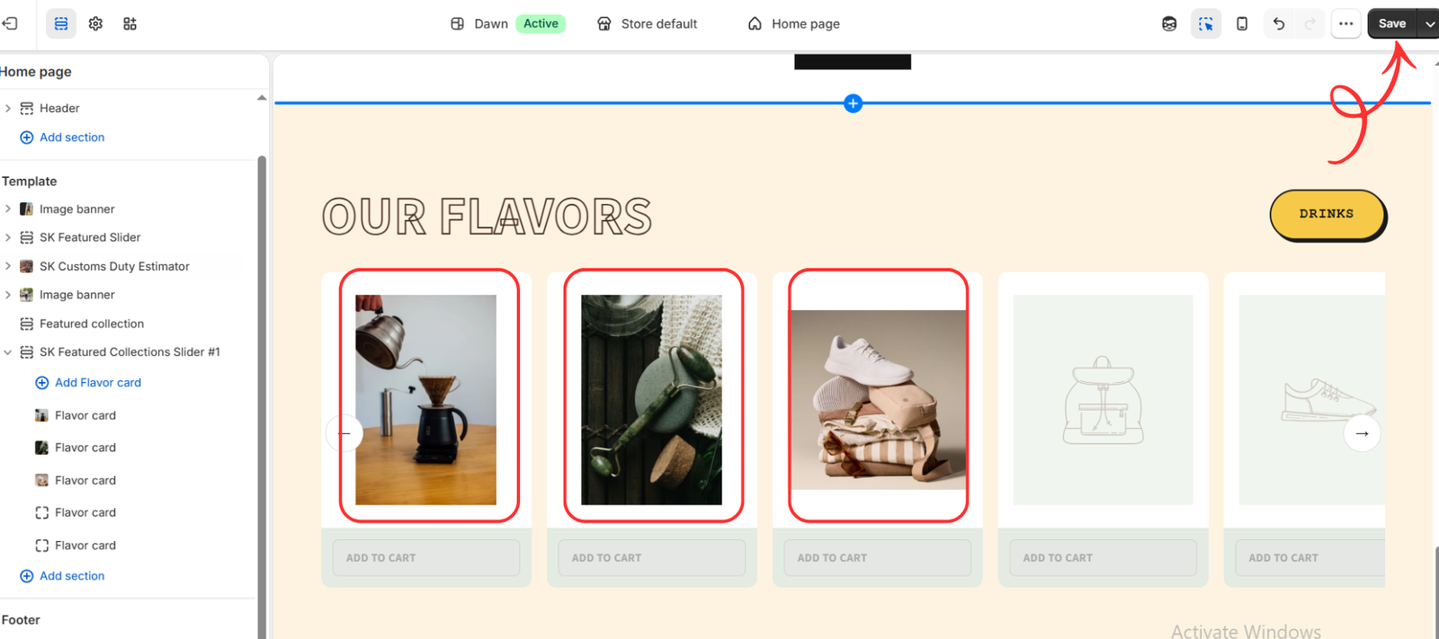
Image 7 shows three cards with images added, while two cards still contain placeholders. The Add to Cart buttons also appear disabled, so this image represents a setup in progress. Adding an image alone does not confirm that a card is ready to sell. Finish configuring all cards, remove unused placeholders, and verify that the intended products and purchase actions work.
Before saving the finished section, check the following:
- Every card displays the correct image and product information.
- Product links open the intended product pages.
- Navigation arrows and any supported mobile swipe controls work.
- Text, images, and buttons fit comfortably on smaller screens.
- Any Add to Cart action adds the correct purchasable item.
- The heading and top button match your selected products.
Click Save in the top-right corner, then preview the storefront to confirm the result. Saving changes to an active theme can make them visible to customers; changes saved to an unpublished theme remain in that theme until it is published.
Final Thoughts
Adding a product slider to a Shopify store is a focused way to improve how customers explore a selected product range. With Section Kit, you can add a premade section and manage its design through the Shopify Theme Editor.
Start with a clear merchandising purpose, choose relevant products, and complete every card before making the slider visible. A well-configured section should feel like a natural part of your storefront and make browsing easier for customers.
Ready to add a product slider to your Shopify store? Explore Section Kit: Theme Sections on the Shopify App Store.