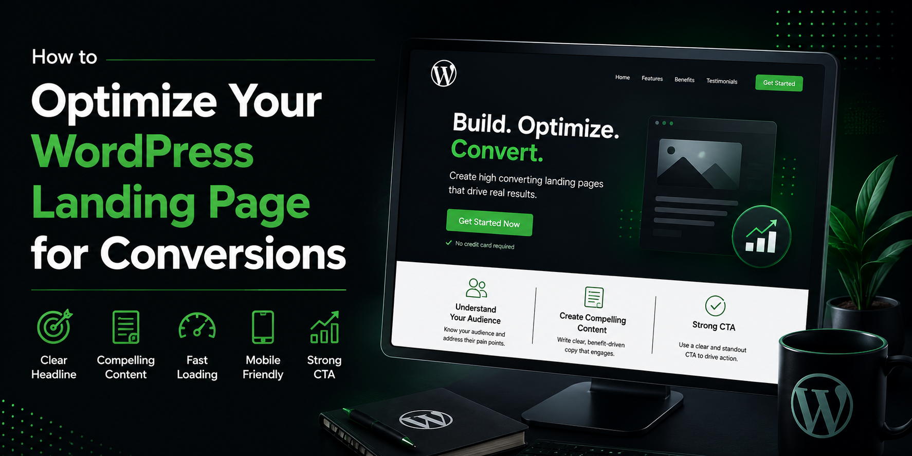
How to Optimize Your WordPress Landing Page for Conversions
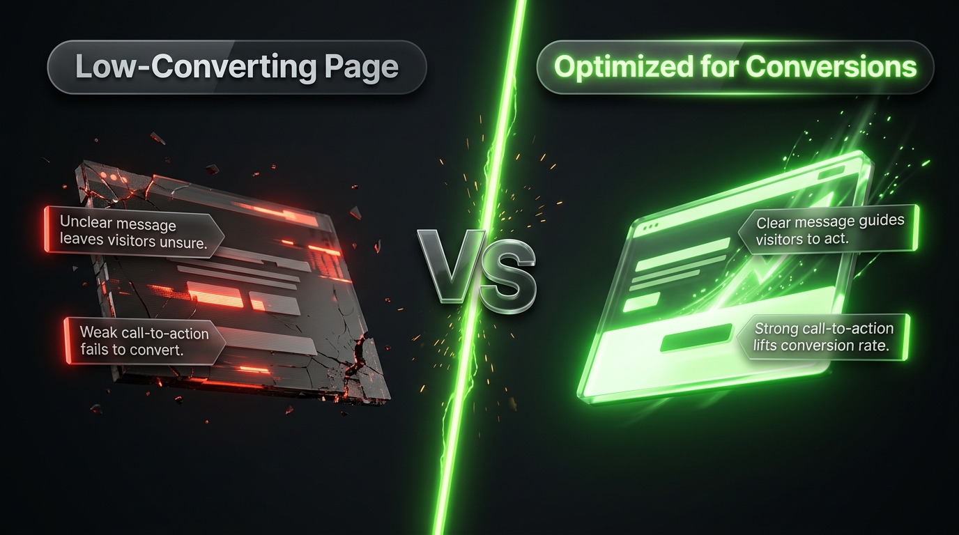
Building a landing page is only the first half of the job. The second half, the part that actually determines whether your page makes money or just sits there quietly, is optimization. A page can look beautiful and still convert poorly if the message is unclear, the load time is slow, or the call to action gets buried.
The good news is that conversion optimization is not guesswork. There is a well tested set of principles that apply to almost every landing page, regardless of your industry or your offer. In this guide we will walk through exactly what to check and improve, from your headline all the way down to your page speed, so you can turn more of your visitors into subscribers, leads, or customers.
Why Conversion Optimization Matters More Than Traffic
It is tempting to assume the answer to a low performing page is simply more visitors. In reality, sending more traffic to a page that already converts poorly just wastes ad spend and effort faster.
Consider two scenarios. A page that converts at 1 percent needs 1,000 visitors to generate 10 conversions. A page that converts at 5 percent only needs 200 visitors to hit that same number. Improving your conversion rate is almost always cheaper and more sustainable than chasing endless new traffic, which is exactly why optimization deserves as much attention as promotion.
Start With a Single, Clear Goal
Every high converting landing page is built around one specific action. Before touching any design element, confirm that your page has exactly one goal, whether that is collecting an email address, booking a call, or completing a purchase.
Pages that try to accomplish two or three things at once, such as asking visitors to both subscribe to a newsletter and follow on social media and download a resource, tend to underperform compared to pages with a single focused ask. If your current page has multiple competing actions, pick the one that matters most and remove or de emphasize the rest.
Optimize Your Headline First
Your headline is the first thing a visitor reads, and in many cases it determines whether they keep reading at all. A weak headline can sink an otherwise excellent page.
Lead with the benefit, not the feature. Instead of describing what your product or resource is, describe what the visitor gets out of it. A headline like Save Three Hours a Week With Automated Invoicing outperforms a vague one like Introducing Our New Invoicing Tool.
Be specific. Numbers, timeframes, and concrete outcomes build more trust than broad claims. Get More Leads sounds nice, but Get 40 Percent More Leads in 30 Days feels far more credible and compelling.
Keep it short enough to read in a glance. Visitors scan before they read, so a headline that takes more than a few seconds to process will lose attention before it lands.
If you are unsure whether your current headline is working, try writing three or four alternatives and testing them against each other, a process covered in more detail later in this guide.
Simplify Your Form
Every additional field on a form reduces the percentage of visitors willing to finish filling it out. This is one of the most consistent findings in conversion research, and it applies almost universally.
Ask yourself honestly whether you need a phone number, a company name, or a job title right away, or whether that information can wait until a later stage of the relationship. In most cases, an email address alone, or an email address plus a first name, will outperform a longer form asking for five or six fields.
If you do need more information for internal reasons, consider a multi step form that asks for just one or two fields at a time, since breaking a request into smaller pieces tends to feel less intimidating than one long form all at once.
Make Your Call to Action Impossible to Miss
Your call to action button is arguably the single most important element on the entire page, yet it is often the most overlooked during design.
Use a contrasting color. Your button should visually stand out from every other element on the page rather than blending into your color scheme.
Write action focused button text. Generic words like Submit or Click Here convert worse than specific, benefit driven text like Get My Free Guide or Start My Free Trial.
Repeat it strategically. On longer pages, place your call to action near the top, again in the middle, and once more at the bottom, so a visitor never has to scroll back up to convert once they decide to act.
Give it breathing room. A button crowded by too much surrounding text or competing visual elements is easy to miss. White space around your button draws the eye toward it.
Add Social Proof Where It Counts
Visitors are naturally cautious, especially with a page they have never seen before. Social proof helps ease that hesitation by showing that other real people have already trusted you.
Testimonials work well when they are specific rather than generic, ideally mentioning a concrete result rather than a vague compliment. Review scores, client logos, and total customer counts also build credibility quickly, especially when placed near your call to action where hesitation is highest. If you have any recognizable press mentions or well known clients, featuring their logos near the top of the page can meaningfully boost trust before a visitor even reads further.
Address Objections Directly
Every visitor has some hesitation before taking action, whether that is about cost, time, or whether your offer will actually work for their situation. A page that ignores these objections leaves that doubt unresolved, and unresolved doubt usually means no conversion.
Think through the two or three most common reasons someone might hesitate, then address each one directly somewhere on the page. This might mean adding a short FAQ section, mentioning a money back guarantee, or including a line that clarifies exactly how long a process takes. Directly naming a concern and answering it tends to build more trust than avoiding the topic entirely.
Improve Your Page Load Speed
A slow landing page quietly kills conversions before a visitor even has the chance to read your headline. Research consistently shows that a large share of visitors abandon a page if it takes more than a few seconds to load, particularly on mobile connections.
A handful of practical steps make a meaningful difference here. Compress your images before uploading them, since oversized photos are one of the most common causes of slow landing pages. Avoid loading unnecessary scripts or plugins on the page itself, since every extra element adds to the load time. Use a caching plugin if your WordPress site does not already have one active, and consider a content delivery network if your audience is spread across different regions.
You can check your current load time using a free tool like Google PageSpeed Insights, which will also point out specific issues slowing your page down.
Design for Mobile First
A significant share of landing page traffic now arrives from phones rather than desktop computers, which means a page that looks great on a large monitor but breaks down on a small screen is actively losing conversions.
Check that your headline remains readable without shrinking awkwardly, that your call to action button is large enough to tap comfortably with a thumb, and that your form fields do not require excessive zooming or scrolling to complete. Most modern page builders include a mobile preview mode, so use it every time you make a design change rather than only checking once at the end.
Use Split Testing to Remove Guesswork
Even with every principle above applied carefully, you are still making educated guesses about what will perform best for your specific audience. Split testing, often called A/B testing, removes the guesswork by showing two versions of your page to different visitors and measuring which one actually converts better.
Start with one variable at a time, such as your headline, your button color, or your hero image, rather than changing several elements at once, since testing multiple changes together makes it impossible to know which one actually caused a difference in results. Many page builder plugins, along with most email marketing platforms, include built in split testing tools, so you do not necessarily need a separate analytics setup to get started.
Give each test enough time and traffic to produce a meaningful result before declaring a winner. Ending a test too early based on a small sample size often leads to conclusions that do not hold up once more visitors see the page.
Track the Right Metrics
Optimization only works if you are actually measuring the right numbers. Beyond your overall conversion rate, pay attention to your bounce rate, which shows how many visitors leave without taking any action at all, and your average time on page, which can hint at whether visitors are engaging with your content or leaving almost immediately.
If you notice a high bounce rate paired with a very short time on page, that usually points to a mismatch between what brought the visitor to your page, such as an ad or email link, and what they actually find once they arrive. Making sure your messaging stays consistent from the initial click through to the landing page itself is one of the simplest ways to fix this kind of drop off.
Common Optimization Mistakes to Avoid
A few mistakes show up repeatedly even on pages built with good intentions.
Testing too many changes at once is one of the most frequent issues, since it becomes impossible to know which specific change actually moved the needle. Another common mistake is stopping a split test too early, often after just a day or two, which usually is not enough time or traffic to produce a trustworthy result. Some pages also fall into the trap of adding too much content out of a desire to cover every possible question, which ends up burying the call to action under paragraphs of text that most visitors will never read. Finally, many teams optimize the page itself while completely ignoring where the traffic comes from, forgetting that a mismatch between an ad headline and the landing page headline can quietly sabotage conversions no matter how well the page itself is built.
Avoiding these missteps is often just as valuable as actively adding new optimization tactics.
Frequently Asked Questions
How long does it take to see results from landing page optimization? It depends on your traffic volume. A page with steady traffic can show meaningful results from a single change within a week or two, while lower traffic pages may need longer to gather enough data for a reliable conclusion.
What is considered a good conversion rate for a landing page? This varies significantly by industry and offer type, but many marketers consider anywhere from 2 to 5 percent a reasonable benchmark, with strong performing pages reaching well above that.
Should I optimize for conversions or for traffic first? Optimize your existing page first. Sending more traffic to an already weak page simply multiplies the number of visitors who leave without converting, while a well optimized page makes every visitor, including ones you already have, more valuable.
Do I need expensive tools to run split tests? No. Many page builder plugins, along with free tools like Google Optimize alternatives built into popular WordPress plugins, allow basic split testing without any additional cost.
Final Thoughts
Optimizing a WordPress landing page is rarely about one dramatic overhaul. It is usually a series of small, deliberate improvements, a sharper headline, a shorter form, a more visible call to action, a faster load time, that compound into a meaningfully better result over time.
Work through the checklist covered in this guide one section at a time, starting with your headline and call to action since those tend to produce the biggest early gains. From there, keep testing, keep measuring, and treat your landing page as something you continually refine rather than a project you finish once and never revisit.