HOW TO PREVIEW HEADER ICON CHANGES BEFORE PUBLISHING ON SHOPIFY
Shopify Header Customization | Live Icon Preview | No-Code Tutorial | 2026

Introduction
Your Shopify store’s header is one of the first elements customers see when visiting your website. It contains essential navigation controls such as the shopping cart, search, and customer account icons.
Although these icons are small, their appearance influences how professional and consistent your storefront feels.
Changing icon styles, colors, or sizes without checking the results can lead to problems. For example, an oversized cart icon might overlap other header elements, or a newly selected color might blend into the background.
That is why previewing Shopify header icon changes before publishing is an important part of storefront customization.
Instead of immediately applying a new design without checking it, merchants should review the icons together and confirm that their appearance fits the store.
With PA Cart Icons Library, you can select cart, search, and account icon designs, adjust their styling, and use the Live Preview panel to inspect the result.
In this guide, we’ll explain how to preview Shopify header icon changes, customize their appearance, and check the results before making them visible on your storefront.
Why Preview Shopify Header Icons Before Publishing?
1. Avoid design inconsistencies
A new cart icon may look attractive on its own but appear out of place next to the search and account icons.
Previewing them together helps maintain visual consistency.
2. Check icon colors
Icons must remain visible against your store’s header background. Previewing helps you identify color combinations that are difficult to see.
3. Verify icon sizes
Oversized icons can overcrowd the header, while very small icons may be difficult to recognize.
4. Improve mobile usability
Desktop and mobile headers often have different layouts. Checking both helps identify spacing and alignment problems.
5. Avoid unnecessary design changes
A visual preview lets you compare different options before deciding on the final styling.
Common Problems When Changing Shopify Header Icons
Merchants sometimes make changes without checking the complete storefront.
Common problems include inconsistent icon sizes, unsuitable colors, excessive stroke widths, and icons that are difficult to recognize.
Another issue occurs when a customization looks correct inside an app but displays differently in the live Shopify theme.
This is why it is important to distinguish between an application’s styling preview and the actual Shopify storefront preview.
Introducing PA Cart Icons Library
PA Cart Icons Library is a Shopify app that allows merchants to customize storefront header icons without manually editing Liquid, CSS, or SVG files.
The app’s Theme Icons Pro dashboard provides a Live Preview panel alongside the customization settings.
Key features
- Cart, search, and account icon selection.
- 300+ advertised cart icon styles.
- Live header icon preview.
- Adjustable icon size.
- Stroke-width customization.
- Custom HEX colors.
- Cart count badge styling.
- Theme app embed integration.
- Custom SVG uploads on eligible plans.
App Link: PA Cart Icons Library — Shopify App Store
Step-by-Step Guide: How to Preview Header Icon Changes on Shopify
The screenshots below are taken from your previously shared PA Cart Icons Library interface and show the key parts of the process.
Step 1: Find and Install PA Cart Icons Library
Open Google and search for Shopify App Store.
Visit the official Shopify App Store, enter PA Cart Icons Library in the search field, and open the application listing.

Image 1: PA Cart Icons Library’s Shopify App Store listing, showing the app description and Open button.
The app listing explains that merchants can customize storefront cart, search, and account icons.
Click Install if the app is not already installed, or Open if you have previously installed it.
Step 2: Open the Theme Icons Pro Dashboard
Inside Shopify Admin, navigate to:
Apps → PA Cart Icons Library → Dashboard
Image 2: Theme Icons Pro dashboard with Cart Icon Style, Search Icon Style, Account Icon Style, and Live Preview.
The dashboard includes separate dropdown menus for selecting cart, search, and account icon designs.
On the right, you can see the Live Preview section, which displays the selected icons together.
This provides an immediate visual reference while configuring your header.
Step 3: Choose a Header Icon Style
Open the Icon Library or use the icon selection dropdowns on the Theme Icons Pro dashboard.

Image 3: Icon Library showing Minimal Bag, Modern Basket, Filled Shopping Bag, and additional designs.
You can compare different styles to determine which best matches your Shopify theme.
For example, fashion merchants may prefer a minimalist shopping bag, while electronics stores may choose a traditional shopping cart.
When using the Icon Library’s Apply to Theme control, remember that you are applying a selection to the app configuration. If you are experimenting, use a non-live or unpublished theme where possible and verify the storefront behavior before proceeding.
Step 4: Check Your Selected Icons in Live Preview
After selecting your preferred styles, return to the Theme Icons Pro dashboard.
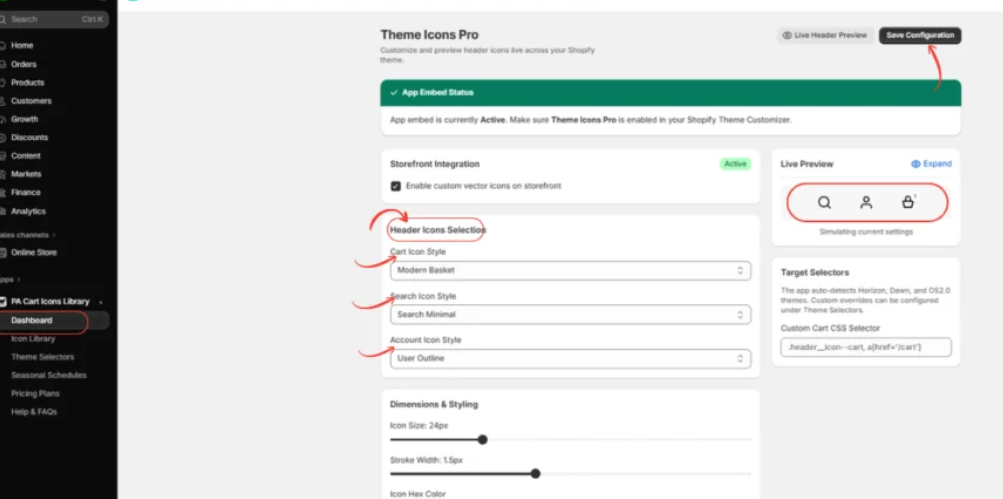
Image 4: Live Preview displaying the cart, search, and account icons together before saving the configuration.
Image explanation: The screenshot highlights the Header Icons Selection area and the Live Preview panel.
The preview helps you examine the appearance of the selected icon combination.
Check whether the icons have consistent proportions, visually compatible designs, and adequate spacing.
The Live Preview is a styling simulation. It should not be treated as a guarantee of how the icons will appear in every Shopify theme.
Step 5: Adjust Icon Colors, Sizes, and Stroke Widths
Scroll to the Dimensions & Styling section.
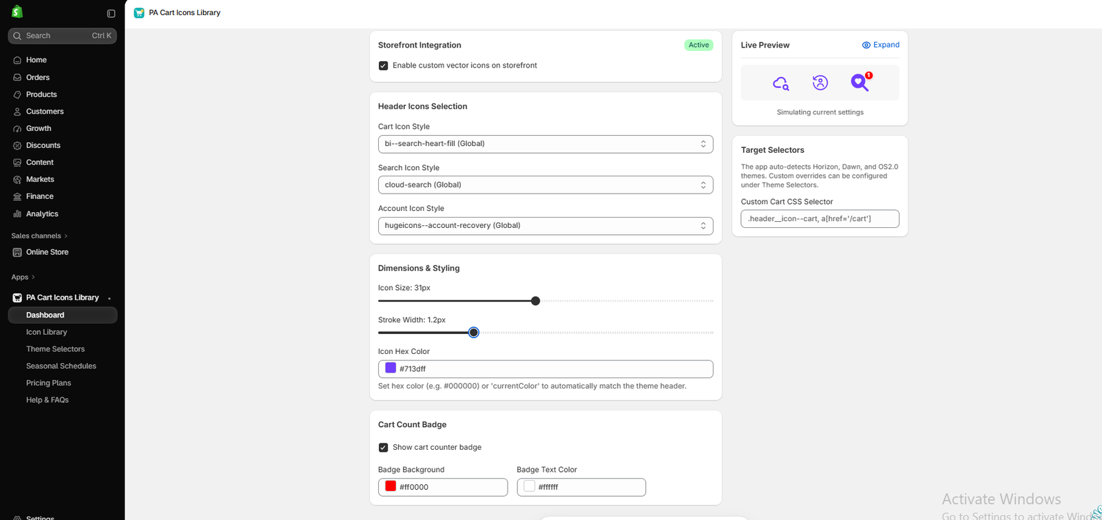
Image 5: Adjusting icon size to 31px, stroke width to 1.2px, and icon HEX color to purple.
This screenshot demonstrates three important styling settings:
Icon Size: Controls the overall dimensions of supported icons. The example shows 31px.
Stroke Width: Adjusts the line thickness of compatible outline icons. The example shows 1.2px.
Icon Hex Color: Changes the selected header icon color. The example uses purple (#713dff).
The Live Preview panel shows how these settings work together.
Experiment with different combinations until the icons look balanced.
Step 6: Preview the Complete Header Icon Combination
Before saving, check the final group of icons.
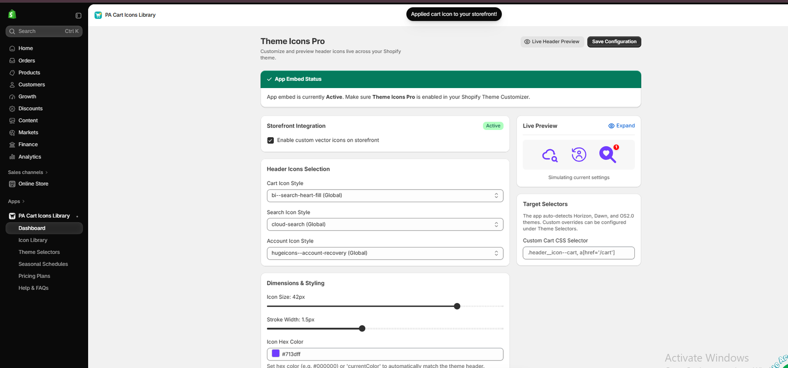
Image 6: Live Preview showing purple search, account, and selected cart icons with a red cart count badge.
In this screenshot, the cart, search, and account icon selections appear together in purple.
The red cart count badge is also visible.
This is a useful opportunity to compare the icon sizes, colors, and overall balance.
The example cart selection uses a decorative heart-search symbol. For most storefronts, a recognizable shopping cart, shopping bag, or basket design is preferable because it communicates the shopping function more clearly.
Step 7: Save Your Icon Configuration
After reviewing your chosen styles, click Save Configuration.

Image 7: Save Configuration button and Live Preview panel in Theme Icons Pro.
The screenshot highlights the Save Configuration button.
Saving retains your choices in the application.
Important: If the app is already connected to your published storefront, saving or applying settings may affect live icons. For changes that must remain private until approval, test using a duplicate or unpublished theme and confirm the app’s behavior first.
Best Practices for Previewing Shopify Header Icons
Keep your icon styles consistent
Select icons with similar visual weights and proportions so they look like one coordinated set.
Preview multiple color combinations
Test colors against your actual header background rather than relying only on the application’s preview panel.
Check the mobile version separately
An icon arrangement that looks balanced on a large desktop screen may be crowded on smaller devices.
Maintain familiar navigation symbols
Using recognizable cart, search, and account icons is more important than choosing unusual decorative shapes.
Test the complete customer experience
An icon should not only look attractive; its associated button must function correctly.
Frequently Asked Questions
1. Can I preview Shopify header icon changes without publishing them?
Yes. PA Cart Icons Library includes a Live Preview simulation, and Shopify’s theme editor can be used to inspect changes. Use a duplicate or unpublished theme for safer testing.
2. Can I preview cart, search, and account icons together?
Yes. Theme Icons Pro displays the three selected icons in its Live Preview section.
3. Can I change icon colors before saving?
Yes. The dashboard includes an Icon Hex Color setting.
4. Can I preview different icon sizes?
Yes. The Icon Size slider allows you to experiment with supported icon dimensions.
5. Does Live Preview show exactly how icons will appear on my store?
Not necessarily. The app provides a simulation, while the Shopify theme editor and live storefront show how the icons render within your actual theme.
6. Can I test header icon changes on mobile?
Yes. Use Shopify’s theme editor mobile preview and test on a real mobile device when possible.
7. Will saving icon settings automatically publish my changes?
Do not assume saving is always preview-only. When the application is active on a published theme, saved settings may affect the storefront. Test your setup before making changes.
8. Can I customize the cart count badge too?
Yes. PA Cart Icons Library provides cart count badge styling controls.
Conclusion
Previewing Shopify header icon changes before publishing is an important way to maintain a professional and user-friendly storefront.
While custom cart, search, and account icons can improve visual consistency, they need to remain recognizable, appropriately sized, and functional.
With PA Cart Icons Library, merchants can browse different icon styles, adjust their sizes and colors, and review the selected designs through the Theme Icons Pro Live Preview.
Shopify’s theme editor provides an additional opportunity to inspect how those icons appear in the actual storefront layout.
For the safest workflow, experiment with the icon design, verify the theme integration, check desktop and mobile layouts, and publish only after confirming the final results.
Customize and preview your Shopify header icons with PA Cart Icons Library.Explore PA Cart Icons Library on Shopify