HOW TO ADD CURSOR HOVER EFFECTS TO A SHOPIFY STOREFRONT
Introduction
A small interaction can add personality to your Shopify storefront. Cursor hover effects change the appearance of a mouse pointer when it moves over an interactive element, such as a link or button. With a suitable design, the change can complement your store’s visual identity while helping desktop visitors notice where they can interact.
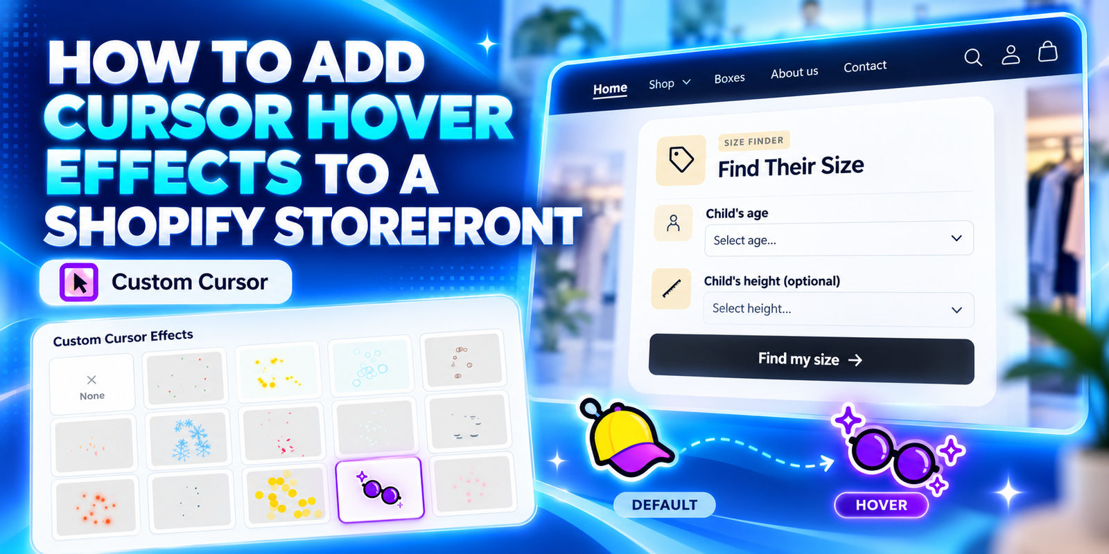
This guide explains how to add cursor hover effects to a Shopify storefront using Custom Cursor. The seven supplied images follow the setup in order, ending with an example where a colorful cap cursor changes to glasses over a button.
The Main Headache: Creating Hover Behavior Without Extra Theme Work
Merchants often want more personality in their store but do not want to maintain custom theme code for every small visual change. Implementing a cursor effect manually can involve preparing assets, editing styles or scripts, and testing how the pointer behaves over different elements.
Choosing the artwork introduces another challenge. The default and hover designs need to feel related, remain visible, and make clicking comfortable. A design that looks attractive in a gallery may become unclear when shown small or placed over product photography.
It is also easy to confuse different effects. A hover cursor changes the pointer’s appearance over an interactive element. A particle trail adds visuals behind the moving pointer. Clicking activates the element underneath. These behaviors can appear together, but they are separate.
Why Use the Custom Cursor App?
Custom Cursor provides a visual gallery of paired cursor designs and a preview area with a button for testing link-hover behavior. You can compare the normal and hover appearances, adjust cursor size, and save your selection without manually building each design into your theme.
The app also offers a separate effects panel for particle effects. You do not need to enable a trail to use a hover cursor. Check that the cursor pair you want is available on your active plan before selecting it.
Why Hover Effects Can Matter
A coordinated pair can reinforce the mood of a store. A playful cap-and-glasses design may suit a colorful accessories shop, while a restrained pointer pair may better complement a minimal storefront.
The effect should support browsing rather than dominate it. Keep button labels readable, use a manageable cursor size, and make sure links remain easy to recognize. Decorative cursor effects do not guarantee higher sales and should not replace the usual visual cues for interactive elements.
How to Add Cursor Hover Effects to a Shopify Storefront: Step by Step
Step 1: Install Custom Cursor
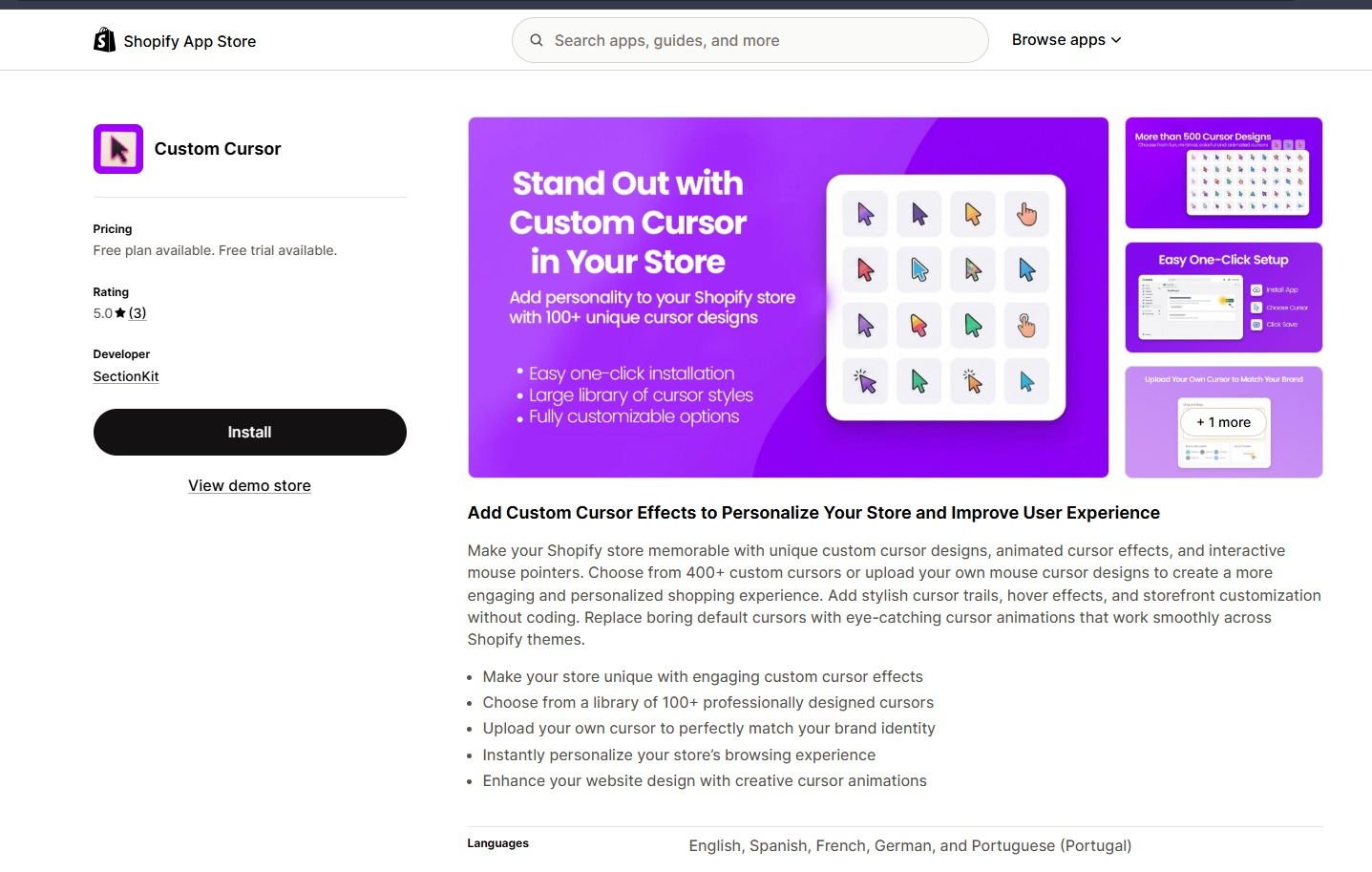
Open the Custom Cursor listing in the Shopify App Store and click Install. Select your store if prompted, review the requested permissions, and complete Shopify’s installation process.
The first image shows the listing and Install button. Once the installation is complete, open the app from Shopify admin.
Step 2: Choose and Preview a Default-and-Hover Cursor Pair
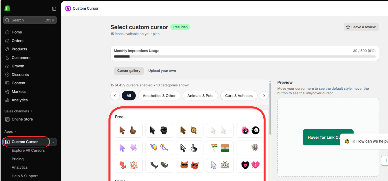
Go to Apps → Custom Cursor. Browse the Cursor gallery and choose a pair available on your plan. The second image includes the colorful cap-and-glasses pair used in the final examples.
Select that pair if you want to follow the example, or choose another design that fits your brand. Move your mouse through the preview box to inspect the default appearance, then place it over the Hover for Link Cursor button to inspect the hover appearance.
Adjust Cursor Size if needed, and click Save & Publish in the cursor configuration area. The image shows where to find the gallery and preview; scroll within the app if the save controls are below your current view.
Test both states before saving. A hover cursor should remain recognizable and should not cover the text on a small button.
Step 3: Review Optional Particle Effects Separately
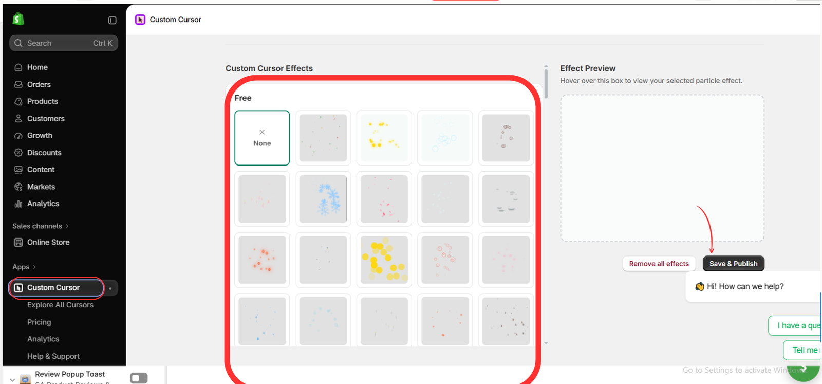
The third image shows Custom Cursor Effects and its Effect Preview area. These are particle effects, not the control that selects your default-and-hover cursor pair.
For a clean hover-only result, leave None selected, as shown. If you also want a trail, choose an available effect, preview it, and click Save & Publish in this effects area.
Adding particles is optional. Keep them subtle so visitors can still see the pointer, button labels, and product details clearly.
Step 4: Open Your Shopify Theme Editor
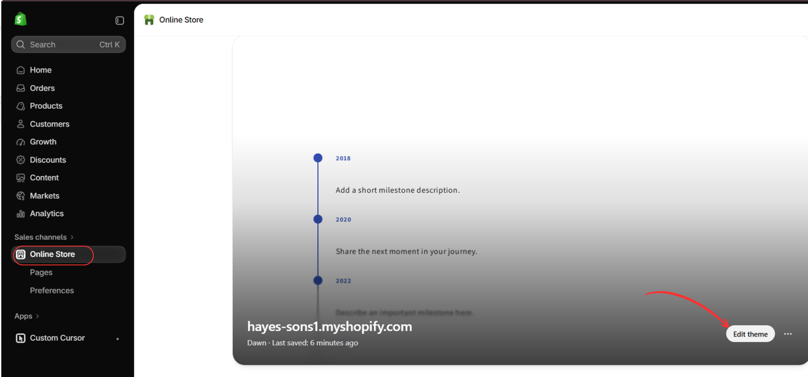
Go to Online Store → Themes. Find the theme where you want the cursor pair to appear and click Edit theme, highlighted in the fourth image.
Confirm that you are opening the intended theme. Activating an app embed in a draft does not activate it in a different live theme.
Step 5: Enable the Custom Cursor App Embed
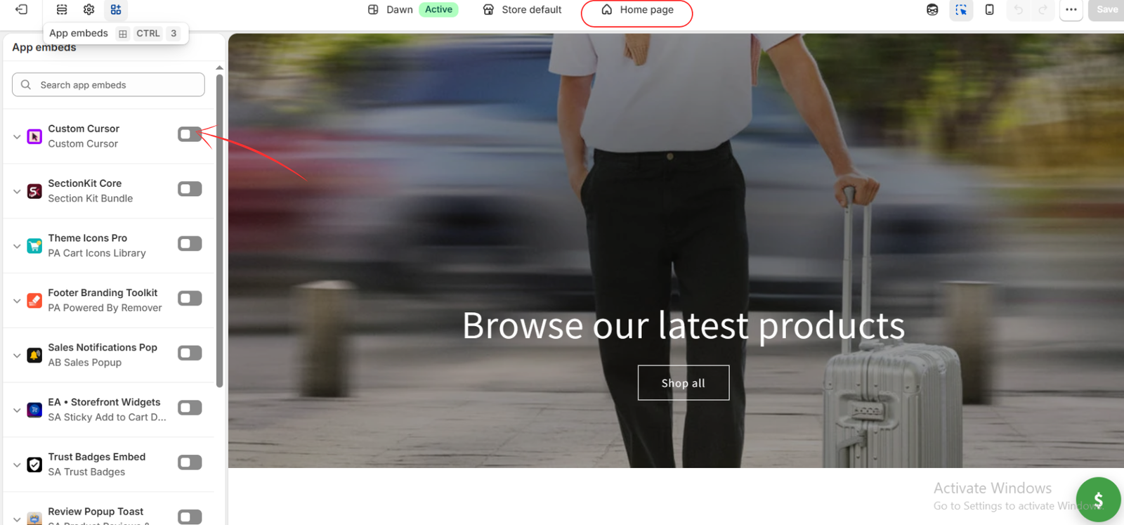
In the theme editor, open App embeds and locate Custom Cursor. The fifth image shows the toggle switched off. Turn it on, then click Save in the top-right corner.
You do not need to add a homepage section to activate the cursor. The app embed connects the saved configuration to this theme.
Step 6: Check the Default Cap Cursor
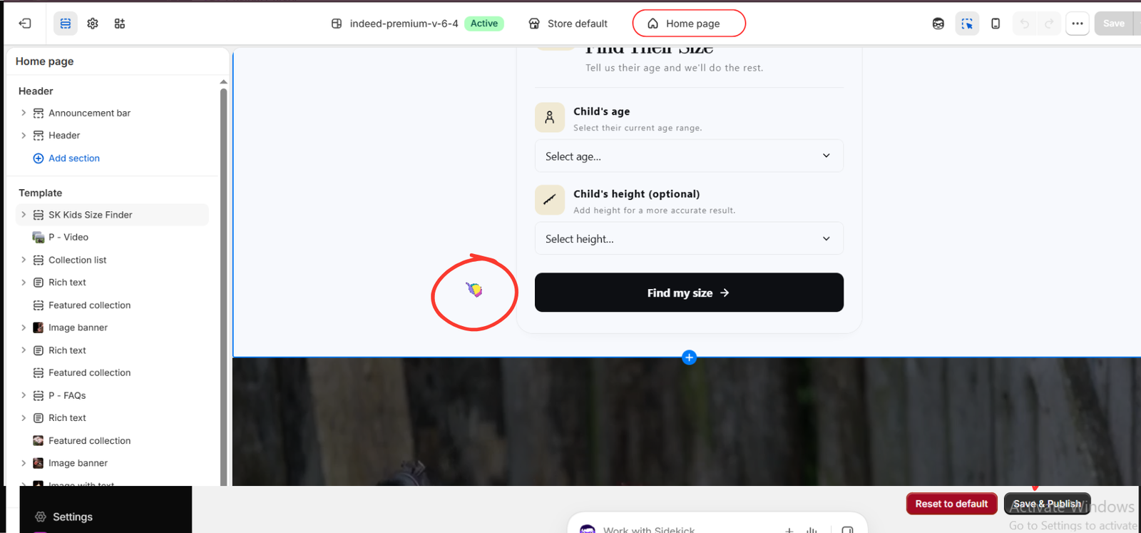
The sixth image shows the colorful cap cursor over an open area beside the size-finder card. This is the default appearance in the supplied example.
Move the pointer over a non-interactive part of your storefront and check that your chosen default design appears. Inspect its visibility over both light backgrounds and images.
The example uses a different theme from the earlier editor images. Use your own intended theme throughout; switching themes is not required. The size-finder section is simply part of the example storefront, not part of the cursor setup.
Step 7: Test the Glasses Cursor Over the Button
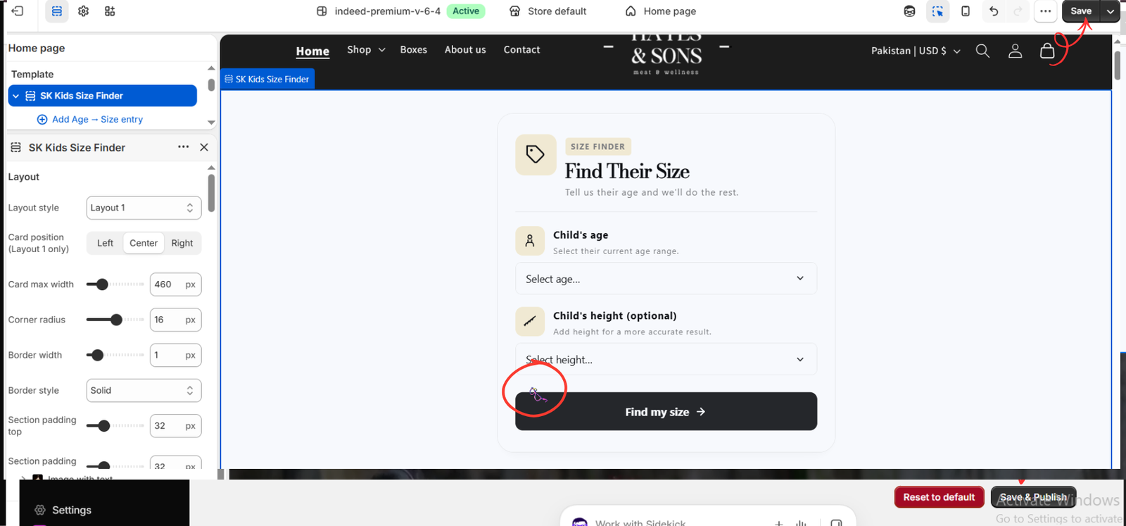
Move your pointer onto an interactive element, such as a button or link. In the seventh image, the cap has changed to purple glasses over the dark Find my size button.
You described seeing this change when clicking the block. The images illustrate the default and hover appearances: the glasses are visible while the pointer is over the button. Clicking is a separate action that activates the button. Test by moving onto the button without clicking to confirm the hover change in your storefront.
Move away again and check that the default cursor returns. Then click the button to verify that its normal action still works. Save any remaining changes in the theme editor.
Finally, open the storefront in a separate desktop browser tab. Theme-editor selection controls can affect how interactions feel, so the storefront itself is the best place to check the customer experience.
If Your Cursor Hover Effect Does Not Work
- Check the pair: confirm that you selected and saved the intended default-and-hover design in the cursor gallery.
- Use the app preview: hover over its preview button to confirm that the selected pair changes appearance.
- Check activation: enable the Custom Cursor embed in the correct theme and save.
- Test an interactive element: try an actual link or button rather than expecting every decorative block to trigger the hover state.
- Test on desktop: refresh the storefront and use a mouse or trackpad. A touchscreen-only phone does not provide the same pointer-hover interaction.
If the app preview works but a particular storefront control does not, check that element’s behavior in the live preview and contact app support with the page and element details if needed.
Keep the Effect Consistent with Your Brand
Choose two appearances that feel related. Keep the pointer easy to locate and avoid designs that make its clicking point unclear. Test navigation links, product cards, form controls, and purchase buttons rather than judging the effect only on the homepage.
The cap-and-glasses example demonstrates the behavior, but your final design can be different. Choose a pair that suits your audience and keeps browsing comfortable.
Conclusion
To add cursor hover effects to a Shopify storefront, install Custom Cursor, select and preview a paired design, save the app settings, and enable the theme embed. Test the default appearance in an open area, then hover over a button or link to check the alternate state.
Ready to try a pair that fits your store? Explore Custom Cursor on the Shopify App Store.