HOW TO MATCH HEADER ICON STROKE WEIGHT TO YOUR SHOPIFY THEME’S DESIGN
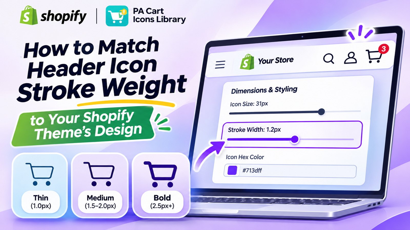
Shopify Header Customization | Icon Stroke Width | No-Code Tutorial | 2026
Introduction
Your Shopify store’s header is one of the most important elements of your website’s design. It helps customers navigate the store, search for products, access their accounts, and open their shopping cart.
While many merchants focus on header colors, logos, and icon sizes, one small design detail is often overlooked: icon stroke weight.
Stroke weight refers to the thickness of the lines used to draw an icon.
A thin shopping cart icon can complement an elegant, minimalist storefront. A thicker icon may look more appropriate in a bold, modern eCommerce design.
However, when your cart, search, and account icons have inconsistent stroke weights, your header can appear unbalanced.
For example, imagine a Shopify store with a thin search icon, a heavy shopping cart icon, and a medium-weight account icon. Even when all three are the same size and color, they may not look visually consistent.
Fortunately, PA Cart Icons Library allows Shopify merchants to adjust supported header icon stroke widths using a visual slider, without manually modifying CSS or SVG code.
In this guide, you’ll learn how to match your Shopify header icon stroke weight to your theme’s design, with a real screenshot from PA Cart Icons Library.
What Is Icon Stroke Weight?
Icon stroke weight refers to the thickness of the lines that form an icon’s shape.
It is commonly measured in pixels.
For example, an outline icon with a stroke width of 1px looks thinner and lighter than the same icon with a stroke width of 2.5px.
Thin1px
Medium2px
Bold3.2px
Illustration: The same shopping cart icon with different line thicknesses.
Thin stroke icons
Thin icons create a light, minimal appearance. They can work well with fashion, jewelry, beauty, and luxury brands.
Medium stroke icons
Medium-weight icons provide a balance between simplicity and visibility. They are suitable for many general-purpose Shopify stores.
Bold stroke icons
Bold icons use thicker lines and can fit energetic, high-contrast, or technology-focused designs.
The best option depends on the rest of your Shopify theme.
Why Matching Header Icon Stroke Weight Matters
1. Creates a consistent header appearance
Your shopping cart, search, and account icons should look like they belong to the same design system.
Consistent line thickness helps achieve that appearance.
2. Complements your theme’s typography
A Shopify theme with thin, elegant fonts may look better with lighter outline icons.
A store using bold typography and prominent buttons may benefit from thicker icons.
3. Improves icon visibility
Extremely thin lines can become difficult to see on small screens, especially when there is insufficient contrast.
4. Supports brand identity
Stroke weight contributes to the personality of an icon. Thin designs often feel refined, while heavier outlines can feel bold and energetic.
5. Makes navigation easier to recognize
Clear, consistent icons can help customers locate important shopping controls.
The Problem With Editing Shopify Icon Stroke Width Manually
Many Shopify themes use SVG graphics for shopping cart, search, and account icons.
These SVG files may define properties such as stroke-width, stroke, and fill.
Changing the stroke weight manually can require finding the correct Liquid or SVG file, editing its properties, and testing the result.
Some icons use filled shapes rather than adjustable strokes, making the process more complicated.
Incorrect modifications can also create inconsistent results across different themes or devices.
A visual customization tool offers an easier alternative.
Introducing PA Cart Icons Library
PA Cart Icons Library is a Shopify app for customizing cart, search, and account header icons.
The application includes the Theme Icons Pro dashboard, where merchants can choose icon designs, adjust icon sizes, customize colors, and control stroke width.
Key features
- Cart, search, and account icon customization.
- Adjustable icon stroke width.
- Icon size controls.
- Custom HEX color selection.
- Live header preview.
- Cart count badge color customization.
- Multiple outline and solid icon styles.
- Theme app embed integration.
- No-code styling for supported themes.
App Link: PA Cart Icons Library — Shopify App Store
Step 1: Search for Shopify App Store on Google
Open your browser and type Shopify App Store in the Google search bar.
Click the official Shopify App Store result to open the website.

Image 1: Google search results showing the official Shopify App Store website.
The screenshot highlights the search query and the official Shopify App Store result.
This is where you can discover and install applications for customizing your Shopify store.
Step 2: Search for PA Cart Icons Library
Once you’re on the Shopify App Store, locate the search bar at the top.
Enter PA Cart Icons Library and search for the application.

Image 2: PA Cart Icons Library appearing in Shopify App Store search results.
The screenshot shows the application highlighted in the search results.
Look for its turquoise shopping cart logo and the description mentioning cart, search, and header icon customization.
Click the application name to open its listing.
Step 3: Install and Open PA Cart Icons Library
On the application’s listing page, review the features and available customization options.
Click Install to add it to your Shopify store, or Open if you’ve already installed it.

Image 3: Official PA Cart Icons Library listing displaying its customization features and Open button.
The application page highlights its large cart icon library and its ability to customize storefront header elements.
Once the app is installed, open it from Shopify Admin.
Step 4: Customize the Icon Color and Size

Image 6: Theme Icons Pro dashboard showing the selected cart icon, purple icon styling, and live preview.
After applying an icon, the Theme Icons Pro dashboard allows you to review your configuration.
In this screenshot, the example uses a decorative heart-search design for the cart icon, alongside separate search and account icons.
The Live Preview displays the icons in purple, with a red cart count badge.
The visible settings include an icon size of 42px, stroke width of 1.5px, and HEX color #713dff.
For an actual storefront, choose a recognizable cart, bag, or basket symbol rather than an unrelated decorative icon.
Adjust the icon size and color to suit your brand, then click Save Configuration.
Step 5: Adjust the Icon Stroke Width
Your screenshot shows the actual PA Cart Icons Library settings:
PA Cart Icons Library dashboard showing 31px icon size and 1.2px stroke widthImage 1: Theme Icons Pro dashboard showing the Stroke Width slider set to 1.2px, Icon Size at 31px, and purple header icons in the Live Preview.
Image explanation: The screenshot displays the Theme Icons Pro dashboard with Storefront Integration marked Active.
In the Dimensions & Styling section, the Icon Size is set to 31px, and the Stroke Width is set to 1.2px.
The Icon Hex Color is #713dff, a vibrant purple.
The Live Preview shows the selected search, account, and cart symbols in purple, with a small red cart count badge.
To change the line thickness, drag the Stroke Width slider.
Move it toward a smaller value for thinner lines, or toward a larger value for thicker lines.
The exact visual effect depends on the selected icon and whether its design uses adjustable strokes.
Step 6: Choose the Right Stroke Weight for Your Store
Try different line thicknesses while reviewing the Live Preview.
| Stroke width | Suggested appearance |
|---|---|
| 1.0–1.2px | Thin and minimalist |
| 1.3–1.6px | Light and elegant |
| 1.7–2.0px | Balanced and versatile |
| 2.1–2.5px | Bold and prominent |
| Above 2.5px | Heavy and expressive |
These are general design guidelines, not required app values. Actual available slider ranges and results may vary.
For a luxury fashion store, 1.2px may be a useful starting point.
For a general Shopify store, approximately 1.5–2px may produce a balanced look.
For a bold electronics brand, a thicker stroke may work better.
Step 7: Match Stroke Width With Icon Size
Stroke width and icon size should be considered together.
An icon with a 1px stroke may look balanced at 20px but too thin when enlarged to 40px.
Similarly, a 3px stroke may look too heavy on a small icon.
Your screenshot demonstrates a 31px icon size combined with a 1.2px stroke width.
This creates a relatively light outline appearance where the selected icon supports stroke adjustment.
Experiment with both controls until the icons look visually balanced.
Common Mistakes to Avoid
Making icons too thin
Very thin icons can become difficult to see, especially on mobile devices.
Using different visual weights
A heavy cart icon beside a thin account icon can make the header look inconsistent.
Ignoring icon size
Stroke width should be evaluated together with icon dimensions.
Choosing low-contrast colors
Even a perfectly styled icon can be difficult to see against a similar-colored background.
Using unrelated icon designs
Some icons are filled shapes, while others are outlined. They may not respond to stroke adjustments in the same way. Choose visually compatible designs for the most consistent results.
Frequently Asked Questions
1. What is stroke weight in Shopify header icons?
Stroke weight is the thickness of the lines used to draw an icon, usually measured in pixels.
2. Can I change Shopify icon stroke width without coding?
Yes. PA Cart Icons Library includes a Stroke Width slider for supported header icons.
3. What is the best stroke width for Shopify cart icons?
For many outline icons, 1.5–2px is a useful starting point, depending on the icon size and theme design.
4. Can I adjust stroke width for cart, search, and account icons?
The app provides a shared stroke-width control, although individual results depend on the selected icon designs.
5. Does stroke width affect icon size?
Stroke width changes line thickness, while icon size changes overall dimensions. Both influence the icon’s appearance.
6. Does increasing stroke width improve conversions?
Not necessarily. Appropriate stroke weight can support clarity and usability, but it does not guarantee increased conversions.
7. Can I customize the icon color too?
Yes. The app includes an Icon Hex Color setting.
8. Will adjusting stroke width affect filled icons?
Filled icons may not respond to stroke-width adjustments in the same way as outline icons.
Conclusion
Matching header icon stroke weight to your Shopify theme is a small design improvement that can make your storefront feel more professional and consistent.
Whether you run a minimalist fashion boutique, a beauty store, a home decor business, or an electronics shop, the right line thickness helps your cart, search, and account icons work together visually.
With PA Cart Icons Library, merchants can adjust supported icon stroke widths, sizes, and colors without manually modifying Shopify theme code.
The example screenshot demonstrates a 31px icon size, 1.2px stroke width, and purple icon styling, showing how these settings work together in the Theme Icons Pro dashboard.
For the best results, experiment with different thicknesses, maintain adequate contrast, and test the final appearance on both desktop and mobile.
Customize your Shopify header icons with PA Cart Icons Library.Install PA Cart Icons Library