Shopify Theme Prompt Examples for Common Store Design Changes
Introduction
A Shopify store rarely stays the same for long. You may need a more noticeable header button, a cleaner product grid, better mobile spacing, or a new homepage section. The challenge is turning a simple design idea into a change that works with your existing theme.
These Shopify theme prompt examples show how to describe common changes clearly. You will also learn how to use AI Theme Code Editor to submit a request, review the generated changes, and adjust the result in the Shopify Theme Editor.
The Headache: Small Design Changes Can Become Technical Tasks
Merchants often know what they want customers to see, but cannot find the right setting in their theme. A request such as “add a button beside the header icons” may involve theme markup, styling, responsive behavior, and new editor settings.
Without a clear workflow, merchants can spend hours looking through files, copy code that does not match their theme, or arrange developer help for each small update. Vague requests create another problem: “make my store look better” leaves too many decisions open.
Why Use AI Theme Code Editor?
AI Theme Code Editor accepts natural-language requests and helps generate or modify theme code. Its App Store listing describes support for sections, blocks, layout changes, Liquid, CSS, JavaScript, and sandbox previews. This makes it a useful option when the change you need goes beyond the settings already available in your theme.
The app does not remove the need to review a change. Its value is helping you translate a specific design brief into an implementation that you can inspect and refine.
Why Clear Prompts Matter
A useful prompt names the page or section, explains the requested change, describes desktop and mobile behavior, and lists any settings you want to edit later. Ask for one focused change at a time so you can judge the result.
On [page or section], add or change [element]. Use [layout and styling]. On mobile, [behavior]. Add Theme Editor settings for [controls]. Preserve existing theme functionality and limit changes to this area.
Step-by-Step: Use a Prompt to Change Your Shopify Theme
The images below follow the supplied order. Images 1–4 illustrate the app and a header-button request. Images 5–6 show a separate calculator section in the Theme Editor, demonstrating how section settings can be reviewed and customized.
Step 1: Install and Open AI Theme Code Editor
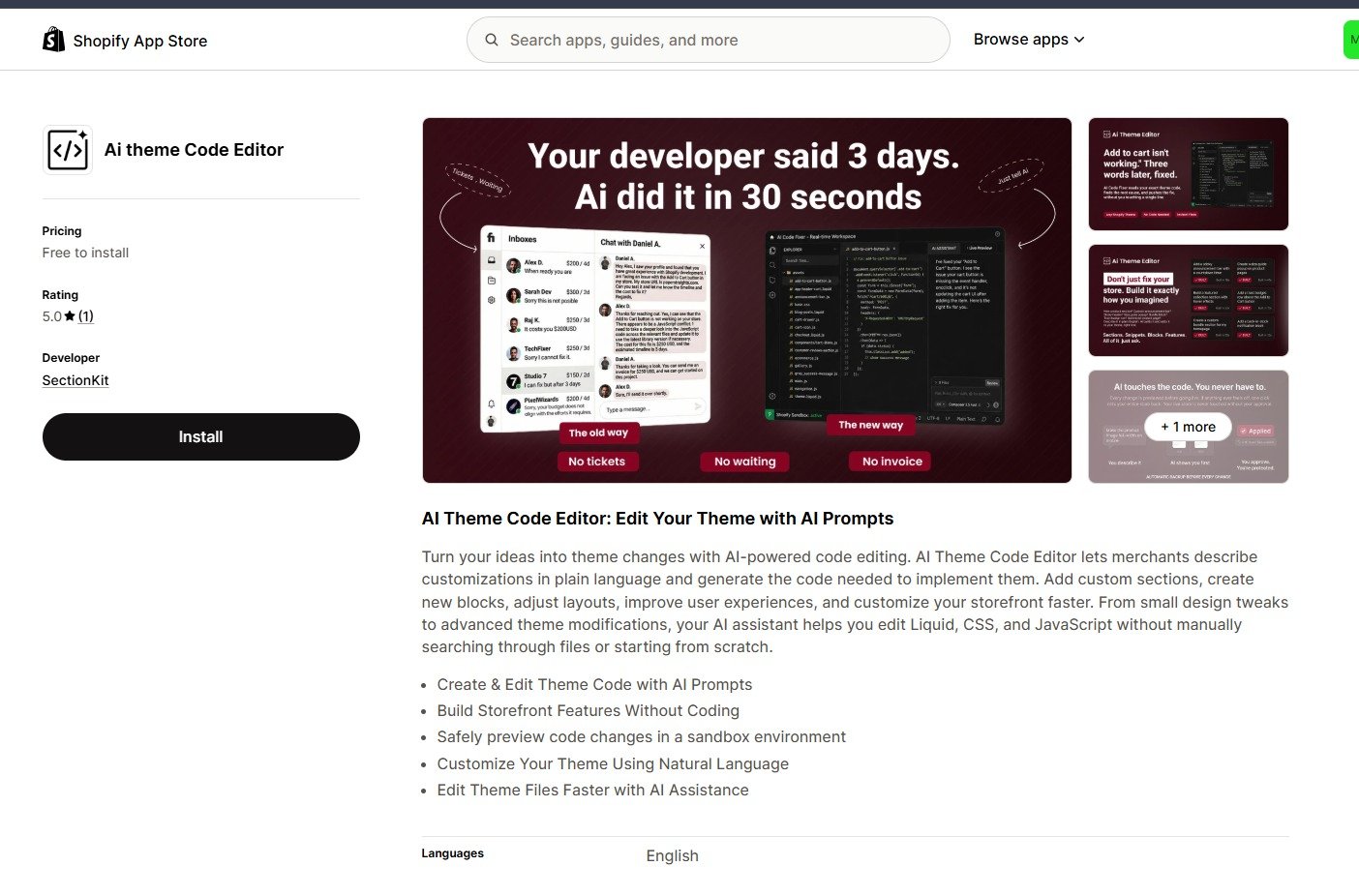
Find AI Theme Code Editor in the Shopify App Store, select Install, and complete Shopify’s installation flow. Open the app from your Shopify admin. Review the available plan and usage allowance in the app before beginning.
Step 2: Connect the Theme You Want to Edit
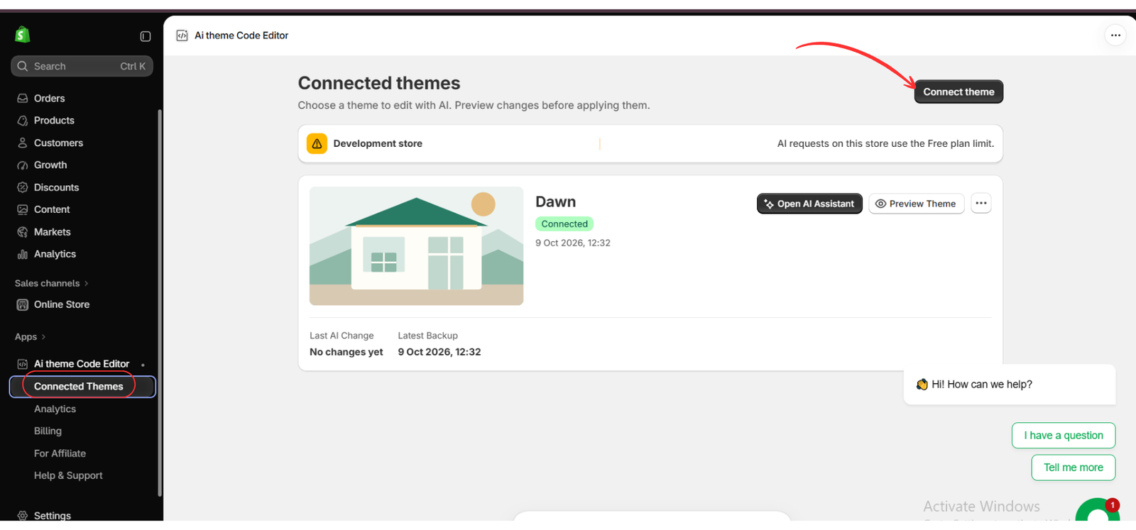
Open Connected Themes and use Connect theme to select your theme. Confirm the correct theme name before opening the assistant. The image shows Dawn connected, with Open AI Assistant and Preview Theme controls.
For an existing store, keep a theme backup or work on a duplicate where supported. This gives you a reference if the new design needs adjustment.
Step 3: Enter a Specific Design Prompt
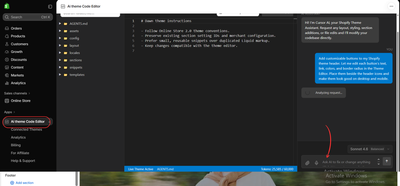
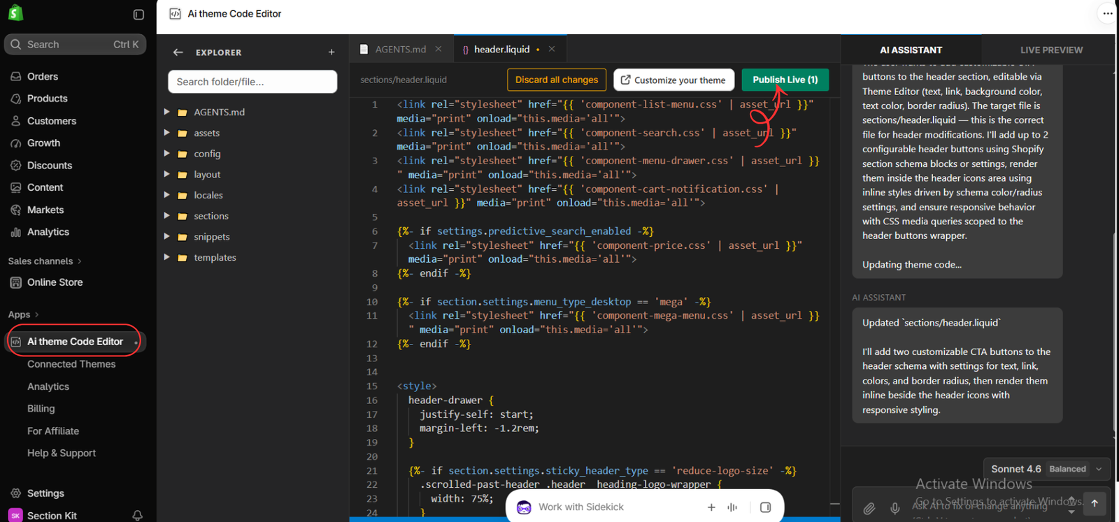
Open the AI assistant and describe one change. The supplied image uses a header-button request with editable text, links, colors, and rounded corners. You can use this prompt as a starting point:
Prompt Example: Custom Header Buttons
Add customizable buttons to my Shopify theme header. Let me edit each button’s text, link, colors, and border radius in the Theme Editor. Place them beside the header icons and make them look good on desktop and mobile. Keep the existing menu, search, account, and cart functions working.
Step 4: Review the Generated Changes Before Publishing
Read the assistant’s response and inspect the preview. In this example, the editor displays a change to sections/header.liquid and a Publish Live control. Check that the buttons fit the header, their links work, and the mobile navigation still opens correctly.
If the result needs refinement, submit a focused follow-up such as: “Reduce the button padding on mobile and keep both buttons inside the header without horizontal scrolling.” Use the available preview workflow before selecting Publish Live; that control applies changes to the connected live theme.
Step 5: Open the Relevant Page in the Theme Editor
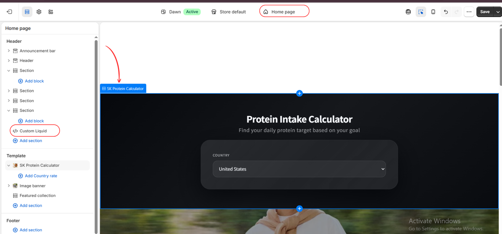
Open Customize your theme or the Shopify Theme Editor, then select the page or template affected by your request. For a newly created section, use Add section if it has not already been placed in the template.
This image shows a separate example: an SK Protein Calculator section on the homepage. It illustrates selecting a section in the editor; it is not the result of the header-button prompt in the earlier images. The visible Custom Liquid item is another item in the sidebar.
Step 6: Customize Available Settings and Save
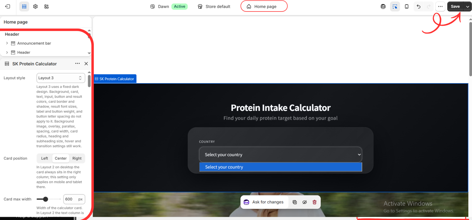
Open the section’s settings and adjust the controls available for that section. The calculator example shows Layout style, Card position, and Card max width. Its settings also explain that some color and style controls do not apply to the fixed dark Layout 3 design.
Review the page on desktop and mobile, test the relevant inputs or links, and select Save when the editor changes are ready. If a setting you requested is missing, ask the assistant to add that specific control rather than rebuilding the entire section.
Copy-Ready Shopify Theme Prompt Examples
Replace the sample labels, colors, and dimensions with your own requirements. These prompts are starting briefs; the finished result depends on your theme and should be tested before going live.
1. Improve Homepage Banner Layout
Update my homepage image banner so the heading, short description, and Shop Now button sit on the left on desktop and below the image on mobile. Add editable text alignment and spacing settings. Preserve the existing image and link settings, and keep the text readable.
2. Create a Homepage Product Grid
Create a homepage section that displays products from a collection I choose in the Theme Editor. Show four products per row on desktop and two on mobile. Include each product’s image, title, and formatted price. Add settings for the heading, product count, spacing, and a View All link.
3. Reduce Product Page Spacing
Reduce the gaps between the product title, price, variant selector, and Add to Cart button on the product page. Add separate desktop and mobile spacing controls. Preserve variant selection, price updates, and the existing Add to Cart behavior.
4. Add an Editable Product FAQ
Add a collapsible FAQ section to the product page with editable question-and-answer blocks. Match my theme’s typography and colors. Make the questions accessible by keyboard and keep the layout readable on mobile.
5. Add a Benefits Row Below Add to Cart
Add a benefits row below the product page Add to Cart button with three editable items: Secure Payment, Easy Returns, and Customer Support. Include optional icons and editable text. Display items in a row on desktop and stack them on mobile. Do not change the product form.
6. Improve Mobile Button Styling
Make the main buttons in my homepage featured collection easier to tap on mobile, with a minimum height of 44 pixels and consistent padding. Keep desktop styling unchanged and preserve visible keyboard focus states.
7. Add a Homepage Call-to-Action Section
Create a homepage section with an editable heading, short paragraph, and button. Use a camel background, dark green text, and a yellow button with dark text. Add settings for colors, button label, button link, content width, and top and bottom spacing. Keep the layout responsive.
8. Make the Header Sticky
Make my existing header remain visible while scrolling without covering page content. Preserve the current menu, search, account, and cart behavior. Add a Theme Editor toggle to enable or disable the sticky header, and test it on desktop and mobile.
9. Clean Up the Footer Layout
Organize my footer into menu, contact information, and newsletter columns on desktop, stacked on mobile. Keep existing links and newsletter form functionality. Add editable column spacing and heading sizes, and preserve the theme’s current color scheme.
How to Refine a Prompt That Misses the Mark
Explain the exact difference between the current result and the design you want. A useful follow-up is “Keep the desktop layout, but stack the two header buttons on mobile and reduce their font size to 14 pixels.” This is easier to evaluate than another broad redesign request.
For repeated sections, ask the assistant to keep styling scoped to that section so it does not unintentionally change buttons, cards, or headings elsewhere.
Final Checks Before Making a Change Live
- Check the affected page at desktop and mobile widths.
- Test buttons, navigation, forms, and product controls where relevant.
- Confirm that requested Theme Editor settings appear and work.
- Look for clipped text, overlapping elements, or horizontal scrolling.
- Keep a backup and verify the correct connected theme before publishing.
Conclusion
Common store design changes become easier to communicate when your prompt names the location, appearance, mobile behavior, and editable settings. Start with one of these Shopify theme prompt examples, adapt it to your store, and review the result before moving to the next change.
AI Theme Code Editor provides a way to turn those instructions into theme code changes while keeping preview and refinement part of the workflow.
Explore AI Theme Code Editor: https://apps.shopify.com/ai-code-fixer