STATIC VS ANIMATED CURSORS: WHICH WORKS BETTER FOR YOUR STORE DESIGN?
Introduction
A custom cursor can add a small but distinctive touch to a Shopify storefront. The bigger question is whether that cursor should stay visually simple or include animation. Both approaches can complement a store, but neither is automatically the better choice.
In this guide to static vs animated cursors, we compare their design tradeoffs and walk through choosing, previewing, and activating a cursor with Custom Cursor. The final decision depends on your brand, your viewers, and how comfortably people can browse your store.
The Main Headache: Choosing Personality Without Distraction
Merchants often want a storefront that feels unique, yet too much visual movement can compete with products, prices, and navigation. A static design may feel restrained but lack the playful character you want. An animated design may attract attention but feel out of place in a calm, minimal shop.
There is also a practical testing challenge. A cursor thumbnail does not tell you how it feels over product images or small buttons. A still image cannot demonstrate animation, and a visible particle trail does not prove that the cursor icon itself is animated.
Building and comparing these options manually may require theme code and additional testing. A visual app workflow makes it easier to explore designs before deciding which one belongs on your storefront.
Why Use Custom Cursor?
Custom Cursor provides a cursor gallery, a preview area, size controls, and access to static and animated designs according to the selected plan. Eligible plans also offer custom uploads.
Use the app to compare available options and test their actual behavior. The supplied images illustrate gallery selections, plan access, and theme activation. They support the setup process, but they are not a performance comparison or proof that a particular icon animates.
Static, Animated, Hover, and Trail Effects: The Difference
Static cursor: its artwork does not animate. It still moves across the page with the mouse and may have a separate hover appearance.
Animated cursor: its artwork changes over time, adding movement within the cursor design.
Hover cursor: an alternate appearance shown over supported interactive elements such as links and buttons. Switching between two still designs is not the same as continuous icon animation.
Cursor trail: particles or other visuals follow the moving pointer. A trail can accompany a static or animated design and should be assessed separately.
Static vs Animated Cursors: A Practical Comparison
| Consideration | Static cursor | Animated cursor |
|---|---|---|
| Visual tone | Can suit a restrained or minimal presentation | Can suit a playful or expressive presentation |
| Attention | No movement within the artwork | Movement may draw more attention |
| Comfort | A useful starting point for a calm experience | Check whether motion distracts or feels uncomfortable |
| Brand fit | Depends on color, shape, and hover design | Depends on those details plus the animation style |
| Performance | Test the complete implementation on your store | Test responsiveness with animation enabled |
| Sales impact | No guaranteed conversion improvement | No guaranteed conversion improvement |
These are design considerations, not universal rules. A detailed static cursor can still distract, and a subtle animation may work comfortably. Judge the actual design rather than relying only on its category.
Why the Choice Matters for Store Design
Your cursor should feel consistent with the rest of the storefront. A bold character may fit a mascot-led brand, while a clear pointer may suit a store built around quiet typography and product photography.
Whichever option you choose, shoppers must be able to read and interact easily. Keep the clicking point obvious, maintain visibility over different backgrounds, and avoid obscuring important controls.
Step-by-Step: Compare and Apply Your Preferred Cursor
Step 1: Install Custom Cursor
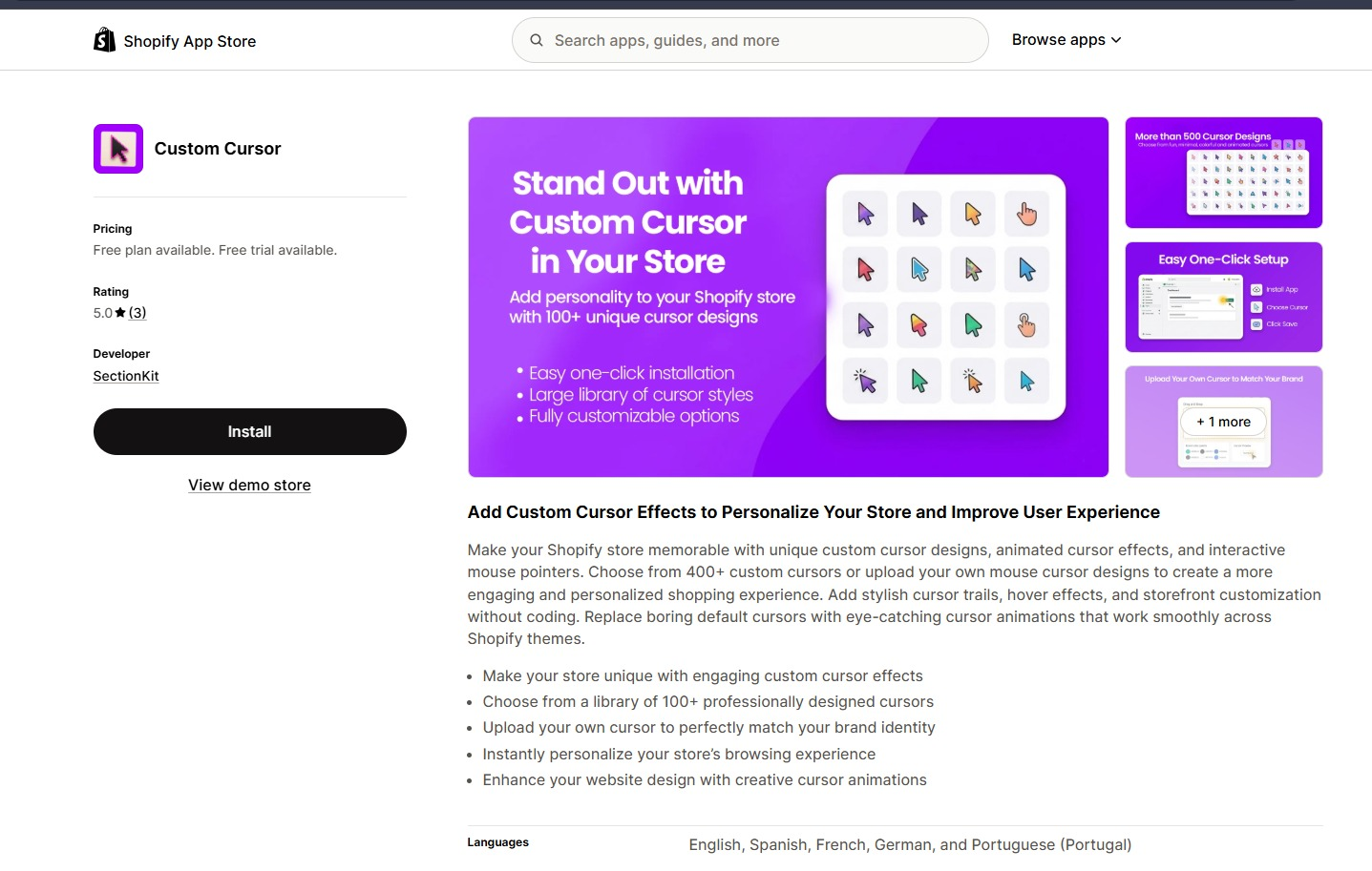
Open the app listing in the Shopify App Store and click Install. Select the intended store, review the requested permissions, and complete installation.
Before comparing designs, define the mood you want: restrained, playful, colorful, or another style appropriate to your audience.
Step 2: Review Your Plan’s Static and Animated Options
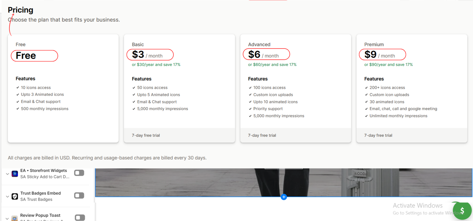
The second image shows the app’s plan comparison, including icon access, animated icon allowances, and monthly impressions. Select a plan that supports the designs you want to test.
The image lists Free, Basic, Advanced, and Premium. Custom uploads appear under Advanced and Premium. Confirm current terms in the app before approving a subscription; a paid plan is not automatically necessary for every comparison.
Step 3: Browse Designs and Consider Custom Artwork
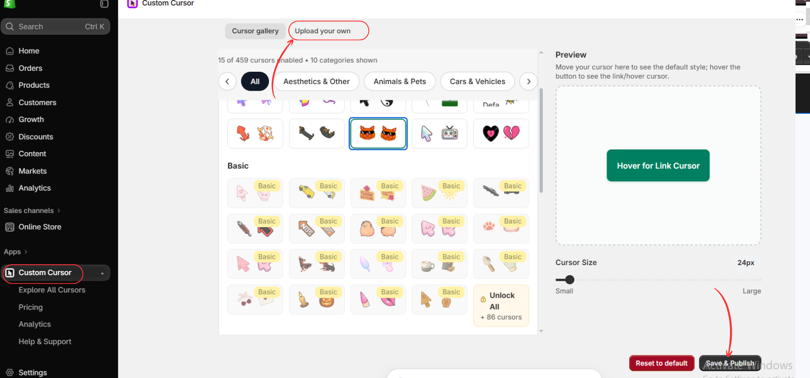
Open Apps → Custom Cursor. Browse the gallery and category filters, shown in the third image. Shortlist a simple option and a more expressive candidate available on your plan.
The image highlights Upload your own. If your plan supports it, you can follow the upload instructions to add suitable brand artwork. Uploading a still image does not automatically make it animated.
Step 4: Establish a Simple Visual Baseline
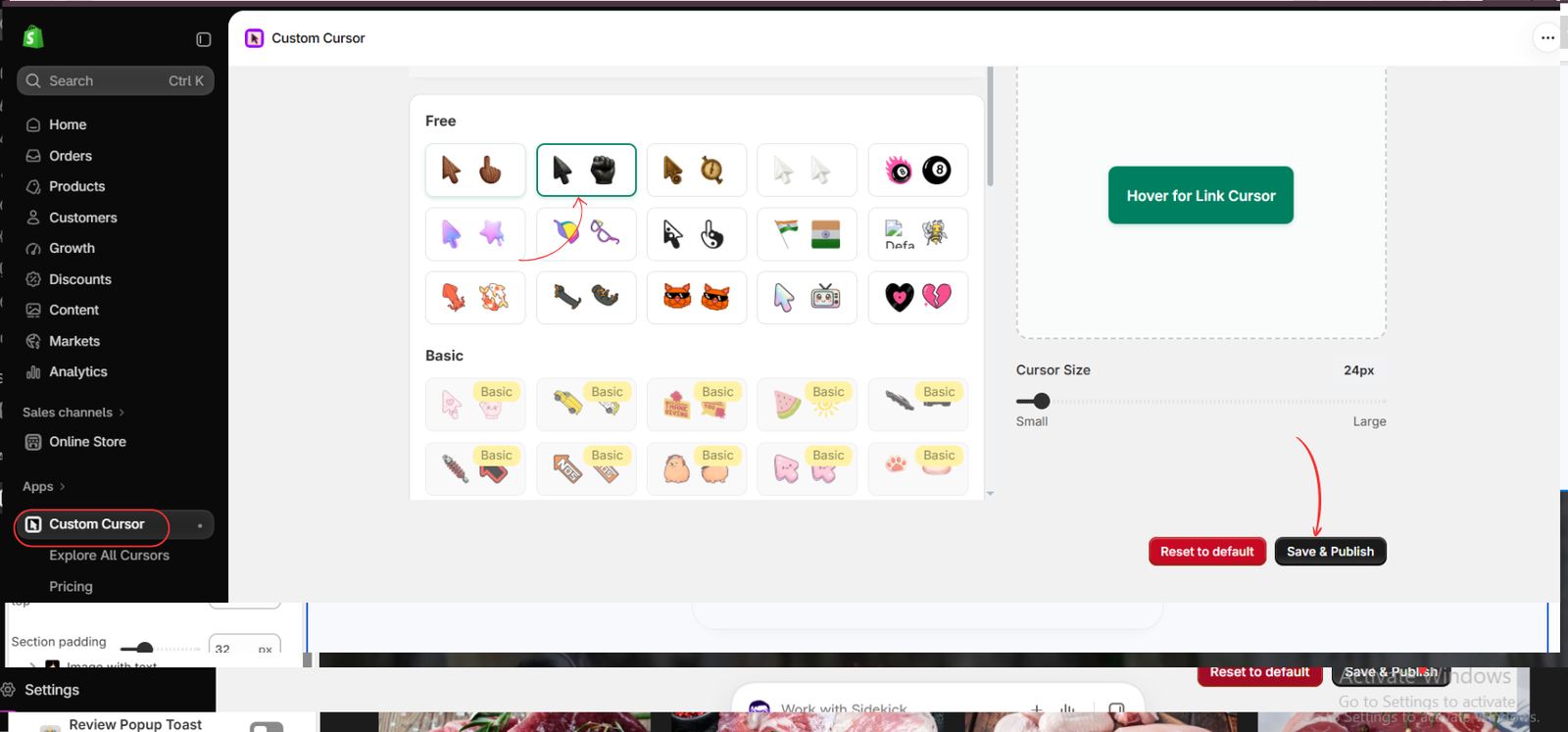
The fourth image highlights a dark pointer paired with a fist-shaped hover design. Use it as an example of how to inspect a less colorful candidate.
Move through the preview box and hover over the preview button. Check size, contrast, and the clicking point. Confirm whether the selected artwork is static by watching its actual preview; the still image alone cannot establish that.
Adjust Cursor Size if needed. Click Save & Publish if you want to test this candidate on your storefront.
Step 5: Compare an Expressive or Animated Candidate
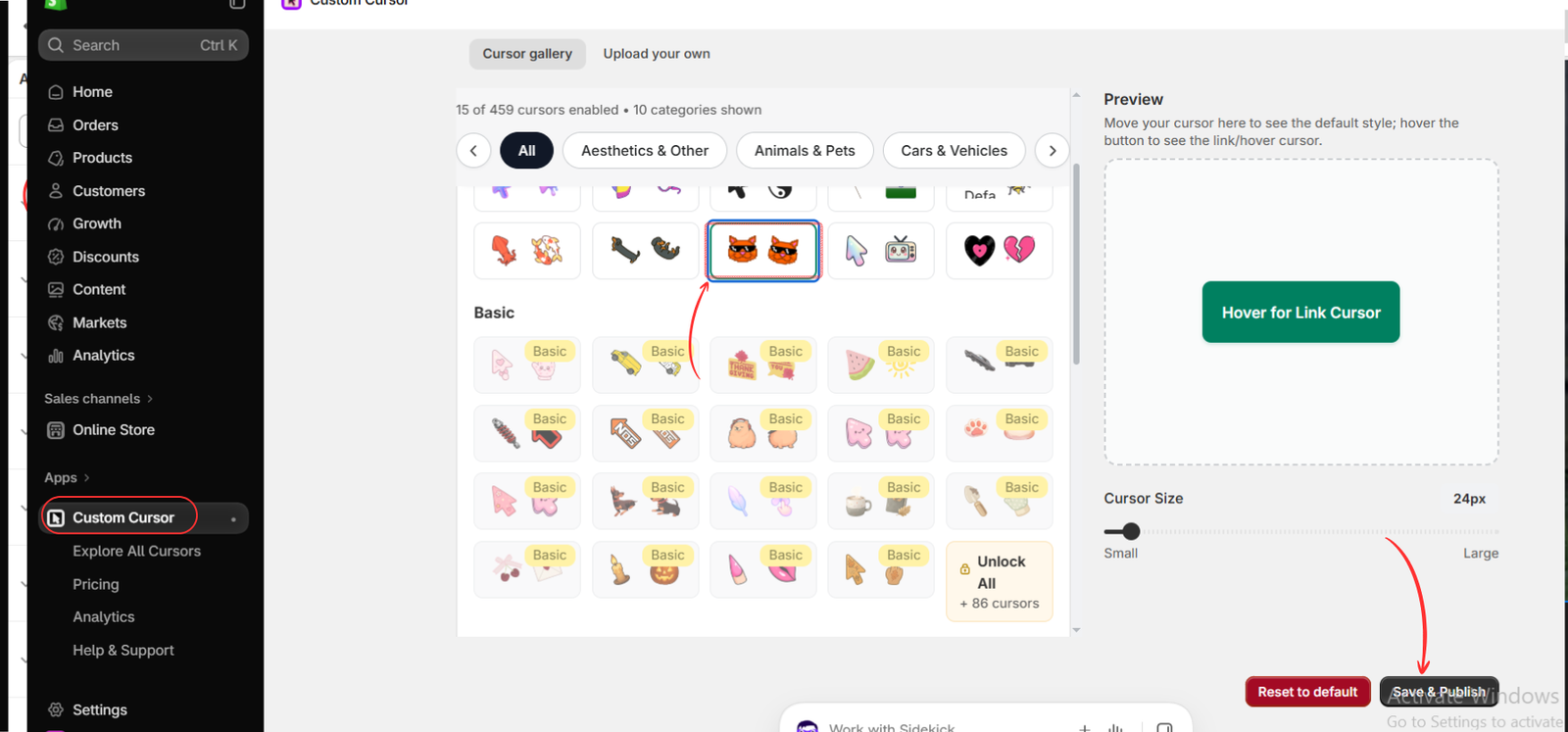
The fifth image highlights an orange cat design. It illustrates a more expressive visual option, but does not establish whether that icon animates.
For an animated comparison, choose a design identified as animated in the app and watch it in the preview. Compare it with your baseline at a similar size. Ask whether its movement fits your brand or competes with product information.
Click Save & Publish to test your preferred candidate. Compare one option at a time; you do not need to publish both together.
Step 6: Open the Intended Theme
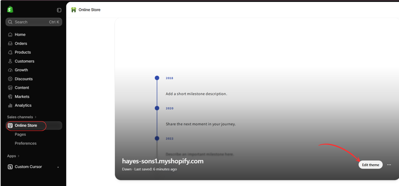
Go to Online Store → Themes and click Edit theme for the storefront you want to customize.
The sixth image highlights that button. Use the same intended theme throughout your comparison so the surrounding design remains consistent.
Step 7: Enable the App Embed
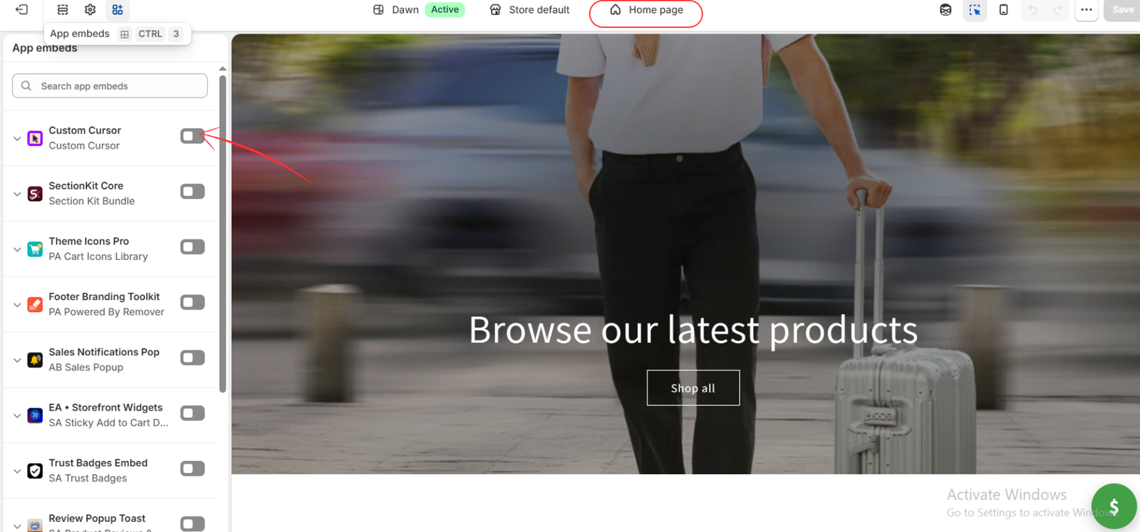
Open App embeds and locate Custom Cursor. The seventh image shows its toggle off. Turn it on and save the theme.
A cursor embed enabled in a draft theme does not activate it in a different live theme. Check which theme your storefront uses before evaluating the result.
Step 8: Save and Test the Real Browsing Experience
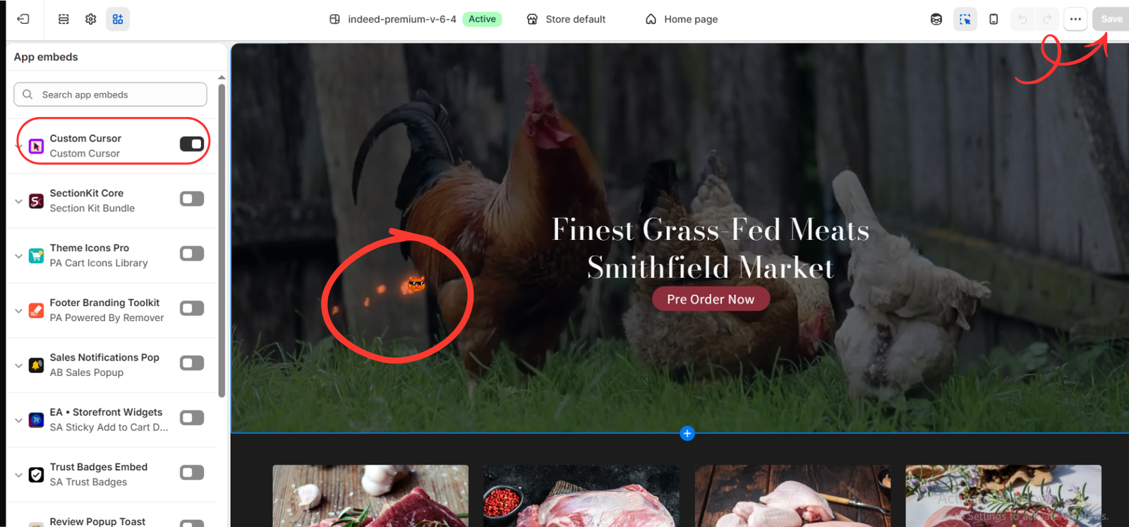
The eighth image shows the embed enabled, an orange cat cursor, and an orange particle trail. Save any pending changes using the top-right Save button.
The trail demonstrates an additional particle effect, not proof of animation within the cat icon. To compare static and animated cursors fairly, keep optional trails off or consistent between candidates.
This final example uses a different theme from the earlier images. You do not need to switch themes; activate the app in your own intended theme and test there.
Open the storefront in a separate desktop browser tab. Test navigation, product cards, form fields, and purchase buttons with a mouse or trackpad. Compare readability, clicking accuracy, comfort, and page responsiveness. A touchscreen-only phone is not a suitable way to judge a mouse cursor.
How to Decide Which Works Better
Start with a clear static design if you want a restrained experience or are unsure about motion. Consider an animated option when its movement supports your store’s personality and remains comfortable during normal shopping tasks.
Ask a few people who resemble your intended viewers to try both versions. Have them browse a collection, open a product, and use a button. Ask whether the cursor feels appropriate, distracting, or difficult to use.
Do not conclude that an option improves sales simply because it looks more noticeable. If you evaluate business outcomes, use a properly planned comparison with enough traffic rather than assuming a result from visual preference.
The Final Choice Belongs to the Merchant and the Audience
There is no universal winner in static vs animated cursors. The better option depends on your brand, your viewers’ preferences, and how easily shoppers can use the store.
Choose the design that complements your storefront and keeps browsing comfortable. If neither improves the experience, keeping the standard pointer is a valid decision.
Explore the available options and choose what suits your audience with Custom Cursor on the Shopify App Store.