The 10 Most Expensive Shopify Theme Mistakes Hurting Your Mobile Conversion Rate (2026 Fixes)
If you are running a Shopify store in 2026 and your mobile conversion rate is disappointing, there is a strong chance your theme is quietly killing your sales. Most store owners spend hours tweaking ads, testing audiences, and adjusting product prices, but they completely overlook the one thing that decides whether a visitor becomes a buyer: the experience your theme delivers on a mobile screen.
Mobile commerce now accounts for more than 70 percent of all ecommerce traffic globally. If your Shopify theme is not optimized specifically for mobile users, you are essentially leaking money every single day. The worst part is that most of these mistakes are invisible to you as the store owner because you probably review your store on a desktop. Your customers, however, are shopping on a 6 inch screen while commuting, waiting in line, or lying on the couch.
Let us walk through the ten most expensive Shopify theme mistakes that are hurting your mobile conversion rate right now, and more importantly, what you can do in 2026 to fix each one.
Mistake Number One: Slow Mobile Page Load Speed
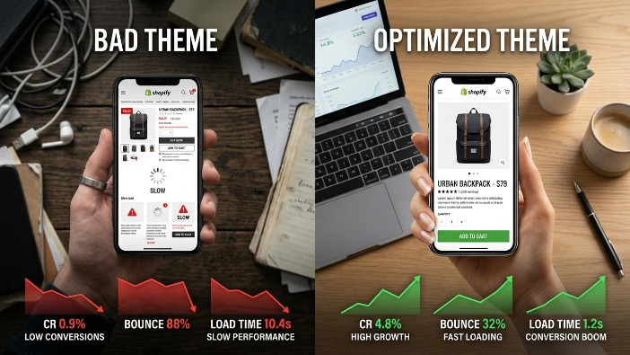
Speed is not just a technical concern. It is a revenue concern. Research has consistently shown that for every additional second it takes your mobile page to load, your conversion rate drops significantly. In 2026, with 5G becoming mainstream and shoppers more impatient than ever, a slow store is a dead store.
Many Shopify themes come bloated with unnecessary JavaScript, oversized image files, unused CSS, and third party app scripts that stack on top of each other. When a customer on mobile hits your store and has to wait three to five seconds for content to appear, they leave. They do not come back.
The 2026 Fix: Start by running your store through Google PageSpeed Insights and focus specifically on the mobile score. Compress all your images using modern formats like WebP. Remove any Shopify apps you are not actively using because every app typically injects its own scripts into your theme. Choose a theme that is built with performance first architecture. Shopify’s own Dawn theme and themes like Prestige or Impulse have been optimized for speed. Also, enable lazy loading for images so that only the content visible on screen loads first.
Mistake Number Two: Oversized and Unoptimized Product Images
Beautiful product photography is essential for ecommerce, but those stunning high resolution images that look gorgeous on a desktop monitor become a serious liability on mobile. Many store owners upload images that are 3000 pixels wide and several megabytes in size, not realizing that a mobile screen only needs a fraction of that resolution to display the image perfectly.
When your product page loads five or six unoptimized images, the mobile browser has to download massive files that it will then shrink down to fit the screen anyway. This wastes bandwidth, slows load time, and frustrates the customer.
The 2026 Fix: Resize your product images to a maximum of 1200 pixels on the longest side before uploading them to Shopify. Use compression tools like Squoosh, TinyPNG, or ShortPixel to reduce file size without visible quality loss. Use Shopify’s built in image optimization but do not rely on it alone. If your theme supports responsive images, make sure that feature is enabled so the browser automatically loads the appropriately sized image for each device.
Mistake Number Three: Poor Mobile Navigation and Menu Structure
Navigation is how your customers find what they want to buy. On desktop, you have the luxury of space. Mega menus, multiple columns, and expanded categories all work beautifully when someone is using a mouse. On mobile, that same navigation becomes a cluttered nightmare.
Many Shopify themes simply collapse the desktop navigation into a hamburger menu on mobile without actually rethinking the structure. The result is a menu that requires too many taps to reach a product category, confuses the shopper, and sends them back to wherever they came from.
The 2026 Fix: Simplify your mobile navigation ruthlessly. Your top level menu should have no more than five to six items. Use clear, benefit driven labels instead of clever internal naming that only makes sense to you. Consider adding a sticky navigation bar at the bottom of the mobile screen that gives quick access to your home page, search, cart, and account. Bottom navigation bars have been shown to dramatically improve usability because they sit right where a user’s thumb naturally rests.
Mistake Number Four: Touch Targets That Are Too Small
This is one of the most overlooked mistakes in mobile theme design. Touch targets, which are the buttons, links, and interactive elements that a user taps on mobile, need to be large enough for a human finger to hit accurately. Google recommends a minimum touch target size of 48 by 48 pixels.
Many Shopify themes have tiny “Add to Cart” buttons, small filter options, close buttons on popups that are nearly impossible to tap, and product variant selectors that require surgical precision to interact with. Every time a customer mis taps or has to zoom in to hit a button, your conversion rate suffers.
The 2026 Fix: Audit your mobile theme by actually using it on a physical phone, not just the browser’s device emulator. Try to tap every interactive element. If anything requires more than one attempt, it needs to be redesigned. Increase button sizes, add more padding around links, and make sure your variant selectors like size and color options are large enough to tap comfortably. Your “Add to Cart” button should be prominent, high contrast, and easy to reach without zooming.
Mistake Number Five: Intrusive Popups and Overlays on Mobile
Popups are a controversial topic even on desktop, but on mobile, they go from annoying to conversion destroying. A full screen popup that appears the moment a mobile visitor lands on your page covers the entire screen, interrupts their shopping intent, and forces them to find and tap a tiny close button before they have even seen your product.
Google has been penalizing intrusive mobile interstitials since 2017, meaning aggressive popups can also hurt your search rankings and reduce your organic traffic. Yet in 2026, countless Shopify stores still trigger massive email capture popups the instant someone visits on mobile.
The 2026 Fix: Do not show full screen popups to mobile visitors within the first thirty seconds of their visit. If you need to collect emails, use a slide-in banner from the bottom of the screen that does not cover the main content. Alternatively, use an embedded signup form at the bottom of your product pages or in your footer. If you use exit intent popups, configure them to only trigger on desktop since mobile browsers do not reliably support exit intent detection anyway.
Mistake Number Six: Non Sticky or Poorly Placed Add to Cart Button
Think about the mobile shopping experience. A customer lands on your product page, scrolls through images, reads the description, checks reviews, and by the time they are ready to buy, the “Add to Cart” button is somewhere far above them. They have to scroll back up, find it, and tap it. Every extra action you ask a customer to take is an opportunity for them to change their mind.
Many Shopify themes place the “Add to Cart” button only at the top of the product page and offer no sticky version that follows the user as they scroll. This is a significant conversion killer on mobile where product pages can be quite long.
The 2026 Fix: Implement a sticky “Add to Cart” bar that appears as the user scrolls down past the original button on mobile product pages. This bar should show the product name, selected variant, price, and a clearly visible “Add to Cart” button. Many premium Shopify themes include this feature. If yours does not, there are apps like Sticky Add to Cart Booster that can add this functionality without requiring theme code changes.
Mistake Number Seven: Checkout That Is Not Optimized for Mobile
Getting a customer to click “Add to Cart” is only half the battle. The checkout process is where a large percentage of mobile conversions are lost. A checkout flow that requires too many steps, has tiny form fields, does not support mobile payment methods, or is confusing to navigate will result in abandoned carts regardless of how well the rest of your store is designed.
Many store owners assume that Shopify’s native checkout is automatically optimized, and while Shopify has done significant work on this, there are still theme level decisions that affect the checkout experience.
The 2026 Fix: Enable Shopify’s one page checkout if you have not already done so. Make sure Shop Pay is activated because it allows returning customers to complete a purchase in just a couple of taps. Enable Apple Pay and Google Pay as express checkout options, as these eliminate the need to type in card details on a small keyboard. Reduce the number of required fields in your checkout to the absolute minimum. Every field you remove from a mobile checkout form increases your completion rate.
Mistake Number Eight: Text That Is Too Small to Read Without Zooming
Readability is directly tied to conversion. If a customer has to pinch and zoom to read your product description, your return policy, or your shipping information, they will not read it. And customers who have unanswered questions do not buy.
Many Shopify themes use font sizes that look refined and elegant on a large desktop monitor but become uncomfortably small on a mobile screen. The standard minimum body text size for mobile is 16 pixels, yet many themes use 13 or 14 pixels, forcing visitors to strain their eyes or zoom in.
The 2026 Fix: Set your body text to at least 16 pixels for mobile screens. Your headings should scale appropriately and be large enough to create clear visual hierarchy. Check your theme’s mobile stylesheet and adjust font sizes specifically for small screens using CSS media queries. Also pay attention to line height and letter spacing, as generous spacing significantly improves readability on mobile. Make sure your product descriptions are concise and use short paragraphs, bullet points, and bold text to highlight key information.
Mistake Number Nine: Missing or Broken Mobile Product Filters
If you run a store with more than twenty products, filtering is essential for helping customers find what they want quickly. On desktop, sidebar filters work well. On mobile, those same sidebar filters often become hidden, confusing, or completely broken depending on how the theme handles them.
When a mobile shopper cannot easily filter by size, color, price range, or category, they face an overwhelming product grid and give up. This is especially damaging for fashion, home goods, and electronics stores where customers have specific requirements and need to narrow down options quickly.
The 2026 Fix: Use Shopify’s native search and discovery app which provides mobile friendly filtering that works well across most themes. Make sure your filter button is prominently placed above your product grid on mobile and opens a full screen filter panel that is easy to interact with. Test every filter option on a real mobile device and make sure selections are saved when the customer closes the filter panel. Remove any filter categories that have fewer than three options as they clutter the interface without providing real value.
Mistake Number Ten: Ignoring Mobile Specific User Testing
This final mistake is not about a specific design element. It is about a process failure that allows all the other mistakes to persist undetected. Most Shopify store owners never actually sit down and use their own store on a mobile device the way a real customer would.
They check their analytics, they look at heatmaps, they read session recordings, but they do not pick up a phone and try to browse, add to cart, and complete a purchase as if they were a new visitor. As a result, broken elements, confusing flows, and frustrating interactions go unnoticed for months or even years while they quietly destroy conversion rates.
The 2026 Fix: Schedule a monthly mobile audit where you go through your entire store on a real smartphone with fresh eyes. Try it on both iOS and Android if possible. Ask a friend or family member who is unfamiliar with your store to try to find a product and complete a purchase while you watch. Their confusion and hesitation will tell you more than any analytics tool. Use tools like Microsoft Clarity or Hotjar to watch real mobile session recordings and identify exactly where users are dropping off. Then fix those specific friction points one by one.
Bringing It All Together
The mobile conversion rate gap between an average Shopify store and a well optimized one can be enormous. Stores that fix these ten mistakes routinely see conversion rate improvements of 30 to 80 percent from mobile visitors, which translates directly into significant revenue increases without spending a single extra dollar on advertising.
The good news is that none of these fixes require you to be a developer or to rebuild your store from scratch. Most of them are theme settings, app installations, or small CSS adjustments that can be implemented in an afternoon. The key is to approach your Shopify theme not as a visual design exercise but as a conversion optimization system that must perform flawlessly on a small touchscreen.
In 2026, mobile is not the future of ecommerce. It is the present. Every day you leave these mistakes in place is a day you are paying for traffic that your theme is turning away at the door. Fix the mistakes, respect your mobile visitors, and watch your conversion rate reflect that respect in your revenue.
Start with the one mistake that resonates most with your current situation, implement the fix, measure the result, and then move to the next. Systematic improvement of your mobile theme experience is one of the highest-return activities available to any Shopify store owner today.
