How to Optimize Your Shopify Store for Mobile Commerce
Here is a number that should get your attention immediately.
More than 70% of e-commerce traffic now comes from mobile devices.
That means right now, as you read this, the majority of people visiting Shopify stores are doing it on their phones. They are browsing products, comparing options, reading reviews, and making purchase decisions all on a screen that fits in their pocket.
And yet a huge number of Shopify stores are still built and optimized with desktop users in mind.
That is a problem. Because a store that looks great on a laptop but feels clunky and frustrating on a phone is not just missing sales. It is actively driving customers away. People who land on a slow, hard to navigate mobile experience do not wait around for it to improve. They leave. They go somewhere else. And they usually do not come back.
Mobile optimization is not optional anymore. It is the foundation of a successful Shopify store in 2026.
This guide is going to walk you through everything you need to do to make your Shopify store genuinely excellent on mobile fast, easy to use, visually compelling, and built to convert the customers who arrive on their phones.
Why Mobile Commerce Is Now Your Primary Concern
Before we get into the specifics, it is worth understanding exactly why mobile has become so dominant and why that trend is only going to continue.
The shift to mobile shopping has been driven by a few compounding forces.
Social media is primarily a mobile experience. TikTok, Instagram, Pinterest the platforms where product discovery happens most often are used almost exclusively on phones. When someone sees your product on TikTok and taps the link, they arrive on your store on their phone. That entire journey happens on mobile.
People are comfortable making purchases on their phones now in a way they were not five years ago. Mobile payments, saved card details, Apple Pay, Google Pay — the friction of buying on mobile has dropped dramatically. The hesitation is gone.
The quality of mobile hardware has improved to the point where browsing a website on a phone can be just as comfortable as browsing on a desktop — if the website is built properly. When it is not built properly, the frustration is real and immediate.
For Shopify store owners, this means your mobile experience is not a secondary consideration. It is your primary one. Design and optimize for mobile first. Then make sure the desktop experience is excellent too.
Part One: Start With the Right Theme
Everything about your mobile experience starts with your Shopify theme. The theme is the structural foundation of your store it controls the layout, the navigation, the way products are displayed, the checkout flow, and dozens of other elements that affect how mobile users experience your store.
Choose a Genuinely Mobile Responsive Theme
All modern Shopify themes are described as mobile-responsive, which means they automatically adjust their layout to fit different screen sizes. But there is a significant difference between a theme that technically resizes itself on mobile and one that is actually designed with mobile users in mind from the ground up.
When evaluating themes, preview them on a mobile device not just on the Shopify theme previewer, but on an actual phone. Navigate through the pages. Add a product to cart. Go through the checkout flow. Pay attention to how natural and intuitive everything feels.
Look for themes with clean, spacious layouts that translate well to small screens. Avoid themes that are heavy with design elements, complex multi-column layouts, or intricate hover effects that simply do not exist on touchscreens.
Shopify’s own free themes Dawn being the most notable are well optimized for mobile performance and a strong starting point for most stores. Paid themes from reputable developers on the Shopify Theme Store are generally well tested on mobile too, but always verify before purchasing.
Prioritize Speed in Your Theme Choice
Theme performance has a direct impact on mobile conversion rates. Google’s research shows that the probability of a mobile user bouncing increases dramatically with each additional second of page load time. A page that loads in one second converts significantly better than one that loads in three seconds.
Every theme has different performance characteristics. When evaluating options, check the theme’s Lighthouse performance score — a tool built into Chrome’s developer tools that gives you a quantitative performance assessment. Look for themes with high performance scores that load quickly on mobile connections, not just on fast desktop broadband.
Avoid themes that are heavy with animations, autoplay videos, complex JavaScript functionality, and large image assets baked into the design. These add load time that costs you mobile conversions.
Part Two: Speed Is Everything on Mobile
Page speed deserves its own dedicated focus because it is the single most impactful technical factor in mobile commerce performance.
Mobile users are on the go. They are impatient. They are often on cellular connections that are slower than broadband. When your store loads slowly, they leave — and they make that decision in seconds, not minutes.
Here is how to make your Shopify store as fast as possible on mobile.
Optimize Every Image
Images are the biggest culprit behind slow-loading Shopify stores. A single unoptimized product image can be several megabytes fine on a desktop with fast broadband, completely unacceptable on a mobile connection.
Every image on your store should be compressed before upload. Use tools like TinyPNG, Squoosh, or ImageOptim to reduce file sizes without visible quality loss. A well-compressed image that looks great should typically be under 200 kilobytes. Many product photos can be compressed to under 100 kilobytes without any noticeable quality reduction.
Use the correct file format. JPEG works well for photographs. PNG is better for images with transparent backgrounds or sharp text. WebP is a modern format that delivers significantly smaller file sizes than both JPEG and PNG while maintaining excellent quality. Shopify automatically serves WebP versions of images to browsers that support the format, so make sure your images are uploaded at the highest quality and let Shopify handle the WebP conversion.
Size your images appropriately. Uploading a 4000 x 4000 pixel image for a product thumbnail that displays at 600 x 600 pixels is wasteful. Match your image dimensions to how they will actually be displayed on your store.
Reduce App Bloat
Every app you install on your Shopify store adds code JavaScript and CSS that needs to load every time someone visits your store. The more apps you have, the more code there is, and the slower your store gets.
Do a brutally honest audit of every app installed on your store. Remove anything you are not actively using. Question whether you genuinely need every app that is active. Each one you can eliminate speeds up your store for every visitor.
Be especially careful with apps that load code on every page like live chat widgets, popups, review apps, and social proof notifications. These are often the worst offenders for adding load time. If you use them, make sure they are configured to load in a way that does not block your page’s initial render.
Use Shopify’s Built-In CDN
Shopify automatically serves your store’s assets images, CSS, JavaScript through a global content delivery network. This means your store’s files are served from servers that are geographically close to each visitor, which dramatically reduces load times for customers around the world.
Make sure all your images and assets are uploaded through Shopify’s admin so they benefit from CDN delivery. Do not host images on external servers and link to them from your store — that bypasses the CDN and slows down your load times.
Minimize Redirect Chains
Every redirect adds a round trip between the browser and your server, adding load time. Check your store for unnecessary redirects — especially on mobile where connection latency is higher. A URL that redirects twice before landing on the right page adds meaningless load time that costs you conversions.
Test Your Speed Regularly
Use Google PageSpeed Insights a free tool at pagespeed.web.dev to measure your store’s performance on mobile. Enter your store URL and get a detailed performance score with specific recommendations for improvement.
Aim for a mobile performance score of 70 or above. Scores in the 80s and 90s are excellent and will give you a measurable competitive advantage in both user experience and search engine rankings.
Run this test on your homepage, your most important product pages, and your collection pages. Speed problems often appear on specific page types rather than across the entire store.
Part Three: Mobile Navigation and User Experience
Speed gets people to your store. Navigation and user experience determine whether they stay, browse, and buy.
Mobile navigation has to work completely differently from desktop navigation. On a desktop, you have plenty of screen real estate for multi-level dropdown menus, sidebars, and complex filtering systems. On mobile, you have a screen that is roughly 375 pixels wide and every element competes for limited space.
Simplify Your Navigation Menu
Your mobile navigation should be simple, clear, and limited to the most important destinations.
Use a hamburger menu — the three-line icon that reveals a navigation panel when tapped for your main menu on mobile. This is a universally recognized pattern that mobile users understand immediately.
Limit your top-level navigation items to your most important categories. If you have dozens of product categories, organize them into logical parent categories rather than displaying everything at the top level. Deeply nested navigation is confusing and frustrating on mobile.
Make sure your menu items are large enough to tap comfortably. Small tap targets tiny links or buttons that are hard to hit accurately with a finger — are one of the most common and most frustrating mobile usability problems. Every interactive element should be at least 44 x 44 pixels to meet comfortable tap target size guidelines.
Make Search Prominent and Functional
Mobile users rely heavily on search to find products quickly. If your search function is buried or hard to find, you are losing customers who know what they want but cannot find it efficiently.
Put your search bar or search icon in a highly visible position typically in your mobile header. Make the search input easy to activate with a single tap. And make sure your search results are fast, relevant, and mobile friendly.
Consider enabling predictive search where product suggestions appear as the user types if your theme supports it. This speeds up product discovery significantly on mobile where typing is slower than on a keyboard.
Optimize Your Collection Pages for Mobile
Collection pages on mobile need careful attention. The standard desktop layout of multiple columns with small product images and text does not translate well to narrow screens.
For mobile, a two-column product grid works well for most stores wide enough to show meaningful product detail, narrow enough to display two products side by side. For stores with very visual products, a single-column layout can work even better because each product gets more screen space.
Make your product images tall and clear. On mobile, the product image is doing most of the work it needs to be compelling enough to make someone want to tap and learn more.
Put the most important product information name and price directly under each product image. Keep it clean and readable without requiring the customer to scroll horizontally or zoom in.
Include mobile-friendly filtering and sorting options. On desktop you might have a sidebar with multiple filter columns. On mobile, a collapsible filter panel that slides in from the side or bottom of the screen works much better. Make it easy to apply and remove filters with large, tappable buttons.
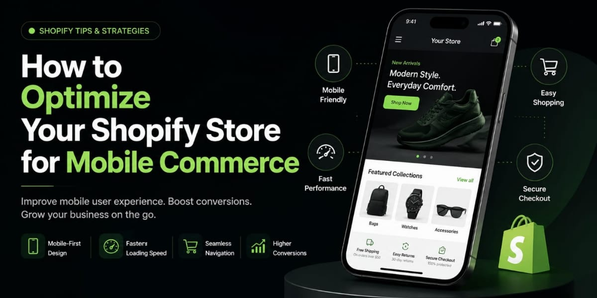
Design Product Pages for Mobile Conversion
Your product page is where the buying decision is made. On mobile, everything about this page needs to be designed around making that decision as easy as possible.
Lead with your best product image large, high quality, and immediately impactful. Allow users to swipe through additional images with simple horizontal swipe gestures. Pinch-to-zoom functionality is essential for products where customers want to inspect details closely.
Put your product name, price, and Add to Cart button above the fold on mobile meaning visible without scrolling. This is critical. If a customer has to scroll down to find the price or the buy button, you are creating unnecessary friction.
Make your Add to Cart button large, prominently colored, and impossible to miss. It should span the full width of the screen or close to it. On mobile, this button is the most important element on the page. Treat it that way.
Display your product variants size, color, style options in a clean, easy to use format on mobile. Large swatch buttons or clearly labeled dropdown menus work better than tiny radio buttons that are hard to tap accurately.
Put your key product details the information that answers the most common questions before a customer has to ask — near the top of the page. Delivery timeframe, return policy, materials, sizing information. Use expandable accordion sections to keep the page clean while making this information accessible with a single tap.
Place your reviews below the product details in a mobile optimized format. Star ratings summary at the top. Individual reviews in a clean, readable layout beneath. Reviews are often the deciding factor for hesitant buyers make them easy to read on a small screen.
Part Four: Mobile Checkout Optimization
You can do everything right in the browsing and product experience and still lose customers at checkout if the process is not smooth on mobile. Cart abandonment is already a significant problem in e-commerce. On mobile, a frustrating checkout experience dramatically increases it.
Here is how to optimize your mobile checkout for maximum conversions.
Enable Shopify’s Accelerated Checkout Options
Shopify supports one tap checkout options Shop Pay, Apple Pay, Google Pay, and PayPal Express — that allow customers to complete their purchase without manually entering shipping and payment details.
This is transformational for mobile conversion rates. Typing a full name, email address, shipping address, and credit card number on a mobile keyboard is tedious and error-prone. Most people have done it and found it frustrating. One tap checkout eliminates all of that friction entirely.
Enable every accelerated checkout option available to your store. Display these options prominently on your product pages and cart page not just inside the checkout flow. When a customer can see the Apple Pay or Shop Pay button on the product page itself, they can buy in two taps without ever going through a traditional checkout.
Simplify Your Checkout Form
For customers who do go through the standard checkout flow, make every step as simple as possible.
Only ask for information you genuinely need. Do not add optional fields or marketing preference questions that slow down the process. Every additional field in a checkout form reduces completion rates — on mobile this effect is even more pronounced because each field requires typing on a small keyboard.
Enable autofill and address autocomplete. Shopify’s checkout supports browser autofill natively. Make sure your checkout is not doing anything that interferes with this functionality. Address autocomplete — where the address field suggests and auto completes addresses as the customer types dramatically speeds up the address entry step.
Use a single-page or minimal-page checkout flow. Fewer steps mean fewer opportunities to abandon. Shopify’s native checkout is already well-optimized but if you are on Plus, you have additional checkout customization options worth exploring.
Make error messages clear and helpful. When a customer makes a mistake filling out a form a missing field, an invalid card number the error message should appear immediately, be clearly visible, and explain exactly what needs to be corrected. Vague or invisible error messages cause confusion and abandonment on mobile.
Offer Guest Checkout
Requiring customers to create an account before purchasing is one of the most common conversion killers in e commerce. On mobile, it is especially damaging because account creation adds multiple steps to an already tedious process.
Make sure guest checkout is enabled in your Shopify settings. Let customers buy first. Then invite them to create an account afterward ideally with a simple one-click process that uses the information they already entered during checkout.
Optimize Your Cart Page for Mobile
Your cart page is a critical step in the funnel. On mobile it needs to be clean, clear, and easy to navigate.
Display each item clearly with a product image, name, variant, quantity, and price. Make it easy to adjust quantities or remove items with large, clearly labeled buttons.
Show the order total, any discounts applied, and estimated shipping clearly. Surprise costs at checkout are one of the leading causes of abandonment — be transparent about the total cost before the customer commits to the final checkout step.
Keep your checkout button prominent and easy to find without scrolling. On mobile, if the checkout button is below the fold and requires scrolling to reach, some customers will simply not find it.
Part Five: Mobile First Content and Design
Beyond the technical and structural elements, there are design and content decisions that significantly impact how your store feels on mobile.
Typography That Reads Well on Small Screens
Text that looks elegant on a desktop can become tiny and hard to read on a phone. Your body text should be at least 16 pixels. Your product names and headings should be clear and readable without zooming.
Use a clean, legible font. Avoid decorative fonts that look beautiful in large sizes but become illegible when small. Test how your text looks on an actual phone — not just in the desktop theme editor.
Line spacing matters too. Text that is too tightly spaced is hard to read on a small screen. Give your body text generous line height to improve readability.
Product Photography Optimized for Mobile
Your product photos need to look exceptional on a small screen. This means shooting photos that work in the square or portrait format that displays best on mobile — not just wide landscape shots that crop awkwardly.
Show your products clearly and compellingly in the main image. Mobile users make quick judgments based on the first image they see. If it does not immediately communicate what the product is and why it is desirable, they move on.
Include lifestyle images that show the product being used in a real context. On mobile especially, lifestyle imagery is powerful because it helps customers quickly visualize the product in their own life.
Pop-Ups That Do Not Ruin the Experience
Email capture pop-ups are valuable for building your list. On mobile they are often infuriating.
A pop-up that covers the entire screen the moment someone arrives on your site is particularly damaging. It interrupts the browsing experience before the visitor has had a chance to see anything. On mobile where dismissing a pop-up can be physically awkward hitting the tiny X button with a finger this creates immediate frustration.
Configure your pop-ups to appear after a delay — at least 30 seconds of browsing time, or after the visitor has scrolled down the page, or when they are about to leave. Use a smaller, less intrusive format on mobile. Make the dismiss button large and easy to tap.
Google also penalizes mobile pages that use intrusive interstitials pop ups that cover the main content immediately on page load. Badly configured pop-ups can hurt your search rankings as well as your conversion rate.
Part Six: Testing and Monitoring Your Mobile Experience
Optimizing your mobile store is not a one-time project. It is an ongoing practice of testing, measuring, and improving.
Test on Real Devices
The Shopify theme editor shows you a mobile preview but it is not the same as testing on an actual phone. The way a page feels to navigate, the way tap targets respond, the way text renders these things are only fully apparent on a real device.
Test your store on multiple devices and screen sizes. An iPhone with a small screen behaves differently from a large Android phone. What looks fine on one device can have layout problems on another.
Go through the complete purchase journey on your phone at least once a month browse a collection, view a product, add to cart, go through checkout. Notice every moment where something feels slightly awkward or unclear. Those moments are your optimization opportunities.
Use Shopify Analytics to Understand Mobile Behavior
Shopify’s analytics show you the breakdown of your traffic and sales by device type. Check this regularly. What percentage of your sessions are mobile? What is the conversion rate of mobile sessions compared to desktop? What is the average order value from mobile versus desktop?
If your mobile conversion rate is significantly lower than your desktop conversion rate, that is a strong signal that there are friction points in your mobile experience worth investigating.
Look at where mobile users drop off in the purchase funnel. If many people add to cart on mobile but do not reach checkout, the cart or checkout entry point might be the problem. If they start checkout but do not complete it, the checkout flow itself needs attention.
Google Search Console for Mobile Usability
Google Search Console has a dedicated Mobile Usability report that flags specific technical issues affecting your store’s mobile experience. Common issues include text that is too small to read, clickable elements that are too close together, and content that is wider than the screen.
Log in to Google Search Console, navigate to the Mobile Usability report, and fix any issues flagged there. These are not just user experience problems — they are factors that can hurt your search rankings on Google, since Google uses mobile experience as a ranking signal.
Heatmaps and Session Recordings
Tools like Hotjar and Microsoft Clarity show you recordings of real user sessions on your store. You can watch how mobile visitors navigate your pages, where they tap, where they scroll, and where they stop and leave.
This qualitative data is invaluable. Analytics tell you what is happening. Session recordings show you why. Watching a mobile user struggle to find the checkout button or fail to tap a filter option correctly makes the problem immediately obvious in a way that data alone cannot.
Part Seven: Advanced Mobile Commerce Features
Once your core mobile experience is solid, there are additional features worth exploring that can further enhance the mobile shopping experience.
Progressive Web App Functionality
Some Shopify themes and apps support Progressive Web App features that allow customers to add your store to their phone’s home screen and access it like a native app — with offline capability, push notifications, and app-like navigation.
This creates a more immersive, app-like shopping experience for your most loyal customers without requiring them to download an app from the App Store.
Mobile-Specific Promotions
Consider running promotions that are specifically designed for mobile shoppers — offers that appear only on mobile, countdown timers that create urgency for mobile sessions, or exclusive deals accessible through a mobile-specific code.
These tactics can boost mobile conversion rates and make your mobile channel feel distinct and valuable.
SMS Marketing Integration
SMS marketing is inherently a mobile channel and it integrates naturally with a mobile-optimized Shopify store. Customers who are already browsing on their phone are only one tap away from a text message that brings them back to complete a purchase.
Connect your Shopify store to an SMS marketing platform — Postscript, SMSBump, or Klaviyo’s SMS feature — and build SMS flows for abandoned cart recovery, back in stock notifications, and order updates. These messages are read at extremely high rates and drive significant revenue for stores that use them well.
Final Thoughts
Mobile commerce is not the future of e-commerce. It is the present.
The customers who are going to drive your Shopify store’s growth over the next few years are predominantly mobile users. They are discovering products on TikTok and Instagram, clicking through to stores on their phones, and making buying decisions on screens smaller than a paperback book.
If your store gives them a fast, intuitive, beautiful experience on mobile, you capture those sales. If it gives them a slow, confusing, frustrating experience, you lose them — and they do not come back.
Start with your theme. Check your speed. Simplify your navigation. Optimize your product pages. Remove checkout friction. Test everything on a real phone.
Do those things well and your mobile experience becomes a genuine competitive advantage — one that turns the majority of your traffic into customers instead of bounces.
Your store is probably already getting most of its traffic from mobile right now.
The question is whether that traffic is converting the way it should.